One of the common concerns and questions in any model development is determining how “good” a model is or how well it performs. There are many different factors that determine this and most of them depend on the goals for the model. There are typically two different purposes for modeling - estimation and prediction. Estimation quantifies the expected change in our target variable associated with some relationship or change in the predictor variables. Prediction on the other hand is focused on predicting new target observations. However, these goals are rarely seen in isolation as most people desire a blend of these goals for their models. This section will cover many of the popular metrics for model assessment.
The first thing to remember about model assessment is that a model is only “good” in context with another model. All of these model metrics are truly model comparisons. Is an accuracy of 80% good? Depends! If the previous model used has an accuracy of 90%, then no the new model is not good. However, if the previous model used has an accuracy of 70%, then yes the model is good. Although we will show many of the calculations, at no place will we say that you must meet a certain threshold for your models to be considered “good” because these metrics are designed for comparison.
Some common model metrics are based on likelihood calculations. Likelihood calculations are limited to more statistical based models as more complicated machine learning models don’t have likelihood representations. Three common logistic regression metrics based on likelihood are the following:
AIC
BIC
Generalized (McFadden) \(R^2\)
Without going into too much mathematical detail, the AIC is a crude, large sample approximation of leave-one-out cross validation. The BIC on the other hand favors a smaller model than the AIC as it penalizes model complexity more. In both AIC and BIC, lower values are better. However, there is no amount of lower that is better enough. Neither the AIC or BIC is necessarily better than the other however they may not always agree on the “best” model.
There are a number of “pseudo”-\(R^2\) metrics for logistic regression. Here, higher values indicate a better model. The Generalized (McFadden) \(R^2\) is a metric to measure how much better a model (in terms of likelihood) is compared to the intercept only model. Therefore, we compare two models with this to see which one is “more better” than the intercept compared to the other. Essentially, they are both compared to the same baseline so whichever beats that baseline by more is the model we want. Even though it is bounded between 0 and 1, there is no interpretation to this metric like we had in linear regression.
We will be going back to the Ames, Iowa housing data set to see how well our model performed after subset selection in the previous seciton. We will use the results from the backward selection model.
Let’s see how to calculate the McFadden \(R^2\) in each software!
Python provides a lot of these metrics by default in the output of the summary function on our Logit model objects. However, we can call them separately through the aic, bic_llf, and pseudo_rquared functions as well if needed. Let’s examine the \(R^2\) output from our Logit model summary function output.
From the output above we can see the McFadden \(R^2\) value as 0.7007. This just shows that our model is noticeably better than the intercept model. However, if we were to build another logistic regression model on the same data, we could compare them to see which had the higher value of McFadden’s \(R^2\).
R provides some of these metrics by default in the output of the summary function on our logistic regression objects. However, we can call them separately through the AIC, BIC, and pR2 functions as well. Note the pR2 function comes from the pscl package in R and provides more than just the McFadden \(R^2\) value.
Code
names(X_selected)[names(X_selected) =="1stFlrSF"] <-"FirstFlrSF"names(X_selected)[names(X_selected) =="2ndFlrSF"] <-"SecondFlrSF"logit_model <-glm(y ~ ., data = X_selected, family =binomial(link ="logit"),control =glm.control(maxit =100, epsilon =1e-8))summary(logit_model)
From the output above we can see the McFadden \(R^2\) value as 0.7007. This just shows that our model is noticeably better than the intercept model. However, if we were to build another logistic regression model on the same data, we could compare them to see which had the higher value of McFadden’s \(R^2\).
Probability Metrics
Logistic regression is a model for predicting the probability of an event, not the occurrence of an event. Logistic regression can be used for classification as well. Good models should reflect both good metrics on probability and classification, but the importance of one over the other depends on the problem.
In this section we will focus on the probability metrics. Since we are predicting the probability of an event, we want our model to assign higher predicted probabilities to events and lower predicted probabilities to non-events.
Rank-Order Statistics
Rank-order statistics measure how well a model orders the predicted probabilities. Three common metrics that summarize things together are concordance, discordance, and ties. In these metrics every single combination of an event and non-event are compared against each other (1 event vs. 1 non-event; a 1 vs. a 0). A concordant pair is a pair with the event having a higher predicted probability than the non-event - the model got the rank correct. A discordant pair is a pair with the event having a lower predicted probability than the non-event - the model got the rank wrong. A tied pair is a pair where the event and non-event have the same predicted probability - the model isn’t sure how to distinguish between them. Models with higher concordance are considered better. The interpretation on concordance is that for all possible event and non-event combinations, the model assigned the higher predicted probability to the observation with the event concordance% of the time.
There are a host of other metrics that are based on these rank-statistics such as the \(c\)-statistic, Somer’s D, and Kendall’s \(\tau_\alpha\). The calculations for these are as follows:
Although not provided immediately in the model summary, Python can easily provide a couple of the metrics above using the roc_auc_score function from the sklearn.metrics package. The area under the ROC curve (AUC) is equivalent to the \(c\)-statistic mentioned above. From there we can calculate the Somer’s D statistic ourselves.
As we can see from the output, our model’s \(c\)-statistic is rather high at 0.978 which leads to a high value of Somer’s D of 0.957. Just like with other model metrics, we cannot say whether these are “good” values of these metrics as they are meant for comparison. If these values are higher than the same values from another model, then this model is better than the other model.
Although not provided immediately in the model summary, R can easily provide a couple of the metrics above with the and somers2 function.
Code
library(Hmisc)train$p_hat <-predict(logit_model, type ="response")somers2(train$p_hat, train$bonus)
           C          Dxy            n      Missing
   0.9784599    0.9569198 1095.0000000    0.0000000
As we can see from the output, our model’s \(c\)-statistic is rather high at 0.978 which leads to a high value of Somer’s D of 0.957. Just like with other model metrics, we cannot say whether these are “good” values of these metrics as they are meant for comparison. If these values are higher than the same values from another model, then this model is better than the other model.
Classification Metrics
Logistic regression is a model for predicting the probability of an event, not the occurrence of an event. Logistic regression can be used for classification as well. Good models should reflect both good metrics on probability and classification, but the importance of one over the other depends on the problem.
In this section we will focus on the classification metrics. We want a model to correctly classify events and non-events. Classification forces the model to predict either an event or non-event for each observation based on the predicted probability for that observation. For example, \(\hat{y}_1 = 1\) if \(\hat{p}_i > 0.5\). These are called cut-offs or thresholds. However, strict classification-based measures completely discard any information about the actual quality of the model’s predicted probabilities.
Many of the metrics around classification try to balance different pieces of the classification table (also called the confusion matrix). An example of one is shown below.
Classification Table Example
Let’s examine the different pieces of the classification table that people jointly focus on.
Sensitivity & Specificity
Sensitivity is the proportion of times you were able to predict an event in the groups of actual events. Of the actual events, the proportion of the time you correctly predicted an event. This is also called the true positive rate. This is also just another name for recall.
Example Calculation of Sensitivity
This is balanced typically with the specificity. Specificity is the proportion of times you were able to predict a non-event in the group of actual non-events. Of the actual non-events, the proportion of the time you correctly predicted non-event. This is also called the true negative rate.
Example Calculation of Specificity
These offset each other in a model. One could easily maximize one of these at the cost of the other. To get maximum sensitivity you can just predict every observations is an event, however this would drop your specificity to 0. The reverse is also true. Those who focus on sensitivity and specificity want balance in each. One measure for the optimal cut-off from a model is the Youden’s Index (or Youden’s J Statistic). This is easily calculated as \(J = sensitivity + specificity - 1\). The optimal cut-off for determining predicted events and non-events would be at the point where this is maximized.
Python produces classification tables for any cut-off that you determine. Remember that a cut-off is simply the point where you decide to predict an event and non-event from your predicted probabilities. The crosstab function creates the classification table for us after using the map function to define our cut-off at 0.5.
Code
import pandas as pdtrain['pred'] = train['p_hat'].map(lambda x: 1if x >0.5else0)pd.crosstab(train['bonus'], train['pred'])
pred     0    1
bonus
0      582   41
1       42  430
We want to look at all classification tables for all values of cut-offs between 0 and 1. We can easily loop through this calculation with a for loop in Python. However, the roc_curve function can do this for us. The inputs for this function are the target variable first, followed by the predicted probabilities. We are saving the output of this function into three objects fpr (the false positive rate or \(1-specificity\)), the tpr (the true positive rate), and the corresponding threshold to get those values. From there we combine these variables into a single dataframe. We then calculate the Youden Index as the difference between the TPR and FPR. From there we sort by this Youden Index value and print the observations.
We can see that the highest Youden J statistic had a value of 0.8676. This took place at a cut-off of 0.318. Therefore, according to the Youden Index at least, the optimal cut-off for our model is 0.318. In other words, if our model predicts a probability above 0.318 then we should call this an event. Any predicted probability below 0.318 should be called a non-event.
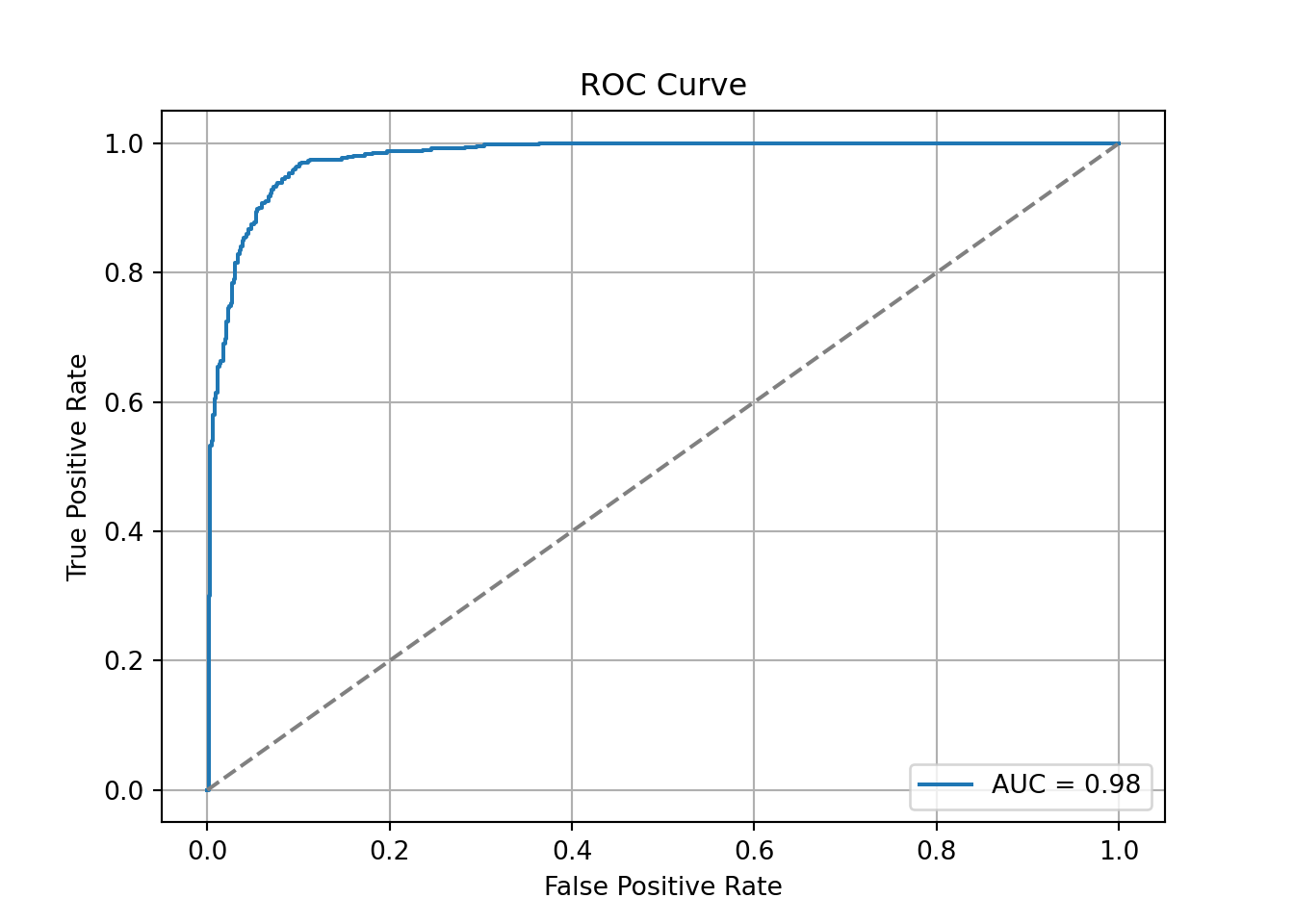
Another commonly used visual for the balance of sensitivity and specificity across all of the cut-offs is the Receiver Operator Characteristic curve. Commonly known as the ROC curve. The ROC curve plots the balance of sensitivity vs. specificity. The “best” ROC curve is the one that reaches to the upper left hand side of the plot as that would imply that our model has both high levels of sensitivity and specificity. The worst ROC curve is represented by the diagonal line in the plot since that would imply our model is as good as randomly assigning events and non-events to our observations. This leads some to calculate the area under the ROC curve (typically called AUC) as a metric summarizing the curve itself. The math won’t be shown here, but the AUC is equal to the \(c\)-statistic in the Rank-order statistics section. Isn’t math fun!?!?
Python easily produces ROC curves using the matplotlib.pyplot function using the fpr and tpr objects we previously calculated in the code above. Using the plt function on this object gives the ROC curve. The roc_auc_score function provides us with the AUC value for the ROC curve.
We can also see that the area under our ROC curve is 0.98. Similar to other metrics, we cannot say whether this is a “good” value of AUC, only if it is better or worse than another model’s AUC.
R produces classification tables for any cut-off that you determine. Remember that a cut-off is simply the point where you decide to predict an event and non-event from your predicted probabilities. The table function creates the classification table for us after using the ifelse function to define our cut-off at 0.5.
We want to look at all classification tables for all values of cut-offs between 0 and 1. We can easily loop through this calculation with a for loop in R. However, the measureit function can do this for us. The inputs for this function are the predicted probabilities first, followed by the target variable. The measure option allows you to define additional measures to calculate at each cut-off. In the code below we ask for accuracy (ACC), sensitivity (SENS), and specificity (SPEC). From there we combine these variables into a single dataframe and print the observations with the head function.
Code
library(ROCit)logit_meas <-measureit(train$p_hat, train$bonus, measure =c("ACC", "SENS", "SPEC"))youden_table <-data.frame(Cutoff = logit_meas$Cutoff, Sens = logit_meas$SENS, Spec = logit_meas$SPEC)head(youden_table, n =10)
We could calculate the Youden Index by hand and then rank the new dataframe by this value, however, rocit function will gives this to us automatically in the next piece of code.
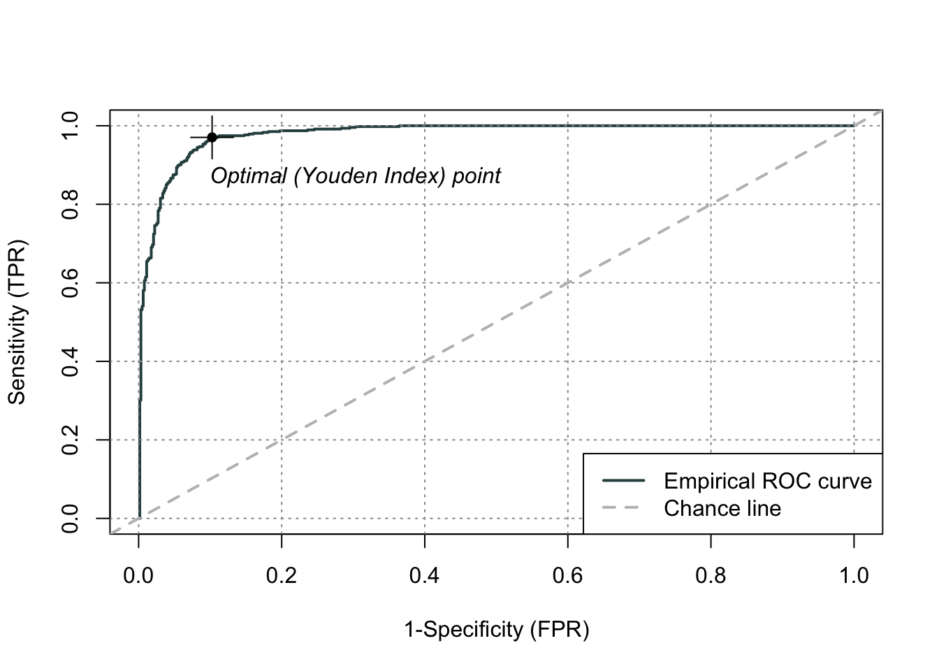
Another commonly used visual for the balance of sensitivity and specificity across all of the cut-offs is the Receiver Operator Characteristic curve. Commonly known as the ROC curve. The ROC curve plots the balance of sensitivity vs. specificity. The “best” ROC curve is the one that reaches to the upper left hand side of the plot as that would imply that our model has both high levels of sensitivity and specificity. The worst ROC curve is represented by the diagonal line in the plot since that would imply our model is as good as randomly assigning events and non-events to our observations. This leads some to calculate the area under the ROC curve (typically called AUC) as a metric summarizing the curve itself. The math won’t be shown here, but the AUC is equal to the \(c\)-statistic in the Rank-order statistics section. Isn’t math fun!?!?
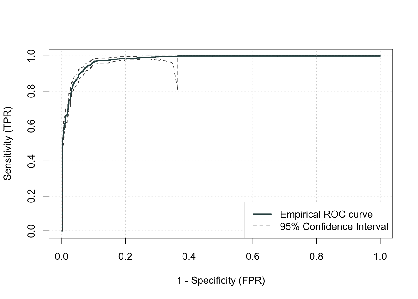
R easily produces ROC curves from a variety of functions. A popular, new function is the rocit function. Using the plot function on the rocit object gives the ROC curve. By calling the $optimal element of the plot of the rocit object, it gives the value of the Youden’s Index (value in the output) along with the respective cut-off that corresponds to that maximum Youden value. The summary function on the rocit object will report the AUC value. We can also get confidence intervals around our AUC values (ciAUC function) and ROC curves (ciROC function).
We can see that the highest Youden J statistic had a value of 0.8676. This took place at a cut-off of 0.318. Therefore, according to the Youden Index at least, the optimal cut-off for our model is 0.318. In other words, if our model predicts a probability above 0.318 then we should call this an event. Any predicted probability below 0.318 should be called a non-event. We can also see that the area under our ROC curve is 0.98. Similar to other metrics, we cannot say whether this is a “good” value of AUC, only if it is better or worse than another model’s AUC.
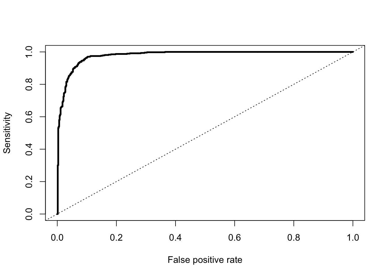
Another common function is the performance function that produces many more plots than the ROC curve. Here the ROC curve is obtained by plotting the true positive rate by the false positive rate using the measure = "tpr" and "x.measure = "fpr" options. The AUC is also obtained from the performance function by calling the measure = "auc" option.
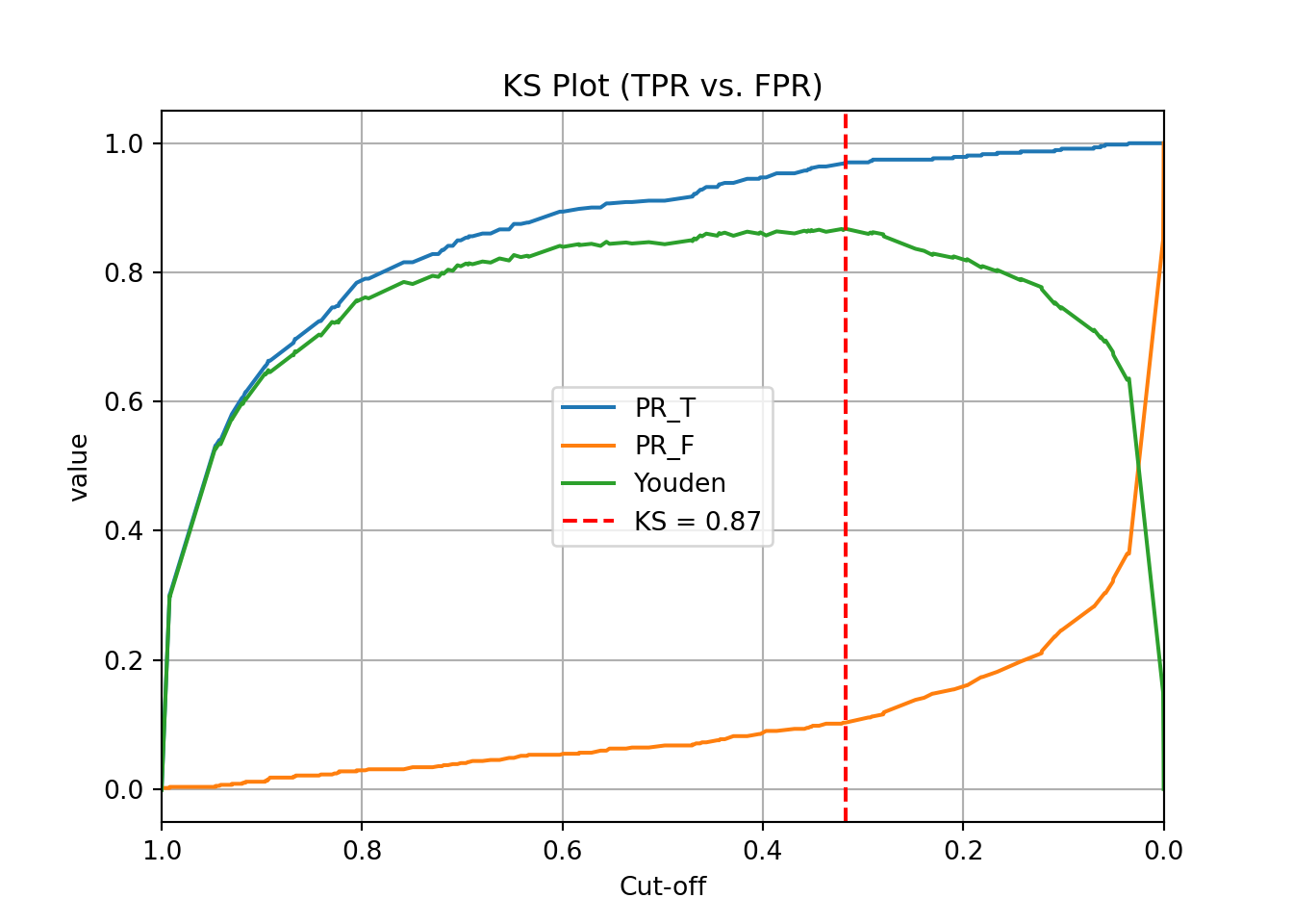
One of the most popular metrics for classification models in the finance and banking industry is the KS statistic. The two sample KS statistic can determine if there is a difference between two cumulative distribution functions. The two cumulative distribution functions of interest to us are the predicted probability distribution functions for the event and non-event target group. The KS \(D\) statistic is the maximum distance between these two curves - calculated by the maximum difference between the true positive and false positive rates, \(D = \max_{depth}{(TPR - FPR)} = \max_{depth}{(Sensitivity + Specificity - 1)}\). Notice, this is the same as maximizing the Youden Index.
The optimal cut-off for determining predicted events and non-events would be at the point where this \(D\) statistic (Youden Index) is maximized.
Mathematically, the KS-statistic and the Youden’s Index are the same. From the output above we can see that the maximum value of the Youden Index is 0.8676. This is the value of the KS \(D\) statistic. The cut-off where this is maximized is the same as Youden at 0.318. The only thing we are doing in the code below is calculating the cumulative probability functions that the KS function is originally based off of as well as plotting the value of the Youden Index across the probability functions. The maximum distance between the probability functions is the place where Youden’s Index is maximized.
plt.title("KS Plot (TPR vs. FPR)")plt.grid(True)plt.axvline(x=ks_cutoff, linestyle='--', color='red', label=f'KS = {ks_val:.2f}')plt.legend()plt.show()
As we saw in the previous section, the optimal cut-off according to the KS-statistic would be at 0.318. Therefore, according to the KS statistic at least, the optimal cut-off for our model is 0.318. In other words, if our model predicts a probability above 0.318 then we should call this an event. Any predicted probability below 0.318 should be called a non-event.
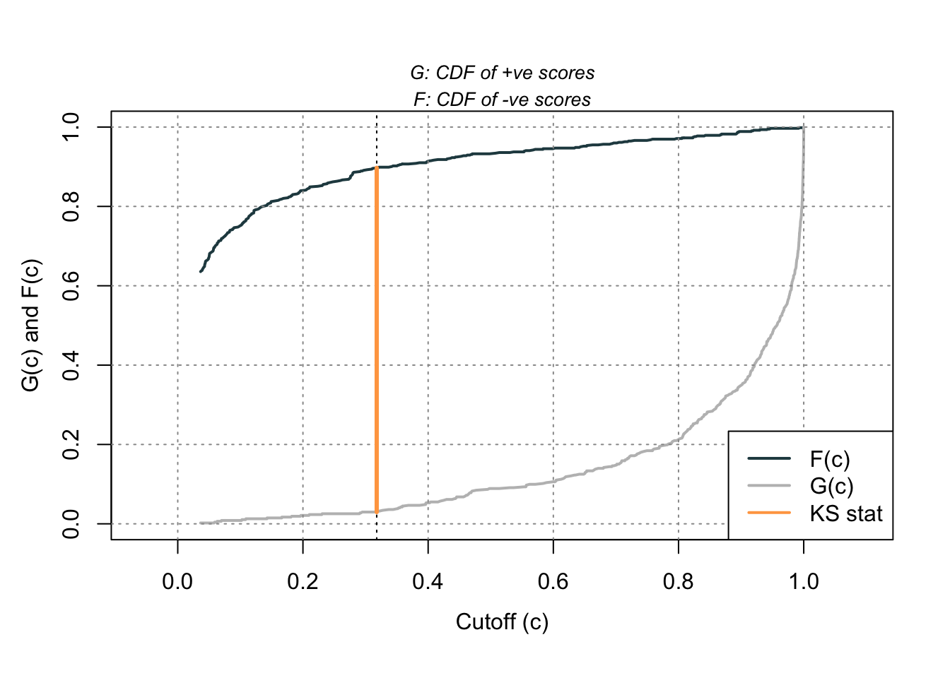
Using the same rocit object from the section on sensitivity and specificity (here called logit_roc) we can also calculate the KS statistic and plot the two cumulative distribution functions it represents. The ksplot function will plot the two cumulative distribution functions as well as highlight the cut-off (or threshold) where they are most separated. This point corresponds the \(D\) statistic mentioned above as well as the Youden’s Index. By calling the KS stat and KS Cutoff elements from this KS plot, we can get the optimal cut-off as well as the value at this cut-off.
Code
ksplot(logit_roc)
Code
ksplot(logit_roc)$`KS stat`
[1] 0.8676103
Code
ksplot(logit_roc)$`KS Cutoff`
[1] 0.3178316
As we saw in the previous section, the optimal cut-off according to the KS-statistic would be at 0.318. Therefore, according to the KS statistic at least, the optimal cut-off for our model is 0.318. In other words, if our model predicts a probability above 0.318 then we should call this an event. Any predicted probability below 0.318 should be called a non-event. The KS \(D\) statistic is reported as 0.8676 which is equal to the Youden’s Index value.
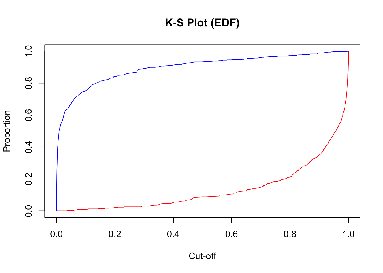
Another way to calculate this is by hand using the performance function we saw in the previous section as well. Using the measure = "tpr" and x.measure = "fpr" options, we can calculate the true positive rate and false positive rate across all our predictions. From there we can just use the max function to calculate the value of maximum difference between the two - the KS statistic. Finding the cut-off at this point is a little trickier with some of the needed R functions, but we essentially search the for alpha values (here the cut-offs) for the point where the KS statistic is maximized.
plot(x =unlist(perf@alpha.values), y = (1-unlist(perf@y.values)),type ="l", main ="K-S Plot (EDF)",xlab ='Cut-off',ylab ="Proportion",col ="red")lines(x =unlist(perf@alpha.values), y = (1-unlist(perf@x.values)), col ="blue")
From the output we can see the KS \(D\) statistic at 0.8676. The predicted probability that this occurs at (the optimal cut-off) is defined at 0.318 as we previously saw.
Precision & Recall
Precision and recall are another way to view a classification table from a model. Recall is the proportion of times you were able to predict an event in the groups of actual events. Of the actual events, the proportion of the time you correctly predicted an event. This is also called the true positive rate. This is also just another name for sensitivity.
Example Recall Calculation
This is balanced here with the precision. Precision is the proportion predicted events that were actually events. Of the predicted events, the proportion of the time they actually were events. This is also called the positive predictive value. Precision is growing in popularity as a balance to recall/sensitivity as compared to specificity.
Example Precision Calculation
These offset each other in a model. One could easily maximize one of these at the cost of the other. To get maximum recall you can just predict all events, however this would drop your precision. Those who focus on precision and recall want balance in each. One measure for the optimal cut-off from a model is the F1 Score. This is calculated as the following:
Python produces classification tables for any cut-off that you determine. Remember that a cut-off is simply the point where you decide to predict an event and non-event from your predicted probabilities.
We want to look at all classification tables for all values of cut-offs between 0 and 1. We can easily loop through this calculation with a for loop in Python using the precision_score, recall_score, and f1_score functions. The inputs for each function are the target variable first, followed by the predicted probabilities. We loop through many cut-off values to find the optimal F1-score.
We can see that the highest F1 score had a value of 0.921. This took place at a cut-off of 0.32. Therefore, according to the F1 score at least, the optimal cut-off for our model is 0.32. In other words, if our model predicts a probability above 0.32 then we should call this an event. Any predicted probability below 0.32 should be called a non-event. This matches up closely with the Youden’s Index from above. This is not always the case. We just got lucky in this example.
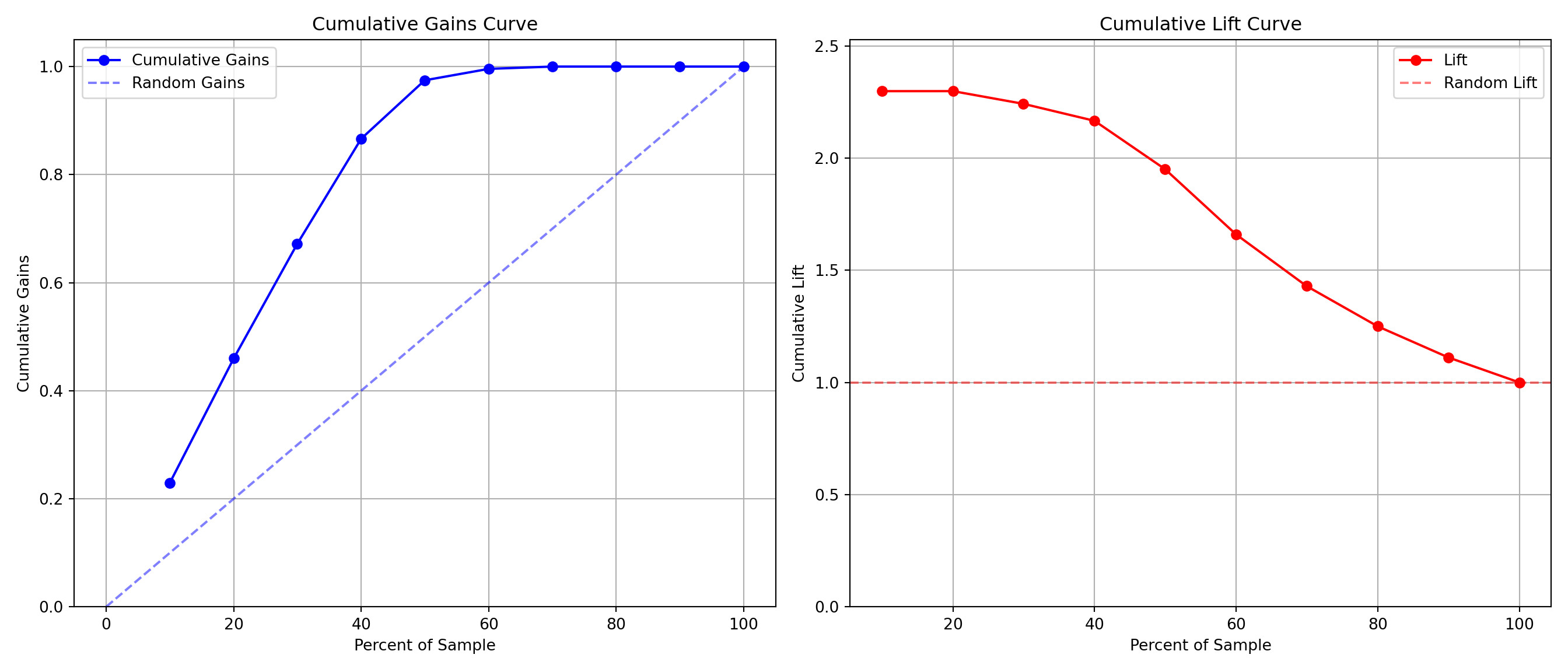
Another common calculation using the precision of a model is the model’s lift. The lift of a model is simply calculated as the ratio of precision to the population proportion of the event - \(Lift = PPV/\pi_1\). The interpretation of lift is really nice for explanation. Let’s imagine that your lift was 3 and your population proportion of events was 0.2. This means that in the top 20% of your customers, your model predicted 3 times the events as compared to you selecting people at random. Sometimes people plot lift charts where they plot the precision at all the different values of the population proportion (called depth).
Python doesn’t have an easy, built-in function for plotting lift, but this isn’t a hard thing to calculate ourselves. The created function below will plot both the lift and gain plots for our data.
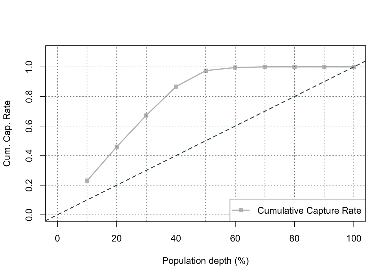
The right-hand, cumulative lift chart displays how good you are up to that point in the data. Based on our output above, the top 10% of our predictions produce bonus eligible homes around 2.5 times the amount we would have gotten by random selection. The left-hand plot is the cumulative capture rate plot (also called cumulative gains). This tells us how much of the target 1’s you captured with your model. The diagonal line would be random, so the further above the line the better the model. For the first 10% of our predictions, we were able to capture a little over 20% of all bonus eligible homes. In fact, we have captured nearly all of the bonus eligible homes in the top 60% of our predictions.
R produces classification tables for any cut-off that you determine. Remember that a cut-off is simply the point where you decide to predict an event and non-event from your predicted probabilities.
We want to look at all classification tables for all values of cut-offs between 0 and 1. We can easily loop through this calculation with a for loop in R. However, the measureit function can do this for us. The inputs for this function are the predicted probabilities first, followed by the target variable. The measure option allows you to define additional measures to calculate at each cut-off. In the code below we ask for precision (PREC), sensitivity (SENS), and F1-score (FSCR). From there we combine these variables into a single dataframe and print the observations with the print function.
We can see that the highest F1 score had a value of 0.9215. This took place at a cut-off of 0.318. Therefore, according to the F1 score at least, the optimal cut-off for our model is 0.3158. In other words, if our model predicts a probability above 0.318 then we should call this an event. Any predicted probability below 0.318 should be called a non-event. This matches up with the Youden’s Index from above. This is not always the case. We just got lucky in this example.
Another common calculation using the precision of a model is the model’s lift. The lift of a model is simply calculated as the ratio of Precision to the population proportion of the event - \(Lift = PPV/\pi_1\). The interpretation of lift is really nice for explanation. Let’s imagine that your lift was 3 and your population proportion of events was 0.2. This means that in the top 20% of your customers, your model predicted 3 times the events as compared to you selecting people at random. Sometimes people plot lift charts where they plot the precision at all the different values of the population proportion (called depth).
Again, we can use the rocit object (called logit_roc) from earlier. The gainstable function breaks the data down into 10 groups (or buckets) ranked from highest predicted probability to lowest. We can use the plot function on this new object along with the type option to get a variety of useful plots. If you want more than 10 buckets for your data you can always use the ngroup option to specify how many you want.
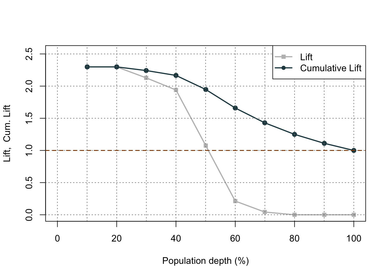
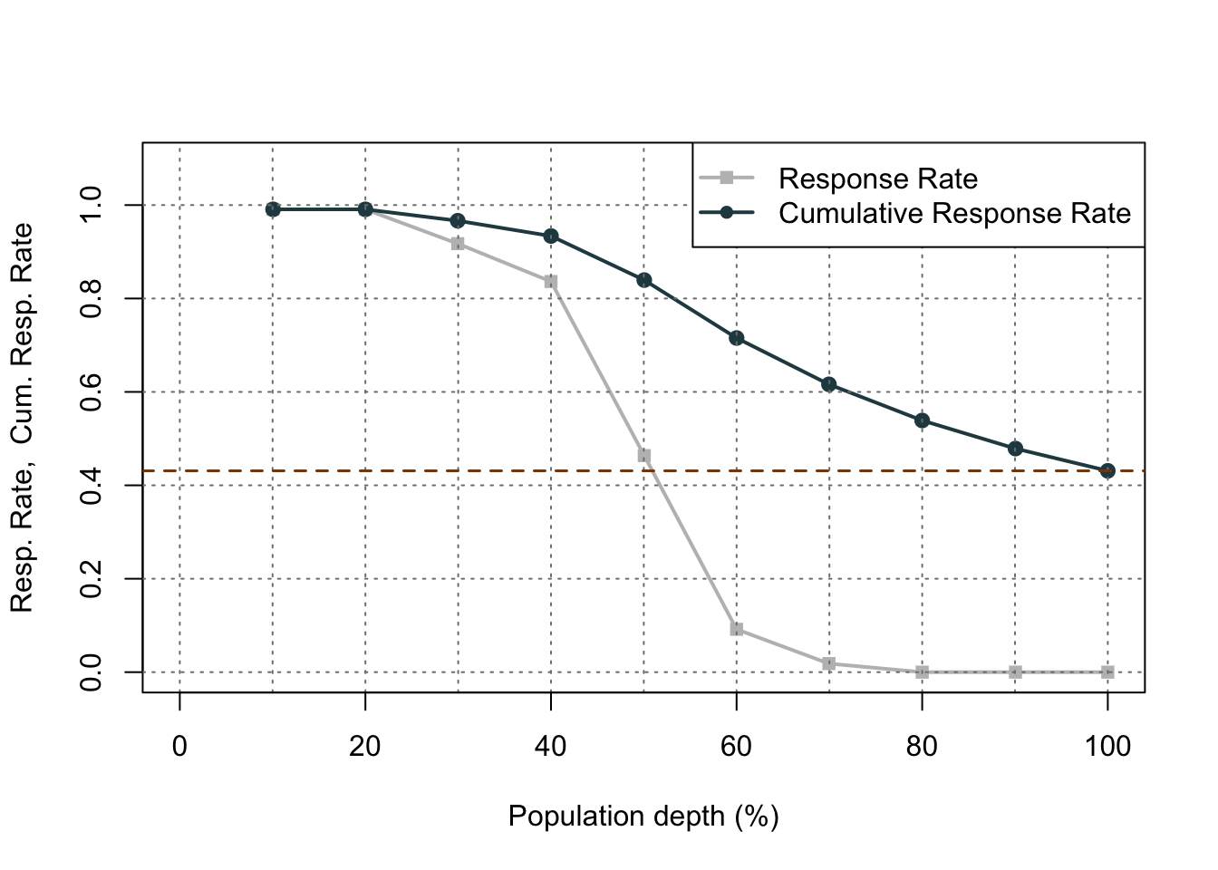
Let’s examine the output above. In the first table with the data split into 10 buckets, let’s examine the first row. Here we have 110 observations (1/10 of our data, or a depth of 0.1). Remember, these observations have been ranked by predicted probability so these observations have the highest probability of being a 1 according to our model. In these 110 observations, 109 of them had the response (target value of 1) which is a response rate of 0.991. Our original data had a total response rate (proportion of 1’s) of only 0.431. This means that we did 2.299 (=0.991 / 0.431) times better than random with our top 10% of customers. Another way to think about this would be that if we were to randomly pick 10% of our data, we would have only expected to see 47 responses (target values of 1). Our best 10% had 109 responses. Again, this ratio is a value of 2.299. The table continues this calculation for each of the buckets of 10% of our data.
The lift chart displays how good that bucket is alone, while the cumulative lift chart (more popular one) displays how good you are up to that point. The cumulative lift and lift charts are the first plot displayed. The second plot is the response rate and cumulative response rate plot. Each point divided by the horizontal line at 0.431 (population response rate) gives the lift value in the first chart. The last chart is the cumulative capture rate plot. This tells us how much of the target 1’s you captured with your model. The diagonal line would be random, so the further above the line the better the model.
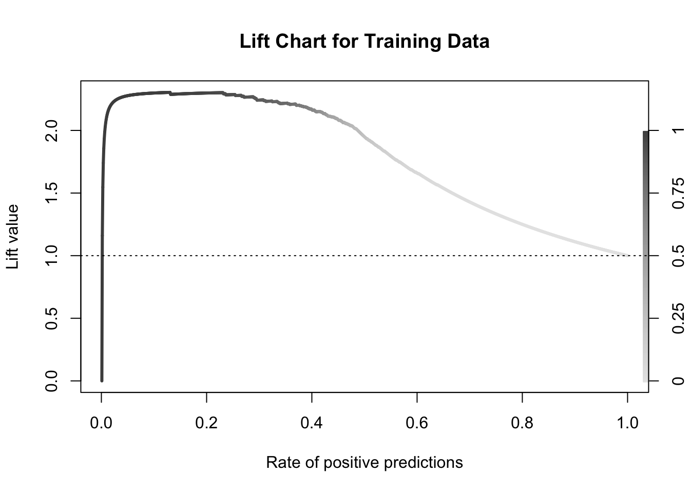
Another way to calculate this is the performance function in R. This can easily calculate and plot the lift chart for us using the measure = "lift" and x.measure = "rpp" options. This plots the lift vs. the rate of positive predictions.
A common place to evaluate lift is at the population proportion. In our example above, the population proportion is approximately 0.431. At that point, we have a lift of approximately 2. In other words, if we were to pick the top 43.1% of homes identified by our model, we would be 2 times as likely to find a bonus eligible home as compared to randomly selecting from the population. This shows the value in our model in an interpretable way.
Accuracy & Error
Accuracy and error rate are typically thought of when it comes to measuring the ability of a logistic regression model. Accuracy is essentially what percentage of events and non-events were predicted correctly.
Example Accuracy Calculation
The error would be the opposite of this.
Example Error Calculation
However, caution should be used with these metrics as they can easily be fooled if only focusing on them. If your data has 10% events and 90% non-events, you can easily have a 90% accurate model by guessing non-events for every observation. Instead, having less accuracy might be better if we can predict both events and non-events. These numbers are still great to report! They are just not the best to decide which model is best.
Python produces classification tables for any cut-off that you determine. Remember that a cut-off is simply the point where you decide to predict an event and non-event from your predicted probabilities.
We want to look at all classification tables for all values of cut-offs between 0 and 1. We can easily loop through this calculation with a for loop in Python using the accuracy_score function. The input for the function are the target variable first, followed by the predicted probabilities. We loop through many cut-off values to find the optimal accuracy.
From the output we can see the accuracy is maximized at 92.97%. The predicted probability that this occurs at (the optimal cut-off) is defined as 0.41. In other words, if our model predicts a probability above 0.41 then we should call this an event. Any predicted probability below 0.41 should be called a non-event, according to the accuracy metric.
There is more to model building than simply maximizing overall classification accuracy. These are good numbers to report, but not necessarily to choose models on.
R produces classification tables for any cut-off that you determine. Remember that a cut-off is simply the point where you decide to predict an event and non-event from your predicted probabilities.
We want to look at all classification tables for all values of cut-offs between 0 and 1. We can easily loop through this calculation with a for loop in R. However, the measureit function can do this for us. The inputs for this function are the predicted probabilities first, followed by the target variable. The measure option allows you to define additional measures to calculate at each cut-off. In the code below we ask for accuracy (ACC) and F1-score (FSCR). From there we combine these variables into a single dataframe and print the observations with the print function.
From the output we can see the accuracy is maximized at 92.97%. The predicted probability that this occurs at (the optimal cut-off) is defined as 0.456. In other words, if our model predicts a probability above 0.456 then we should call this an event. Any predicted probability below 0.456 should be called a non-event, according to the accuracy metric.
There is more to model building than simply maximizing overall classification accuracy. These are good numbers to report, but not necessarily to choose models on.
Optimal Cut-off
Classification is a decision that is extraneous to statistical modeling. Although logistic regressions tend to work well in classification, it is a probability model and does not output events and non-events.
Classification assumes cost for each observation is the same, which is rarely true. It is always better to consider the costs of false positives and false negatives when considering cut-offs in classification. The previous sections talk about many ways to determine “optimal” cut-offs when costs are either not known or not necessary. However, if costs are known, they should drive the cut-off decision rather than modeling metrics that do not account for cost.
Source Code
---title: "Model Assessment"format: html: code-fold: show code-tools: trueengine: knitreditor: visual---```{r}#| include: false#| warning: false#| error: false#| message: falselibrary(reticulate)reticulate::use_condaenv("wfu_fall_ml", required =TRUE)``````{python}#| include: false#| warning: false#| error: false#| message: falsedef check_quasi_complete_separation(X, y):""" Checks each categorical predictor in X for quasi-complete separation with respect to binary target y. Parameters: - X: pd.DataFrame of predictors (categorical variables) - y: pd.Series of binary target variable (e.g., 0/1 or True/False) Returns: - List of variable names that exhibit quasi-complete separation """ problematic_vars = []for col in X.columns: ct = pd.crosstab(X[col], y)# Check if any category (row) has a zero in any outcome classif (ct ==0).any(axis=1).any():print(f"⚠️ Quasi-complete separation detected in '{col}'")print(ct)print() problematic_vars.append(col)return problematic_vars``````{python}#| include: false#| warning: false#| error: false#| message: falsefrom sklearn.datasets import fetch_openmlimport pandas as pdfrom sklearn.feature_selection import SelectKBest, f_classifimport numpy as npimport matplotlib.pyplot as plt# Load Ames Housing datadata = fetch_openml(name="house_prices", as_frame=True)ames = data.frame# Remove Business Logic Variablesames = ames.drop(['Id', 'MSSubClass','Functional','MSZoning','Neighborhood', 'LandSlope','Condition2','OverallCond','RoofStyle','RoofMatl','Exterior1st','Exterior2nd','MasVnrType','MasVnrArea','ExterCond','BsmtCond','BsmtExposure','BsmtFinType1','BsmtFinSF1','BsmtFinType2','BsmtFinSF2','BsmtUnfSF','Electrical','LowQualFinSF','BsmtFullBath','BsmtHalfBath','KitchenAbvGr','GarageFinish','SaleType','SaleCondition'], axis=1)# Remove Missingness Variablesames = ames.drop(['PoolQC', 'MiscFeature','Alley', 'Fence'], axis=1)# Impute Missingness for Categorical Variablescat_cols = ames.select_dtypes(include=['object', 'category']).columnsames[cat_cols] = ames[cat_cols].fillna('Missing')# Remove Low Variability Variablesames = ames.drop(['Street', 'Utilities','Heating'], axis=1)# Train / Test Splitfrom sklearn.model_selection import train_test_splittrain, test = train_test_split(ames, test_size =0.25, random_state =1234)# Impute Missing for Continuous Variablesnum_cols = train.select_dtypes(include='number').columnsfor col in num_cols:if train[col].isnull().any():# Create missing flag column train[f'{col}_was_missing'] = train[col].isnull().astype(int)# Impute with median median = train[col].median() train[col] = train[col].fillna(median)train['bonus'] = (train['SalePrice'] >175000).astype(int)predictors = train.drop(columns=['SalePrice', 'bonus'])predictors = pd.get_dummies(predictors, drop_first=True)predictors = predictors.astype(float)predictors = predictors.drop(['GarageType_Missing', 'GarageQual_Missing','GarageCond_Missing'], axis=1)X = predictorsy = train['bonus']from sklearn.feature_selection import SelectKBest, chi2, f_classif# Separate categorical (dummy) vs. continuous featurescategorical_features = [col for col in X.columns if X[col].nunique() ==2]continuous_features = [col for col in X.columns if X[col].nunique() >2]X_cat = X[categorical_features]X_cont = X[continuous_features]# Fit SelectKBest for Categorical Variablesselector = SelectKBest(score_func=chi2, k='all') # 'all' keeps all features for scoringselector.fit(X_cat, y)# Create a DataFrame with feature names, Chi2-scores, and p-valuesscores_cat_df = pd.DataFrame({'Feature': X_cat.columns,'Chi2_score': selector.scores_,'p_value': selector.pvalues_})# Filter for features with p-value < 0.009selected_cat_features = scores_cat_df[scores_cat_df['p_value'] <0.009]['Feature']# Fit SelectKBest for Continous Variablesselector = SelectKBest(score_func=f_classif, k='all') # 'all' keeps all features for scoringselector.fit(X_cont, y)# Create a DataFrame with feature names, F-scores, and p-valuesscores_cont_df = pd.DataFrame({'Feature': X_cont.columns,'F_score': selector.scores_,'p_value': selector.pvalues_})# Filter for features with p-value < 0.009selected_cont_features = scores_cont_df[scores_cont_df['p_value'] <0.009]['Feature']# Create a new DataFrame with only those selected columnsX_reduced = X[selected_cat_features.tolist() + selected_cont_features.tolist()]X_cat_reduced = X_reduced[selected_cat_features.tolist()]problem_vars = check_quasi_complete_separation(X_cat_reduced, y)X_reduced = X_reduced.drop(problem_vars, axis =1)from mlxtend.feature_selection import SequentialFeatureSelector as SFSfrom sklearn.linear_model import LogisticRegressionfrom sklearn.preprocessing import StandardScalerscaler = StandardScaler()X_scaled = scaler.fit_transform(X_reduced)X_scaled_df = pd.DataFrame(X_scaled, columns = X_reduced.columns)logr = LogisticRegression(max_iter =1000, solver ='newton-cg', penalty =None) # Backward selection to find best subset of featuressfs = SFS(logr, k_features ="best", forward =False, floating =False, scoring ='roc_auc', cv =10)sfs = sfs.fit(X_scaled_df, y)# Get selected feature namesselected_features =list(sfs.k_feature_names_)X_selected = X_reduced[selected_features]``````{r}#| include: false#| warning: false#| error: false#| message: falsetrain = py$traintest = py$testX_selected = py$X_selectedy = py$y```# Comparing ModelsOne of the common concerns and questions in any model development is determining how "good" a model is or how well it performs. There are many different factors that determine this and most of them depend on the goals for the model. There are typically two different purposes for modeling - **estimation** and **prediction**. Estimation quantifies the expected change in our target variable associated with some relationship or change in the predictor variables. Prediction on the other hand is focused on predicting new target observations. However, these goals are rarely seen in isolation as most people desire a blend of these goals for their models. This section will cover many of the popular metrics for model assessment.The first thing to remember about model assessment is that a model is only "good" in context with another model. All of these model metrics are truly model comparisons. Is an accuracy of 80% good? Depends! If the previous model used has an accuracy of 90%, then no the new model is not good. However, if the previous model used has an accuracy of 70%, then yes the model is good. Although we will show many of the calculations, at no place will we say that you must meet a certain threshold for your models to be considered "good" because these metrics are designed for comparison.Some common model metrics are based on likelihood calculations. Likelihood calculations are limited to more statistical based models as more complicated machine learning models don't have likelihood representations. Three common logistic regression metrics based on likelihood are the following:1. AIC2. BIC3. Generalized (McFadden) $R^2$Without going into too much mathematical detail, the AIC is a crude, large sample approximation of leave-one-out cross validation. The BIC on the other hand favors a smaller model than the AIC as it penalizes model complexity more. In both AIC and BIC, lower values are better. However, there is no amount of lower that is better enough. Neither the AIC or BIC is necessarily better than the other however they may not always agree on the "best" model.There are a number of "pseudo"-$R^2$ metrics for logistic regression. Here, higher values indicate a better model. The Generalized (McFadden) $R^2$ is a metric to measure how much better a model (in terms of likelihood) is compared to the intercept only model. Therefore, we compare two models with this to see which one is "more better" than the intercept compared to the other. Essentially, they are both compared to the same baseline so whichever beats that baseline by more is the model we want. Even though it is bounded between 0 and 1, there is no interpretation to this metric like we had in linear regression.We will be going back to the Ames, Iowa housing data set to see how well our model performed after subset selection in the previous seciton. We will use the results from the backward selection model.Let's see how to calculate the McFadden $R^2$ in each software!::: {.panel-tabset .nav-pills}## PythonPython provides a lot of these metrics by default in the output of the `summary` function on our `Logit` model objects. However, we can call them separately through the `aic`, `bic_llf`, and `pseudo_rquared` functions as well if needed. Let's examine the $R^2$ output from our `Logit` model `summary` function output.```{python}#| warning: false#| error: false#| message: falseimport statsmodels.api as sm# Build Logistic RegressionX_selected = sm.add_constant(X_selected)model = sm.Logit(y, X_selected)result = model.fit()print(result.summary())```From the output above we can see the McFadden $R^2$ value as 0.7007. This just shows that our model is noticeably better than the intercept model. However, if we were to build another logistic regression model on the same data, we could compare them to see which had the higher value of McFadden's $R^2$.## RR provides some of these metrics by default in the output of the `summary` function on our logistic regression objects. However, we can call them separately through the `AIC`, `BIC`, and `pR2` functions as well. Note the `pR2` function comes from the `pscl` package in R and provides more than just the McFadden $R^2$ value.```{r}#| warning: false#| error: false#| message: falsenames(X_selected)[names(X_selected) =="1stFlrSF"] <-"FirstFlrSF"names(X_selected)[names(X_selected) =="2ndFlrSF"] <-"SecondFlrSF"logit_model <-glm(y ~ ., data = X_selected, family =binomial(link ="logit"),control =glm.control(maxit =100, epsilon =1e-8))summary(logit_model)library(pscl)pR2(logit_model)```From the output above we can see the McFadden $R^2$ value as 0.7007. This just shows that our model is noticeably better than the intercept model. However, if we were to build another logistic regression model on the same data, we could compare them to see which had the higher value of McFadden's $R^2$.:::# Probability MetricsLogistic regression is a model for predicting the **probability of an event**, not the occurrence of an event. Logistic regression **can** be used for classification as well. Good models should reflect both good metrics on probability and classification, but the importance of one over the other depends on the problem.In this section we will focus on the probability metrics. Since we are predicting the probability of an event, we want our model to assign higher predicted probabilities to events and lower predicted probabilities to non-events.## Rank-Order StatisticsRank-order statistics measure how well a model orders the predicted probabilities. Three common metrics that summarize things together are concordance, discordance, and ties. In these metrics every single combination of an event and non-event are compared against each other (1 event vs. 1 non-event; a 1 vs. a 0). A concordant pair is a pair with the event having a higher predicted probability than the non-event - the model got the rank correct. A discordant pair is a pair with the event having a lower predicted probability than the non-event - the model got the rank wrong. A tied pair is a pair where the event and non-event have the same predicted probability - the model isn't sure how to distinguish between them. Models with higher concordance are considered better. The interpretation on concordance is that for all possible event and non-event combinations, the model assigned the higher predicted probability to the observation with the event *concordance%* of the time.There are a host of other metrics that are based on these rank-statistics such as the $c$-statistic, Somer's D, and Kendall's $\tau_\alpha$. The calculations for these are as follows:$$ c = Concordance + 1/2\times Tied $$$$ D_{xy} = 2c - 1 $$$$ \tau_\alpha = \frac{Condorant - discordant}{0.5*n*(n-1)} $$With all of these, higher values of concordant pairs result in higher values of these metrics.Let's see how to calculate these in each software!::: {.panel-tabset .nav-pills}## PythonAlthough not provided immediately in the model summary, Python can easily provide a couple of the metrics above using the `roc_auc_score` function from the `sklearn.metrics` package. The area under the ROC curve (AUC) is equivalent to the $c$-statistic mentioned above. From there we can calculate the Somer's D statistic ourselves.```{python}#| warning: false#| error: false#| message: falsefrom sklearn.metrics import roc_auc_scoretrain['p_hat'] = result.predict()auc = roc_auc_score(y, train['p_hat'])print("C-statistic (AUC):", auc)somer_d =2* auc -1print("Somer's D:", somer_d)```As we can see from the output, our model's $c$-statistic is rather high at 0.978 which leads to a high value of Somer's D of 0.957. Just like with other model metrics, we cannot say whether these are "good" values of these metrics as they are meant for comparison. If these values are higher than the same values from another model, then this model is better than the other model.## RAlthough not provided immediately in the model summary, R can easily provide a couple of the metrics above with the and `somers2` function.```{r}#| warning: false#| error: false#| message: falselibrary(Hmisc)train$p_hat <-predict(logit_model, type ="response")somers2(train$p_hat, train$bonus)```As we can see from the output, our model's $c$-statistic is rather high at 0.978 which leads to a high value of Somer's D of 0.957. Just like with other model metrics, we cannot say whether these are "good" values of these metrics as they are meant for comparison. If these values are higher than the same values from another model, then this model is better than the other model.:::# Classification MetricsLogistic regression is a model for predicting the **probability of an event**, not the occurrence of an event. Logistic regression **can** be used for classification as well. Good models should reflect both good metrics on probability and classification, but the importance of one over the other depends on the problem.In this section we will focus on the classification metrics. We want a model to correctly classify events and non-events. Classification forces the model to predict either an event or non-event for each observation based on the predicted probability for that observation. For example, $\hat{y}_1 = 1$ if $\hat{p}_i > 0.5$. These are called cut-offs or thresholds. However, strict classification-based measures completely discard any information about the actual quality of the model's predicted probabilities.Many of the metrics around classification try to balance different pieces of the **classification table** (also called the **confusion matrix**). An example of one is shown below.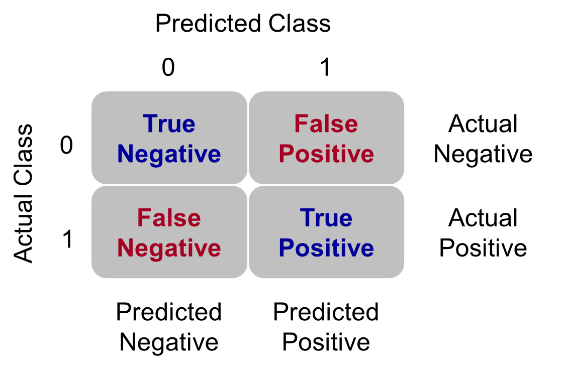{fig-align="center" width="5in"}Let's examine the different pieces of the classification table that people jointly focus on.## Sensitivity & SpecificitySensitivity is the proportion of times you were able to predict an event in the groups of actual events. Of the actual events, the proportion of the time you correctly predicted an event. This is also called the **true positive rate**. This is also just another name for recall.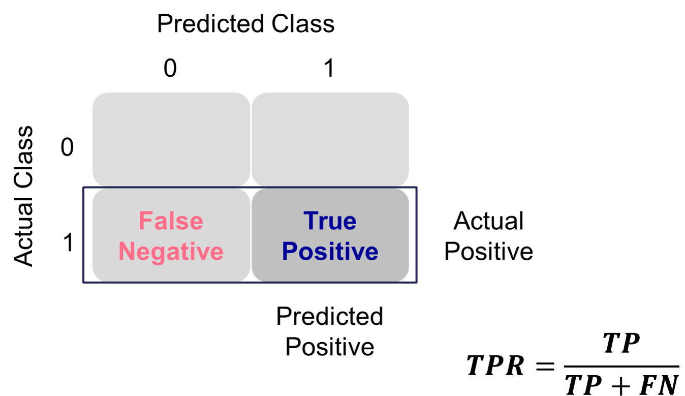{fig-align="center" width="6in"}This is balanced typically with the specificity. Specificity is the proportion of times you were able to predict a non-event in the group of actual non-events. Of the actual non-events, the proportion of the time you correctly predicted non-event. This is also called the **true negative rate**.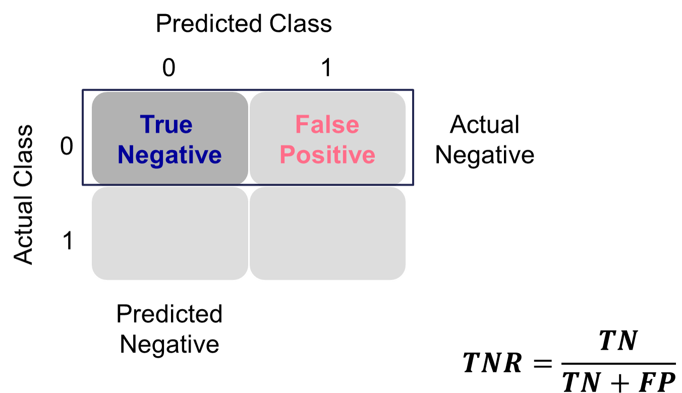{fig-align="center" width="6in"}These offset each other in a model. One could easily maximize one of these at the cost of the other. To get maximum sensitivity you can just predict every observations is an event, however this would drop your specificity to 0. The reverse is also true. Those who focus on sensitivity and specificity want balance in each. One measure for the optimal cut-off from a model is the **Youden's Index** (or Youden's J Statistic). This is easily calculated as $J = sensitivity + specificity - 1$. The optimal cut-off for determining predicted events and non-events would be at the point where this is maximized.Let's see how to do this in each software!::: {.panel-tabset .nav-pills}## PythonPython produces classification tables for any cut-off that you determine. Remember that a cut-off is simply the point where you decide to predict an event and non-event from your predicted probabilities. The `crosstab` function creates the classification table for us after using the `map` function to define our cut-off at 0.5.```{python}#| warning: false#| error: false#| message: falseimport pandas as pdtrain['pred'] = train['p_hat'].map(lambda x: 1if x >0.5else0)pd.crosstab(train['bonus'], train['pred'])```We want to look at all classification tables for all values of cut-offs between 0 and 1. We can easily loop through this calculation with a `for` loop in Python. However, the `roc_curve` function can do this for us. The inputs for this function are the target variable first, followed by the predicted probabilities. We are saving the output of this function into three objects `fpr` (the false positive rate or $1-specificity$), the `tpr` (the true positive rate), and the corresponding threshold to get those values. From there we combine these variables into a single dataframe. We then calculate the Youden Index as the difference between the TPR and FPR. From there we sort by this Youden Index value and print the observations.```{python}#| warning: false#| error: false#| message: falsefrom sklearn.metrics import roc_curve, aucfpr, tpr, thresholds = roc_curve(train['bonus'], train['p_hat'])data = {'TPR': tpr, 'FPR': fpr, 'Cut-off': thresholds, 'Youden': tpr-fpr}youden = pd.DataFrame(data)youden.sort_values(by = ['Youden'], ascending =False)```We can see that the highest Youden J statistic had a value of 0.8676. This took place at a cut-off of 0.318. Therefore, according to the Youden Index at least, the optimal cut-off for our model is 0.318. In other words, if our model predicts a probability above 0.318 then we should call this an event. Any predicted probability below 0.318 should be called a non-event.Another commonly used visual for the balance of sensitivity and specificity across all of the cut-offs is the Receiver Operator Characteristic curve. Commonly known as the ROC curve. The ROC curve plots the balance of sensitivity vs. specificity. The "best" ROC curve is the one that reaches to the upper left hand side of the plot as that would imply that our model has both high levels of sensitivity and specificity. The worst ROC curve is represented by the diagonal line in the plot since that would imply our model is as good as randomly assigning events and non-events to our observations. This leads some to calculate the area under the ROC curve (typically called AUC) as a metric summarizing the curve itself. The math won't be shown here, but the AUC is equal to the $c$-statistic in the Rank-order statistics section. Isn't math fun!?!?Python easily produces ROC curves using the `matplotlib.pyplot` function using the `fpr` and `tpr` objects we previously calculated in the code above. Using the `plt` function on this object gives the ROC curve. The `roc_auc_score` function provides us with the AUC value for the ROC curve.```{python}#| warning: false#| error: false#| message: falsefrom sklearn.metrics import roc_curve, roc_auc_scoreimport matplotlib.pyplot as pltauc = roc_auc_score(train['bonus'], train['p_hat'])plt.cla()plt.plot(fpr, tpr, label=f"AUC = {auc:.2f}")plt.plot([0, 1], [0, 1], linestyle="--", color="gray") # chance lineplt.xlabel("False Positive Rate")plt.ylabel("True Positive Rate")plt.title("ROC Curve")plt.legend()plt.grid(True)plt.show()```We can also see that the area under our ROC curve is 0.98. Similar to other metrics, we cannot say whether this is a "good" value of AUC, only if it is better or worse than another model's AUC.## RR produces classification tables for any cut-off that you determine. Remember that a cut-off is simply the point where you decide to predict an event and non-event from your predicted probabilities. The `table` function creates the classification table for us after using the `ifelse` function to define our cut-off at 0.5.```{r}#| warning: false#| error: false#| message: falselibrary(tidyverse)train <- train %>%mutate(pred =ifelse(p_hat >0.5, 1, 0))table(train$bonus, train$pred)```We want to look at all classification tables for all values of cut-offs between 0 and 1. We can easily loop through this calculation with a `for` loop in R. However, the `measureit` function can do this for us. The inputs for this function are the predicted probabilities first, followed by the target variable. The `measure` option allows you to define additional measures to calculate at each cut-off. In the code below we ask for accuracy (`ACC`), sensitivity (`SENS`), and specificity (`SPEC`). From there we combine these variables into a single dataframe and print the observations with the `head` function.```{r}#| warning: false#| error: false#| message: falselibrary(ROCit)logit_meas <-measureit(train$p_hat, train$bonus, measure =c("ACC", "SENS", "SPEC"))youden_table <-data.frame(Cutoff = logit_meas$Cutoff, Sens = logit_meas$SENS, Spec = logit_meas$SPEC)head(youden_table, n =10)```We could calculate the Youden Index by hand and then rank the new dataframe by this value, however, `rocit` function will gives this to us automatically in the next piece of code.Another commonly used visual for the balance of sensitivity and specificity across all of the cut-offs is the Receiver Operator Characteristic curve. Commonly known as the ROC curve. The ROC curve plots the balance of sensitivity vs. specificity. The "best" ROC curve is the one that reaches to the upper left hand side of the plot as that would imply that our model has both high levels of sensitivity and specificity. The worst ROC curve is represented by the diagonal line in the plot since that would imply our model is as good as randomly assigning events and non-events to our observations. This leads some to calculate the area under the ROC curve (typically called AUC) as a metric summarizing the curve itself. The math won't be shown here, but the AUC is equal to the $c$-statistic in the Rank-order statistics section. Isn't math fun!?!?R easily produces ROC curves from a variety of functions. A popular, new function is the `rocit` function. Using the `plot` function on the `rocit` object gives the ROC curve. By calling the `$optimal` element of the plot of the `rocit` object, it gives the value of the Youden's Index (`value` in the output) along with the respective cut-off that corresponds to that maximum Youden value. The `summary` function on the `rocit` object will report the AUC value. We can also get confidence intervals around our AUC values (`ciAUC` function) and ROC curves (`ciROC` function).```{r}#| warning: false#| error: false#| message: falselogit_roc <-rocit(train$p_hat, train$bonus)plot(logit_roc)plot(logit_roc)$optimalsummary(logit_roc)ciAUC(logit_roc, level =0.99)plot(ciROC(logit_roc))```We can see that the highest Youden J statistic had a value of 0.8676. This took place at a cut-off of 0.318. Therefore, according to the Youden Index at least, the optimal cut-off for our model is 0.318. In other words, if our model predicts a probability above 0.318 then we should call this an event. Any predicted probability below 0.318 should be called a non-event. We can also see that the area under our ROC curve is 0.98. Similar to other metrics, we cannot say whether this is a "good" value of AUC, only if it is better or worse than another model's AUC.Another common function is the `performance` function that produces many more plots than the ROC curve. Here the ROC curve is obtained by plotting the true positive rate by the false positive rate using the `measure = "tpr"` and `"x.measure = "fpr"` options. The AUC is also obtained from the `performance` function by calling the `measure = "auc"` option.```{r}#| warning: false#| error: false#| message: falselibrary(ROCR)pred <-prediction(train$p_hat, factor(train$bonus))perf <-performance(pred, measure ="sens", x.measure ="fpr")plot(perf, lwd =3, colorize =FALSE, colorkey =FALSE)abline(a =0, b =1, lty =3)performance(pred, measure ="auc")@y.values```:::## K-S StatisticOne of the most popular metrics for classification models in the finance and banking industry is the KS statistic. The two sample KS statistic can determine if there is a difference between two cumulative distribution functions. The two cumulative distribution functions of interest to us are the predicted probability distribution functions for the event and non-event target group. The KS $D$ statistic is the maximum distance between these two curves - calculated by the maximum difference between the true positive and false positive rates, $D = \max_{depth}{(TPR - FPR)} = \max_{depth}{(Sensitivity + Specificity - 1)}$. Notice, this is the same as maximizing the Youden Index.The optimal cut-off for determining predicted events and non-events would be at the point where this $D$ statistic (Youden Index) is maximized.Let's see how to do this in each software!::: {.panel-tabset .nav-pills}## PythonMathematically, the KS-statistic and the Youden's Index are the same. From the output above we can see that the maximum value of the Youden Index is 0.8676. This is the value of the KS $D$ statistic. The cut-off where this is maximized is the same as Youden at 0.318. The only thing we are doing in the code below is calculating the cumulative probability functions that the KS function is originally based off of as well as plotting the value of the Youden Index across the probability functions. The maximum distance between the probability functions is the place where Youden's Index is maximized.```{python}#| warning: false#| error: false#| message: falsefrom sklearn.metrics import roc_curveimport seaborn as snsfpr, tpr, thresholds = roc_curve(train['bonus'], train['p_hat'])# Create the Youden DataFrameyouden = pd.DataFrame({'Cut-off': thresholds,'TPR': tpr,'FPR': fpr,'Youden': tpr - fpr})# Sort by Cut-off and renameyouden = youden.sort_values(by='Cut-off', ascending=True)ks_stat = youden.rename(columns={'TPR': 'PR_T', 'FPR': 'PR_F'})ks_stat = ks_stat.melt(id_vars='Cut-off', var_name='PR', value_name='value')ks_val = (youden['TPR'] - youden['FPR']).max()ks_cutoff = youden.loc[(youden['TPR'] - youden['FPR']).idxmax(), 'Cut-off']# Plotplt.cla()sns.lineplot(x='Cut-off', y='value', hue='PR', data=ks_stat)plt.xlim(1, 0)plt.title("KS Plot (TPR vs. FPR)")plt.grid(True)plt.axvline(x=ks_cutoff, linestyle='--', color='red', label=f'KS = {ks_val:.2f}')plt.legend()plt.show()```As we saw in the previous section, the optimal cut-off according to the KS-statistic would be at 0.318. Therefore, according to the KS statistic at least, the optimal cut-off for our model is 0.318. In other words, if our model predicts a probability above 0.318 then we should call this an event. Any predicted probability below 0.318 should be called a non-event.## RUsing the same `rocit` object from the section on sensitivity and specificity (here called `logit_roc`) we can also calculate the KS statistic and plot the two cumulative distribution functions it represents. The `ksplot` function will plot the two cumulative distribution functions as well as highlight the cut-off (or threshold) where they are most separated. This point corresponds the $D$ statistic mentioned above as well as the Youden's Index. By calling the `KS stat` and `KS Cutoff` elements from this KS plot, we can get the optimal cut-off as well as the value at this cut-off.```{r}#| warning: false#| error: false#| message: falseksplot(logit_roc)ksplot(logit_roc)$`KS stat`ksplot(logit_roc)$`KS Cutoff````As we saw in the previous section, the optimal cut-off according to the KS-statistic would be at 0.318. Therefore, according to the KS statistic at least, the optimal cut-off for our model is 0.318. In other words, if our model predicts a probability above 0.318 then we should call this an event. Any predicted probability below 0.318 should be called a non-event. The KS $D$ statistic is reported as 0.8676 which is equal to the Youden's Index value.Another way to calculate this is by hand using the `performance` function we saw in the previous section as well. Using the `measure = "tpr"` and `x.measure = "fpr"` options, we can calculate the true positive rate and false positive rate across all our predictions. From there we can just use the `max` function to calculate the value of maximum difference between the two - the KS statistic. Finding the cut-off at this point is a little trickier with some of the needed R functions, but we essentially search the for alpha values (here the cut-offs) for the point where the KS statistic is maximized.```{r}#| warning: false#| error: false#| message: falseperf <-performance(pred, measure ="tpr", x.measure ="fpr")KS <-max(perf@y.values[[1]] - perf@x.values[[1]])cutoffAtKS <-unlist(perf@alpha.values)[which.max(perf@y.values[[1]] - perf@x.values[[1]])]print(c(KS, cutoffAtKS))plot(x =unlist(perf@alpha.values), y = (1-unlist(perf@y.values)),type ="l", main ="K-S Plot (EDF)",xlab ='Cut-off',ylab ="Proportion",col ="red")lines(x =unlist(perf@alpha.values), y = (1-unlist(perf@x.values)), col ="blue")```From the output we can see the KS $D$ statistic at 0.8676. The predicted probability that this occurs at (the optimal cut-off) is defined at 0.318 as we previously saw.:::## Precision & RecallPrecision and recall are another way to view a classification table from a model. Recall is the proportion of times you were able to predict an event in the groups of actual events. Of the actual events, the proportion of the time you correctly predicted an event. This is also called the **true positive rate**. This is also just another name for sensitivity.{fig-align="center" width="6in"}This is balanced here with the precision. Precision is the proportion predicted events that were actually events. Of the predicted events, the proportion of the time they actually were events. This is also called the **positive predictive value**. Precision is growing in popularity as a balance to recall/sensitivity as compared to specificity.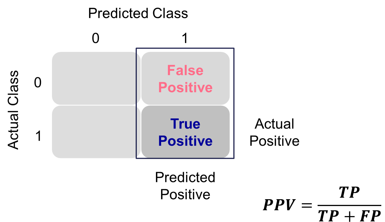{fig-align="center" width="6in"}These offset each other in a model. One could easily maximize one of these at the cost of the other. To get maximum recall you can just predict all events, however this would drop your precision. Those who focus on precision and recall want balance in each. One measure for the optimal cut-off from a model is the **F1 Score**. This is calculated as the following:$$ F_1 = 2\times \frac{precision \times recall}{precision + recall} $$The optimal cut-off for determining predicted events and non-events would be at the point where this is maximized.Let's see how to do this in each software!::: {.panel-tabset .nav-pills}## PythonPython produces classification tables for any cut-off that you determine. Remember that a cut-off is simply the point where you decide to predict an event and non-event from your predicted probabilities.We want to look at all classification tables for all values of cut-offs between 0 and 1. We can easily loop through this calculation with a `for` loop in Python using the `precision_score`, `recall_score`, and `f1_score` functions. The inputs for each function are the target variable first, followed by the predicted probabilities. We loop through many cut-off values to find the optimal F1-score.```{python}#| warning: false#| error: false#| message: falsefrom sklearn.metrics import precision_score, recall_score, f1_scoreimport numpy as npprecision = np.array([])recall = np.array([])f1score = np.array([])for y inrange(100): train['pred'] = train['p_hat'].map(lambda x: 1if x > y/100else0) value_p = precision_score(train['bonus'], train['pred']) precision = np.append(precision, value_p) value_r = recall_score(train['bonus'], train['pred']) recall = np.append(recall, value_r) value_f = f1_score(train['bonus'], train['pred']) f1score = np.append(f1score, value_f)data = {'Precision': precision, 'Recall': recall, 'Cut-off': range(100), 'F1': f1score}f1_s = pd.DataFrame(data)f1_s.sort_values(by = ['F1'], ascending =False)```We can see that the highest F1 score had a value of 0.921. This took place at a cut-off of 0.32. Therefore, according to the F1 score at least, the optimal cut-off for our model is 0.32. In other words, if our model predicts a probability above 0.32 then we should call this an event. Any predicted probability below 0.32 should be called a non-event. This matches up closely with the Youden's Index from above. This is **not** always the case. We just got lucky in this example.Another common calculation using the precision of a model is the model's **lift**. The lift of a model is simply calculated as the ratio of precision to the population proportion of the event - $Lift = PPV/\pi_1$. The interpretation of lift is really nice for explanation. Let's imagine that your lift was 3 and your population proportion of events was 0.2. This means that in the top 20% of your customers, your model predicted 3 times the events as compared to you selecting people at random. Sometimes people plot lift charts where they plot the precision at all the different values of the population proportion (called depth).Python doesn't have an easy, built-in function for plotting lift, but this isn't a hard thing to calculate ourselves. The created function below will plot both the lift and gain plots for our data.```{python}#| warning: false#| error: false#| message: falseimport numpy as npimport pandas as pdimport matplotlib.pyplot as pltdef plot_lift_and_gains(y_true, y_proba, n_bins=10):""" Plot Lift and Cumulative Gains curves. Parameters: - y_true: array-like, true binary labels (0/1) - y_proba: array-like, predicted probabilities for the positive class - n_bins: number of bins/deciles to split data Returns: - None (plots the curves) """ df = pd.DataFrame({'y_true': y_true,'y_proba': y_proba })# Sort descending by predicted probability df = df.sort_values(by='y_proba', ascending=False).reset_index(drop=True)# Add cumulative counts df['cum_total'] = np.arange(1, len(df) +1) df['cum_positives'] = df['y_true'].cumsum() total_positives = df['y_true'].sum() total_samples =len(df)# Cumulative Gains: % positives captured vs % samples df['cum_gains'] = df['cum_positives'] / total_positives# Lift: (cumulative gains) / (cumulative % of sample) df['cum_lift'] = df['cum_gains'] / (df['cum_total'] / total_samples)# Sample points for plotting (deciles) cutoffs = np.linspace(0, total_samples, n_bins +1, dtype=int) cutoffs = cutoffs[cutoffs >0] # remove zero plot_points = df.loc[cutoffs -1, ['cum_total', 'cum_gains', 'cum_lift']].copy() plot_points['percent_samples'] = plot_points['cum_total'] / total_samples *100# Plot fig, axes = plt.subplots(1, 2, figsize=(14, 6))# Plot Cumulative Gains axes[0].plot(plot_points['percent_samples'], plot_points['cum_gains'], marker='o', color='blue', label='Cumulative Gains') axes[0].plot([0, 100], [0, 1], linestyle='--', color='blue', alpha=0.5, label='Random Gains') axes[0].set_xlabel('Percent of Sample') axes[0].set_ylabel('Cumulative Gains') axes[0].set_title('Cumulative Gains Curve') axes[0].set_ylim(0, 1.05) axes[0].grid(True) axes[0].legend()# Plot Lift axes[1].plot(plot_points['percent_samples'], plot_points['cum_lift'], marker='o', color='red', label='Lift') axes[1].axhline(1, linestyle='--', color='red', alpha=0.5, label='Random Lift') axes[1].set_xlabel('Percent of Sample') axes[1].set_ylabel('Cumulative Lift') axes[1].set_title('Cumulative Lift Curve') axes[1].set_ylim(0, plot_points['cum_lift'].max() *1.1) axes[1].grid(True) axes[1].legend() plt.tight_layout() plt.show()# Example:plot_lift_and_gains(train['bonus'], train['p_hat'])```The right-hand, cumulative lift chart displays how good you are up to that point in the data. Based on our output above, the top 10% of our predictions produce bonus eligible homes around 2.5 times the amount we would have gotten by random selection. The left-hand plot is the cumulative capture rate plot (also called cumulative gains). This tells us how much of the target 1's you captured with your model. The diagonal line would be random, so the further above the line the better the model. For the first 10% of our predictions, we were able to capture a little over 20% of all bonus eligible homes. In fact, we have captured nearly all of the bonus eligible homes in the top 60% of our predictions.## RR produces classification tables for any cut-off that you determine. Remember that a cut-off is simply the point where you decide to predict an event and non-event from your predicted probabilities.We want to look at all classification tables for all values of cut-offs between 0 and 1. We can easily loop through this calculation with a `for` loop in R. However, the `measureit` function can do this for us. The inputs for this function are the predicted probabilities first, followed by the target variable. The `measure` option allows you to define additional measures to calculate at each cut-off. In the code below we ask for precision (`PREC`), sensitivity (`SENS`), and F1-score (`FSCR`). From there we combine these variables into a single dataframe and print the observations with the `print` function.```{r}#| warning: false#| error: false#| message: falselogit_meas <-measureit(train$p_hat, train$bonus, measure =c("PREC", "REC", "FSCR"))summary(logit_meas)fscore_table <-data.frame(Cutoff = logit_meas$Cutoff, FScore = logit_meas$FSCR)head(arrange(fscore_table, desc(FScore)), n =10)```We can see that the highest F1 score had a value of 0.9215. This took place at a cut-off of 0.318. Therefore, according to the F1 score at least, the optimal cut-off for our model is 0.3158. In other words, if our model predicts a probability above 0.318 then we should call this an event. Any predicted probability below 0.318 should be called a non-event. This matches up with the Youden's Index from above. This is **not** always the case. We just got lucky in this example.Another common calculation using the precision of a model is the model's **lift**. The lift of a model is simply calculated as the ratio of Precision to the population proportion of the event - $Lift = PPV/\pi_1$. The interpretation of lift is really nice for explanation. Let's imagine that your lift was 3 and your population proportion of events was 0.2. This means that in the top 20% of your customers, your model predicted 3 times the events as compared to you selecting people at random. Sometimes people plot lift charts where they plot the precision at all the different values of the population proportion (called depth).Again, we can use the `rocit` object (called `logit_roc`) from earlier. The `gainstable` function breaks the data down into 10 groups (or buckets) ranked from highest predicted probability to lowest. We can use the `plot` function on this new object along with the `type` option to get a variety of useful plots. If you want more than 10 buckets for your data you can always use the `ngroup` option to specify how many you want.```{r}#| warning: false#| error: false#| message: falselogit_lift <-gainstable(logit_roc)print(logit_lift)plot(logit_lift, type =1)plot(logit_lift, type =2)plot(logit_lift, type =3)logit_lift <-gainstable(logit_roc, ngroup =15)print(logit_lift)```Let's examine the output above. In the first table with the data split into 10 buckets, let's examine the first row. Here we have 110 observations (1/10 of our data, or a depth of 0.1). Remember, these observations have been ranked by predicted probability so these observations have the highest probability of being a 1 according to our model. In these 110 observations, 109 of them had the response (target value of 1) which is a response rate of 0.991. Our original data had a total response rate (proportion of 1's) of only 0.431. This means that we did 2.299 (=0.991 / 0.431) times better than random with our top 10% of customers. Another way to think about this would be that if we were to randomly pick 10% of our data, we would have only expected to see 47 responses (target values of 1). Our **best** 10% had 109 responses. Again, this ratio is a value of 2.299. The table continues this calculation for each of the buckets of 10% of our data.The lift chart displays how good that bucket is alone, while the cumulative lift chart (more popular one) displays how good you are up to that point. The cumulative lift and lift charts are the first plot displayed. The second plot is the response rate and cumulative response rate plot. Each point divided by the horizontal line at 0.431 (population response rate) gives the lift value in the first chart. The last chart is the cumulative capture rate plot. This tells us how much of the target 1's you captured with your model. The diagonal line would be random, so the further above the line the better the model.Another way to calculate this is the `performance` function in R. This can easily calculate and plot the lift chart for us using the `measure = "lift"` and `x.measure = "rpp"` options. This plots the lift vs. the rate of positive predictions.```{r}#| warning: false#| error: false#| message: falseperf <-performance(pred, measure ="lift", x.measure ="rpp")plot(perf, lwd =3, colorize =TRUE, colorkey =TRUE,colorize.palette =rev(gray.colors(256)),main ="Lift Chart for Training Data")abline(h =1, lty =3)```A common place to evaluate lift is at the population proportion. In our example above, the population proportion is approximately 0.431. At that point, we have a lift of approximately 2. In other words, if we were to pick the top 43.1% of homes identified by our model, we would be 2 times as likely to find a bonus eligible home as compared to randomly selecting from the population. This shows the value in our model in an interpretable way.:::## Accuracy & ErrorAccuracy and error rate are typically thought of when it comes to measuring the ability of a logistic regression model. Accuracy is essentially what percentage of events and non-events were predicted correctly.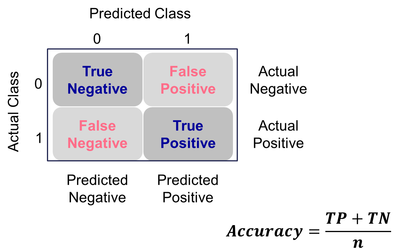{fig-align="center" width="6in"}The error would be the opposite of this.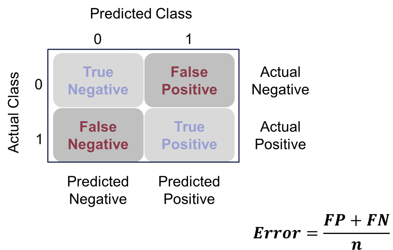{fig-align="center" width="6in"}However, caution should be used with these metrics as they can easily be fooled if *only* focusing on them. If your data has 10% events and 90% non-events, you can easily have a 90% accurate model by guessing non-events for every observation. Instead, having less accuracy might be better if we can predict both events and non-events. These numbers are still great to report! They are just not the best to decide which model is best.Let's see how to do this in each software!::: {.panel-tabset .nav-pills}## PythonPython produces classification tables for any cut-off that you determine. Remember that a cut-off is simply the point where you decide to predict an event and non-event from your predicted probabilities.We want to look at all classification tables for all values of cut-offs between 0 and 1. We can easily loop through this calculation with a `for` loop in Python using the `accuracy_score` function. The input for the function are the target variable first, followed by the predicted probabilities. We loop through many cut-off values to find the optimal accuracy.```{python}#| warning: false#| error: false#| message: falsefrom sklearn.metrics import accuracy_scoreaccuracy = np.array([])for y inrange(100): train['pred'] = train['p_hat'].map(lambda x: 1if x > y/100else0) value_a = accuracy_score(train['bonus'], train['pred']) accuracy = np.append(accuracy, value_a)data = {'Accuracy': accuracy, 'Cut-off': range(100)}acc_s = pd.DataFrame(data)acc_s.sort_values(by = ['Accuracy'], ascending =False)```From the output we can see the accuracy is maximized at 92.97%. The predicted probability that this occurs at (the optimal cut-off) is defined as 0.41. In other words, if our model predicts a probability above 0.41 then we should call this an event. Any predicted probability below 0.41 should be called a non-event, according to the accuracy metric.There is more to model building than simply maximizing overall classification accuracy. These are good numbers to report, but not necessarily to choose models on.## RR produces classification tables for any cut-off that you determine. Remember that a cut-off is simply the point where you decide to predict an event and non-event from your predicted probabilities.We want to look at all classification tables for all values of cut-offs between 0 and 1. We can easily loop through this calculation with a `for` loop in R. However, the `measureit` function can do this for us. The inputs for this function are the predicted probabilities first, followed by the target variable. The `measure` option allows you to define additional measures to calculate at each cut-off. In the code below we ask for accuracy (`ACC`) and F1-score (`FSCR`). From there we combine these variables into a single dataframe and print the observations with the `print` function.```{r}#| warning: false#| error: false#| message: falselogit_meas <-measureit(train$p_hat, train$bonus, measure =c("ACC", "FSCR"))summary(logit_meas)acc_table <-data.frame(Cutoff = logit_meas$Cutoff, Acc = logit_meas$ACC)head(arrange(acc_table, desc(Acc)), n =10)```From the output we can see the accuracy is maximized at 92.97%. The predicted probability that this occurs at (the optimal cut-off) is defined as 0.456. In other words, if our model predicts a probability above 0.456 then we should call this an event. Any predicted probability below 0.456 should be called a non-event, according to the accuracy metric.There is more to model building than simply maximizing overall classification accuracy. These are good numbers to report, but not necessarily to choose models on.:::# Optimal Cut-offClassification is a decision that is extraneous to statistical modeling. Although logistic regressions tend to work well in classification, it is a probability model and does not output events and non-events.Classification assumes cost for each observation is the same, which is rarely true. It is always better to consider the costs of false positives and false negatives when considering cut-offs in classification. The previous sections talk about many ways to determine "optimal" cut-offs when costs are either not known or not necessary. However, if costs are known, they should drive the cut-off decision rather than modeling metrics that do not account for cost.