First, we need to first explore our data before building any models to try and explain/predict our categorical target variable. With categorical variables, we can look at the distribution of the categories as well as see if this distribution has any association with other variables. For this analysis we are going to continue to use the Ames housing dataset. However, we need to come up with a binary target variable for this kind of modeling.
Imagine you worked for a real estate agency and got a bonus check if you sold a house above $175,000 in value. Let’s create this variable in our data:
To keep the results the same between software we have loaded the Python train and test datasets in R and created the same X data frame and y vector for our predictors and target respectively.
Remember that we have already split our data into training and testing pieces from the previous sections. Because models are prone to discovering small, spurious patterns on the data that is used to create them (the training data), we set aside the validation and/or testing data to get a clear view of how they might perform on new data that the models have never seen before.
You are interested in what variables might be associated with obtaining a higher chance of getting a bonus (selling a house above $175,000). An association exists between two categorical variables if the distribution of one variable changes when the value of the other categorical variable changes. If there is no association, the distribution of the first variable is the same regardless of the value of the other variable. For example, if we wanted to know if obtaining a bonus on selling a house in Ames, Iowa was associated with whether the house had central air we could look at the distribution of bonus eligible houses. If we observe that 41% of homes with central air are bonus eligible and 41% of homes without central air are bonus eligible, then it appears that central air has no bearing on whether the home is bonus eligible. However, if instead we observe that only 3% of homes without central air are bonus eligible, but 44% of home with central air are bonus eligible, then it appears that having central air might be related to a home being bonus eligible.
To understand the distribution of categorical variables we need to look at frequency tables. A frequency table shows the number of observations that occur in certain categories or intervals. A one-way frequency table examines all the categories of one variable. These are easily visualized with bar charts.
Let’s look at the distribution of both bonus eligibility and central air using the value_counts attribute of the train dataset. The countplot function allows us to view our data in a bar chart.
Code
from matplotlib import pyplot as pltimport seaborn as snstrain['bonus'].value_counts()
bonus
0    623
1    472
Name: count, dtype: int64
Code
ax = sns.countplot(x ="bonus", data = train, color ="blue")ax.set(xlabel ='Bonus Eligible', ylabel ='Frequency', title ='Bar Graph of Bonus Eligibility')plt.show()
Code
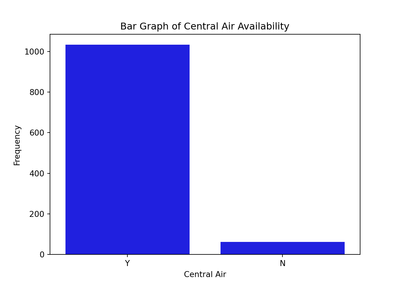
train['CentralAir'].value_counts()
CentralAir
Y    1033
N      62
Name: count, dtype: int64
Code
plt.cla()ax = sns.countplot(x ="CentralAir", data = train, color ="blue")ax.set(xlabel ='Central Air', ylabel ='Frequency', title ='Bar Graph of Central Air Availability')plt.show()
Frequency tables show single variables, but if we want to explore two variables together we look at cross-tabulation tables. A cross-tabulation table shows the number of observations for each combination of the row and column variables.
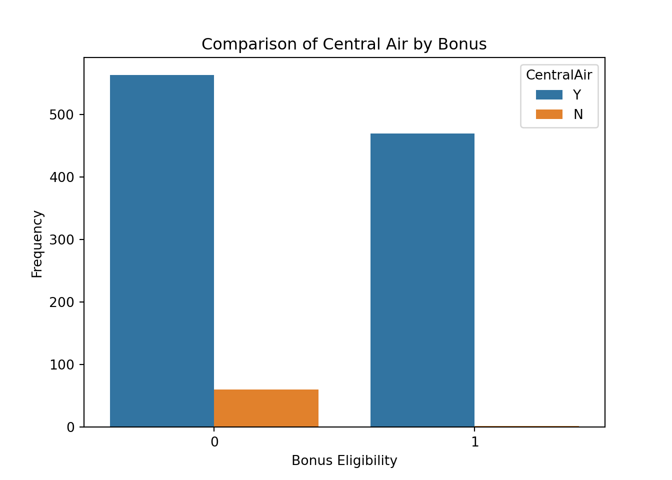
Let’s again examine bonus eligibility, but this time across levels of central air. Here, we can use the crosstab function from pandas.
Code
import pandas as pdpd.crosstab(index = train['CentralAir'], columns = train['bonus'])
bonus         0    1
CentralAir
N            60    2
Y           563  470
Code
plt.cla()ax = sns.countplot(x ="bonus", data = train, hue ="CentralAir")ax.set(xlabel ='Bonus Eligibility', ylabel ='Frequency', title ='Comparison of Central Air by Bonus')plt.show()
From the above output we can see that 62 homes have no central air with only 2 of them being bonus eligible. However, there are 1033 homes that have central air with 470 of them being bonus eligible.
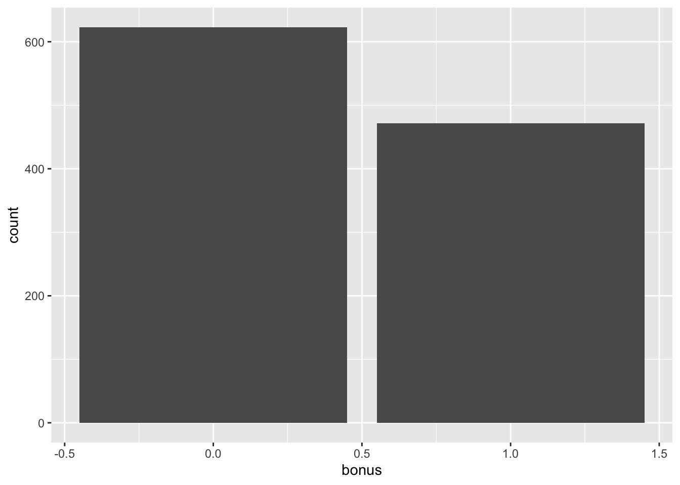
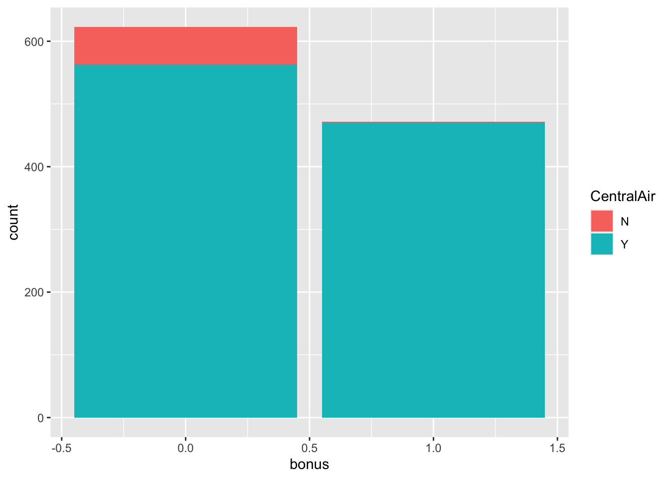
Let’s look at the distribution of both bonus eligibility and central air using the table function. The ggplot function with the geom_bar function allows us to view our data in a bar chart.
Frequency tables show single variables, but if we want to explore two variables together we look at cross-tabulation tables. A cross-tabulation table shows the number of observations for each combination of the row and column variables.
Let’s again examine bonus eligibility, but this time across levels of central air. Again, we can use the table function. The prop.table function allows us to compare two variables in terms of proportions instead of frequencies.
Code
table(train$CentralAir, train$bonus)
      0   1
  N  60   2
  Y 563 470
Code
prop.table(table(train$CentralAir, train$bonus))
              0           1
  N 0.054794521 0.001826484
  Y 0.514155251 0.429223744
Code
ggplot(data = train) +geom_bar(mapping =aes(x = bonus, fill = CentralAir))
From the above output we can see that 62 homes have no central air with only 2 of them being bonus eligible. However, there are 1033 homes that have central air with 470 of them being bonus eligible. For an even more detailed breakdown we can use the CrossTable function.
   Cell Contents
|-------------------------|
|                       N |
|              Expected N |
|           N / Row Total |
|           N / Col Total |
|         N / Table Total |
|-------------------------|


Total Observations in Table:  1095


                 | train$bonus
train$CentralAir |         0 |         1 | Row Total |
-----------------|-----------|-----------|-----------|
               N |        60 |         2 |        62 |
                 |    35.275 |    26.725 |           |
                 |     0.968 |     0.032 |     0.057 |
                 |     0.096 |     0.004 |           |
                 |     0.055 |     0.002 |           |
-----------------|-----------|-----------|-----------|
               Y |       563 |       470 |      1033 |
                 |   587.725 |   445.275 |           |
                 |     0.545 |     0.455 |     0.943 |
                 |     0.904 |     0.996 |           |
                 |     0.514 |     0.429 |           |
-----------------|-----------|-----------|-----------|
    Column Total |       623 |       472 |      1095 |
                 |     0.569 |     0.431 |           |
-----------------|-----------|-----------|-----------|


Statistics for All Table Factors


Pearson's Chi-squared test
------------------------------------------------------------
Chi^2 =  42.61838     d.f. =  1     p =  6.653136e-11

Pearson's Chi-squared test with Yates' continuity correction
------------------------------------------------------------
Chi^2 =  40.91212     d.f. =  1     p =  1.592307e-10
The advantage of the CrossTable function is that we can easily get not only the frequencies, but the cell, row, and column proportions. For example, the third number in each cell gives us the row proportion. For homes without central air, 96.8% of them are not bonus eligible, while 3.2% of them are. For homes with central air, 54.5% of the homes are not bonus eligible, while 45.5% of them are. This would appear that the distribution of bonus eligible homes changes across levels of central air - a relationship between the two variables. This expected relationship needs to be tested statistically for verification. The expected = TRUE option provides an expected cell count for each cell. These expected counts help calculate the tests of association in the next section.
Tests of Association
We have statistical tests to evaluate relationships between two categorical variables. The null hypothesis for these statistical tests is that the two variables have no association - the distribution of one variable does not change across levels of another variable. The alternative hypothesis is an association between the two variables - the distribution of one variable changes across levels of another variable.
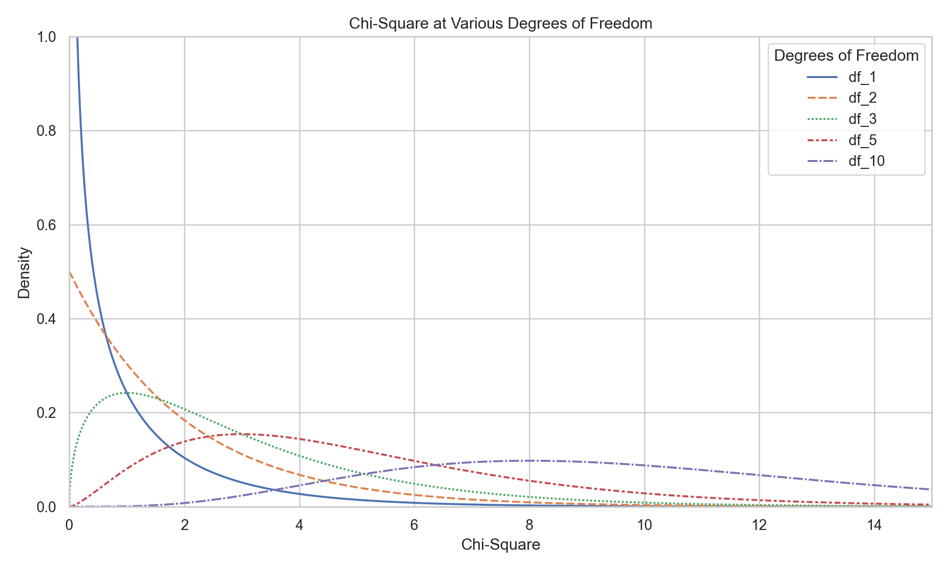
These statistical tests follow a \(\chi^2\)-distribution. The \(\chi^2\)-distribution is a distribution that has the following characteristics:
Bounded below by 0
Right skewed
One set of degrees of freedom
A plot of a variety of \(\chi^2\)-distributions is shown here:
Two common \(\chi^2\) tests are the Pearson and Likelihood Ratio \(\chi^2\) tests. They compare the observed count of observations in each cell of a cross-tabulation table to their expected count if there was no relationship. The expected cell count applies the overall distribution of one variable across all the levels of the other variable. For example, overall 57% of all homes are not bonus eligible. If that were to apply to every level of central air, then the 62 homes without central air would be expected to have 35.3 ( $ = 62 $ ) of them would be bonus eligible while 26.7 ( $ = 62 $ ) of them would not be bonus eligible. We actually observe 60 and 2 homes for each of these categories respectively. The further the observed data is from the expected data, the more evidence we have that there is a relationship between the two variables.
The test statistic for the Pearson \(\chi^2\) test is the following:
From the equation above, the closer that the observed count of each cross-tabulation table cell (across all rows and columns) to the expected count, the smaller the test statistic. As with all hypothesis tests, the smaller the test statistic, the larger the p-value, implying less evidence for the alternative hypothesis.
Another common test is the Likelihood Ratio test. The test statistic for this is the following:
The p-value comes from a \(\chi^2\)-distribution with degrees of freedom that equal the product of the number of rows minus one and the number of columns minus one. Both of the above tests have a sample size requirement. The sample size requirement is 80% or more of the cells in the cross-tabulation table need expected counts larger than 5.
For smaller sample sizes, this might be hard to meet. In those situations, we can use a more computationally expensive test called Fisher’s exact test. This test calculates every possible permutation of the data being evaluated to calculate the p-value without any distributional assumptions.
Both the Pearson and Likelihood Ratio \(\chi^2\) tests can handle any type of categorical variable (either ordinal, nominal, or both). However, ordinal variables provide us extra information since the order of the categories actually matters compared to nominal categories. We can test for even more with ordinal variables against other ordinal variables. We can test whether two ordinal variables have a linear association as compared to just a general one. An ordinal test for association is the Mantel-Haenszel \(\chi^2\) test. The test statistic for the Mantel-Haenszel \(\chi^2\) test is the following:
\[
\chi^2_{MH} = (n-1)r^2
\] where \(r^2\) is the Pearson correlation between the column and row variables. This test follows a \(\chi^2\)-distribution with only one degree of freedom.
Let’s see how to do each of these tests in each software!
Let’s examine the relationship between central air and bonus eligibility with the Pearson and Likelihood Ratio tests using the chi2_contingency function on our crosstab object comparing our two variables.
The above results shows an extremely small p-value that is below any reasonable significance level. This implies that we have statistical evidence for a relationship between having central air and bonus eligibility of homes. The p-value comes from a \(\chi^2\)-distribution with degrees of freedom that equal the product of the number of rows minus one and the number of columns minus one.
Since both the central air and bonus eligibility variables are binary, they are ordinal. Since they are both ordinal, we should use the Mantel-Haenszel \(\chi^2\) test. However, at the time of writing this, Python does not have a built in function for this. Since the previous test can handle ordinal vs ordinal we will just use that.
Although not applicable in this dataset, if we had a small sample size we could use the Fisher’s exact test. To perform this test we can use the fisher_exact function.
Code
from scipy.stats import fisher_exactfisher_exact(pd.crosstab(index = train['CentralAir'], columns = train['bonus']))
We see the same results as with the other tests because the assumptions were met for sample size.
Let’s examine the relationship between central air and bonus eligibility with the Pearson and Likelihood Ratio tests using the assocstats function on our table object comparing CentralAir to bonus.
The above results shows an extremely small p-value that is below any reasonable significance level. This implies that we have statistical evidence for a relationship between having central air and bonus eligibility of homes. The p-value comes from a \(\chi^2\)-distribution with degrees of freedom that equal the product of the number of rows minus one and the number of columns minus one.
Since both the central air and bonus eligibility variables are binary, they are ordinal. Since they are both ordinal, we should use the Mantel-Haenszel \(\chi^2\) test with the CMHtest function. In the main output table, the first row is the Mantel-Haenszel \(\chi^2\) test.
From here we can see another extremely small p-value as we saw in the earlier, more general \(\chi^2\) tests.
Although not applicable in this dataset, if we had a small sample size we could use the Fisher’s exact test. To perform this test we can use the fisher.test function.
Code
fisher.test(table(train$CentralAir, train$bonus))
    Fisher's Exact Test for Count Data

data:  table(train$CentralAir, train$bonus)
p-value = 4.062e-13
alternative hypothesis: true odds ratio is not equal to 1
95 percent confidence interval:
   6.564357 211.498059
sample estimates:
odds ratio
   25.0044
We see the same results as with the other tests because the assumptions were met for sample size.
Looking at statistical tests one at a time can be time consuming. Similar to linear regression, we might need to evaluate large numbers of predictor variables against the target variable:
Since there are different tests to run for different types of predictor variables, the first thing we need to do is split our predictor variables into two dataframes - one for each. Since our data is already dummy coded as binary variables for all categorical variables, we simply just count which ones have only 2 unique values and which have more. To do this we use the SelectKBest function from the sklearn.feature_selection package. We also need the chi2 and f_classif functions to get the proper tests for each type of variable.
Code
from sklearn.feature_selection import SelectKBest, chi2, f_classif# Separate categorical (dummy) vs. continuous featurescategorical_features = [col for col in X.columns if X[col].nunique() ==2]continuous_features = [col for col in X.columns if X[col].nunique() >2]X_cat = X[categorical_features]X_cont = X[continuous_features]
Let’s compare our categorical variables to the categorical target variable first. We use the SelectKBest function with the score_func = chi2 option to use the Pearson \(\chi^2\) test. The k = 'all' option keeps all of the predictor variables in the output for us to decide which are significant and which are not. Next, we input the target variable y and the categorical predictor variables X_cat into the fit function. From there we just use the columns, scores_, and pvalues_ functions to extract the needed results from the SelectKBest object. We use sort_values to rank by the \(\chi^2\) test statistic and then print the output.
Code
# Fit SelectKBest for Categorical Variablesselector = SelectKBest(score_func = chi2, k ='all')selector.fit(X_cat, y)
SelectKBest(k='all', score_func=<function chi2 at 0x31e96a7a0>)
In a Jupyter environment, please rerun this cell to show the HTML representation or trust the notebook. On GitHub, the HTML representation is unable to render, please try loading this page with nbviewer.org.
Parameters
score_func
<function chi2 at 0x31e96a7a0>
k
'all'
Code
# Create a DataFrame with feature names, Chi2-scores, and p-valuesscores_cat_df = pd.DataFrame({'Feature': X_cat.columns,'Chi2_score': selector.scores_,'p_value': selector.pvalues_})# Sort by Chi2-score descendingscores_cat_df = scores_cat_df.sort_values(by ='Chi2_score', ascending =False)with pd.option_context('display.max_rows', None):print(scores_cat_df)
Let’s compare our continuous variables to the categorical target variable next. We use the SelectKBest function with the score_func = f_classif option to use the ANOVA F test. The k = 'all' option keeps all of the predictor variables in the output for us to decide which are significant and which are not. Next, we input the target variable y and the continuous predictor variables X_cont into the fit function. From there we just use the columns, scores_, and pvalues_ functions to extract the needed results from the SelectKBest object. We use sort_values to rank by the F test statistic and then print the output.
Code
# Fit SelectKBest for Continuous Variablesselector = SelectKBest(score_func = f_classif, k ='all')selector.fit(X_cont, y)
SelectKBest(k='all')
In a Jupyter environment, please rerun this cell to show the HTML representation or trust the notebook. On GitHub, the HTML representation is unable to render, please try loading this page with nbviewer.org.
Parameters
score_func
<function f_c...t 0x31e96a5c0>
k
'all'
Code
# Create a DataFrame with feature names, F-scores, and p-valuesscores_cont_df = pd.DataFrame({'Feature': X_cont.columns,'F_score': selector.scores_,'p_value': selector.pvalues_})# Sort by F-score descendingscores_cont_df = scores_cont_df.sort_values(by ='F_score', ascending =False)with pd.option_context('display.max_rows', None):print(scores_cont_df)
That is a much quicker and easier way to get a large number of hypothesis tests comparing both the categorical and continuous predictors variables to our target variable.
Since there are different tests to run for different types of predictor variables, the first thing we need to do is split our predictor variables into two dataframes - one for each. Since our data is already dummy coded as binary variables for all categorical variables, we simply just count which ones have only 2 unique values and which have more. To do this we use the map_lgl and n_distinct functions from the purrr and dplyr packages respectively.
Let’s compare our categorical variables to the categorical target variable first. We use the map_dfr function along with the chisq.test function to use the Pearson \(\chi^2\) test on a table of our predictor variable and target variable. From there we just extract the variable names, test statistic, and p-values from the necessary objects. These results might be different than Python because the chisq.test function uses the Yates’ continuity correction on the results. We use arrange to rank by the \(\chi^2\) test statistic and then print the output.
Code
chi2_results <-map_dfr(categorical_features, function(var) {# Treat each feature as a 0/1 vector x <- df[[var]] y <- df$target tbl <-table(x, y) test <-chisq.test(tbl)tibble(Feature = var,Chi2_score =unname(test$statistic),p_value = test$p.value )})chi2_results <- chi2_results %>%arrange(desc(Chi2_score))print(chi2_results, n =Inf)
Let’s compare our continuous variables to the categorical target variable next. We use the map_dfr function with the lm function to use the ANOVA F test. We sue the paste function to craete the needed formula’s relating each predictor variable to the target. From there we just extract the needed results from the respective objects. We use arrange to rank by the F test statistic and then print the output.
Code
f_results <-map_dfr(continuous_features, function(var) { formula <-as.formula(paste(var, "~ target")) model <-lm(formula, data = df) tidy_anova <-tidy(summary(model))tibble(Feature = var,F_score =summary(model)$fstatistic[1],p_value =pf(summary(model)$fstatistic[1],summary(model)$fstatistic[2],summary(model)$fstatistic[3],lower.tail =FALSE) )})f_results <- f_results %>%arrange(desc(F_score))print(f_results, n =Inf)
That is a much quicker and easier way to get a large number of hypothesis tests comparing both the categorical and continuous predictors variables to our target variable.
Measures of Association
Tests of association are best designed for just that, testing the existence of an association between two categorical variables. However, hypothesis tests are impacted by sample size. When we have the same sample size, tests of association can rank significance of variables with p-values. However, when sample sizes are not the same (or degrees of freedom are not the same) between two tests, the tests of association are not best for comparing the strength of an association. In those scenarios, we have measures of strength of association that can be compared across any sample size.
Measures of association were not designed to test if an association exists, as that is what statistical testing is for. They are designed to measure the strength of association. There are dozens of these measures. Three of the most common are the following: - Odds Ratios (only for comparing two binary variables) - Cramer’s V (able to compare nominal variables with any number of categories) - Spearman’s Correlation (able to compare ordinal variables with any number of categories).
An odds ratio indicates how much more likely, with respect to odds, a certain event occurs in one group relative to its occurrence in another group. The odds of an event occurring is not the same as the probability that an event occurs. The odds of an event occurring is the probability the event occurs divided by the probability that event does not occur.
\[
Odds = \frac{p}{1-p}
\]
Let’s again examine the cross-tabulation table between central air and bonus eligibility.
   Cell Contents
|-------------------------|
|                       N |
| Chi-square contribution |
|           N / Row Total |
|           N / Col Total |
|         N / Table Total |
|-------------------------|


Total Observations in Table:  1095


                 | train$bonus
train$CentralAir |         0 |         1 | Row Total |
-----------------|-----------|-----------|-----------|
               N |        60 |         2 |        62 |
                 |    17.330 |    22.875 |           |
                 |     0.968 |     0.032 |     0.057 |
                 |     0.096 |     0.004 |           |
                 |     0.055 |     0.002 |           |
-----------------|-----------|-----------|-----------|
               Y |       563 |       470 |      1033 |
                 |     1.040 |     1.373 |           |
                 |     0.545 |     0.455 |     0.943 |
                 |     0.904 |     0.996 |           |
                 |     0.514 |     0.429 |           |
-----------------|-----------|-----------|-----------|
    Column Total |       623 |       472 |      1095 |
                 |     0.569 |     0.431 |           |
-----------------|-----------|-----------|-----------|
Let’s look at the row without central air. The probability that a home without central air is not bonus eligible is 96.8%. That implies that the odds of not being bonus eligible in homes without central air is 30.25 (= 0.968/0.032). For homes with central air, the odds of not being bonus eligible are 1.20 (= 0.545/0.455). The odds ratio between these two would be approximately 25.21 (= 30.25/1.20). In other words, homes without central air are 25.2 times as likely (in terms of odds) to not be bonus eligible as compared to homes with central air. This relationship is intuitive based on the numbers we have seen. Without going into details, it can also be shown that homes with central air are 25.2 times as likely (in terms of odds) to be bonus eligible.
Cramer’s V is another measure of strength of association. Cramer’s V is calculated as follows:
\[
V = \sqrt{\frac{\chi^2_P/n}{\min(Rows-1, Columns-1)}}
\]
Cramer’s V is bounded between 0 and 1 for every comparison other than two binary variables. For two binary variables being compared the bounds are -1 to 1. The idea is still the same for both. The further the value is from 0, the stronger the relationship. Unfortunately, unlike \(R^2\), Cramer’s V has no interpretative value. It can only be used for comparison.
Lastly, we have Spearman’s correlation. Much like the Mantel-Haenszel test of association was specifically designed for comparing two ordinal variables, Spearman correlation measures the strength of association between two ordinal variables. Spearman is not limited to only categorical data analysis as it is also used for detecting heteroscedasticity in linear regression. Remember, Spearman correlation is a correlation on the ranks of the observations as compared to the actual values of the observations.
As previously mentioned, these are only a few of the dozens of different measures of association that exist. However, they are the most used ones.
We can use the fisher_exact function from before to also get the odds ratio. The statistic that is reported in the output is the odds ratio between the two binary variables.
Code
from scipy.stats import fisher_exactfisher_exact(pd.crosstab(index = train['CentralAir'], columns = train['bonus']))
This is the odds ratio of the left column odds in the top row over the left column odds in the bottom row. This means that homes without central air are 25 times as likely (in terms of odds) to not be bonus eligible as compared to homes with central air.
The association function from scipy.stats.contingency gives us the Cramer’s V value with the method = "cramer" option.
The Cramer’s V value is 0.197. There is no good or bad value for Cramer’s V. There is only better or worse when comparing to another variable. For example, when looking at the relationship between the lot shape of the home and bonus eligibility, the Cramer’s V is 0.30. This would mean that lot shape has a stronger association with bonus eligibility than central air.
The spearmanr function provides Spearman’s correlation. Since these variables are both ordinal (all binary variables are ordinal), Spearman’s correlation would be more appropriate than Cramer’s V.
Code
from scipy.stats import spearmanrspearmanr(train['CentralAir'], train['bonus'])
Again, as with Cramer’s V, Spearman’s correlation is a comparison metric, not a good vs. bad metric. For example, when looking at the relationship between the number of fireplaces of the home and bonus eligibility, the Spearman’s correlation is 0.42. This would mean that fireplace count has a stronger association with bonus eligibility than central air.
Code
from scipy.stats import spearmanrspearmanr(train['Fireplaces'], train['bonus'])
This is the odds ratio of the left column odds in the top row over the left column odds in the bottom row. This means that homes without central air are 25 times as likely (in terms of odds) to not be bonus eligible as compared to homes with central air.
We use the assocstats function to get the Cramer’s V value. This function also provides the Pearson and Likelihood Ratio \(\chi^2\) tests as well.
The Cramer’s V value is 0.197. There is no good or bad value for Cramer’s V. There is only better or worse when comparing to another variable. For example, when looking at the relationship between the lot shape of the home and bonus eligibility, the Cramer’s V is 0.30. This would mean that lot shape has a stronger association with bonus eligibility than central air.
Code
assocstats(table(train$LotShape, train$bonus))
                    X^2 df P(> X^2)
Likelihood Ratio 101.61  3        0
Pearson          100.96  3        0

Phi-Coefficient   : NA
Contingency Coeff.: 0.291
Cramer's V        : 0.304
The cor.test function that gave us Pearson’s correlation also provides Spearman’s correlation. Since these variables are both ordinal (all binary variables are ordinal), Spearman’s correlation would be more appropriate than Cramer’s V.
Code
cor.test(x =as.numeric(ordered(train$CentralAir)), y =as.numeric(ordered(train$bonus)), method ="spearman")
    Spearman's rank correlation rho

data:  as.numeric(ordered(train$CentralAir)) and as.numeric(ordered(train$bonus))
S = 175651871, p-value = 4.529e-11
alternative hypothesis: true rho is not equal to 0
sample estimates:
      rho
0.1972838
Again, as with Cramer’s V, Spearman’s correlation is a comparison metric, not a good vs. bad metric. For example, when looking at the relationship between the number of fireplaces of the home and bonus eligibility, the Spearman’s correlation is 0.42. This would mean that fireplace count has a stronger association with bonus eligibility than central air.
Code
cor.test(x =as.numeric(ordered(train$Fireplaces)), y =as.numeric(ordered(train$bonus)), method ="spearman")
    Spearman's rank correlation rho

data:  as.numeric(ordered(train$Fireplaces)) and as.numeric(ordered(train$bonus))
S = 126641241, p-value < 2.2e-16
alternative hypothesis: true rho is not equal to 0
sample estimates:
      rho
0.4212588
Now we have explored our data! In the next section it is time to start building our logistic regression model.
Source Code
---title: "Categorical Data Analysis"format: html: code-fold: show code-tools: trueengine: knitreditor: visual---```{r}#| include: false#| warning: false#| error: false#| message: falselibrary(reticulate)reticulate::use_condaenv("wfu_fall_ml", required =TRUE)``````{python}#| warning: false#| error: false#| message: false#| include: falsefrom sklearn.datasets import fetch_openmlimport pandas as pdfrom sklearn.feature_selection import SelectKBest, f_classifimport numpy as npimport matplotlib.pyplot as plt# Load Ames Housing datadata = fetch_openml(name="house_prices", as_frame=True)ames = data.frame# Remove Business Logic Variablesames = ames.drop(['Id', 'MSSubClass','Functional','MSZoning','Neighborhood', 'LandSlope','Condition2','OverallCond','RoofStyle','RoofMatl','Exterior1st','Exterior2nd','MasVnrType','MasVnrArea','ExterCond','BsmtCond','BsmtExposure','BsmtFinType1','BsmtFinSF1','BsmtFinType2','BsmtFinSF2','BsmtUnfSF','Electrical','LowQualFinSF','BsmtFullBath','BsmtHalfBath','KitchenAbvGr','GarageFinish','SaleType','SaleCondition'], axis=1)# Remove Missingness Variablesames = ames.drop(['PoolQC', 'MiscFeature','Alley', 'Fence'], axis=1)# Impute Missingness for Categorical Variablescat_cols = ames.select_dtypes(include=['object', 'category']).columnsames[cat_cols] = ames[cat_cols].fillna('Missing')# Remove Low Variability Variablesames = ames.drop(['Street', 'Utilities','Heating'], axis=1)# Train / Test Splitfrom sklearn.model_selection import train_test_splittrain, test = train_test_split(ames, test_size =0.25, random_state =1234)# Impute Missing for Continuous Variablesnum_cols = train.select_dtypes(include='number').columnsfor col in num_cols:if train[col].isnull().any():# Create missing flag column train[f'{col}_was_missing'] = train[col].isnull().astype(int)# Impute with median median = train[col].median() train[col] = train[col].fillna(median)```# Exploratory Data AnalysisFirst, we need to first explore our data before building any models to try and explain/predict our categorical target variable. With categorical variables, we can look at the distribution of the categories as well as see if this distribution has any association with other variables. For this analysis we are going to continue to use the Ames housing dataset. However, we need to come up with a binary target variable for this kind of modeling.Imagine you worked for a real estate agency and got a bonus check if you sold a house above \$175,000 in value. Let's create this variable in our data:```{python}#| warning: false#| error: false#| message: falsetrain['bonus'] = (train['SalePrice'] >175000).astype(int)test['bonus'] = (test['SalePrice'] >175000).astype(int)predictors = train.drop(columns=['SalePrice', 'bonus'])predictors = pd.get_dummies(predictors, drop_first=True)predictors = predictors.astype(float)predictors = predictors.drop(['GarageType_Missing', 'GarageQual_Missing','GarageCond_Missing'], axis=1)X = predictorsy = train['bonus']```To keep the results the same between software we have loaded the Python train and test datasets in R and created the same `X` data frame and `y` vector for our predictors and target respectively.```{r}#| warning: false#| error: false#| message: falselibrary(tidyverse)train <- py$traintest <- py$testtrain <- train %>%mutate(bonus =as.integer(SalePrice >175000))test <- test %>%mutate(bonus =as.integer(SalePrice >175000))predictors <- train %>%select(-SalePrice, -bonus)X <-model.matrix(~ ., data = predictors)[, -1] %>%as_tibble()X <- X %>%select(-GarageTypeMissing, -GarageQualMissing, -GarageCondMissing)y <- train$bonus```Remember that we have already split our data into training and testing pieces from the previous sections. Because models are prone to discovering small, spurious patterns on the data that is used to create them (the training data), we set aside the validation and/or testing data to get a clear view of how they might perform on new data that the models have never seen before.You are interested in what variables might be associated with obtaining a higher chance of getting a bonus (selling a house above \$175,000). An association exists between two categorical variables if the distribution of one variable changes when the value of the other categorical variable changes. If there is no association, the distribution of the first variable is the same regardless of the value of the other variable. For example, if we wanted to know if obtaining a bonus on selling a house in Ames, Iowa was associated with whether the house had central air we could look at the distribution of bonus eligible houses. If we observe that 41% of homes with central air are bonus eligible and 41% of homes without central air are bonus eligible, then it appears that central air has no bearing on whether the home is bonus eligible. However, if instead we observe that only 3% of homes without central air are bonus eligible, but 44% of home with central air are bonus eligible, then it appears that having central air might be related to a home being bonus eligible.To understand the distribution of categorical variables we need to look at frequency tables. A frequency table shows the number of observations that occur in certain categories or intervals. A one-way frequency table examines all the categories of one variable. These are easily visualized with bar charts.Let's see how to do this in each software!::: {.panel-tabset .nav-pills}## PythonLet's look at the distribution of both bonus eligibility and central air using the `value_counts` attribute of the `train` dataset. The `countplot` function allows us to view our data in a bar chart.```{python}#| warning: false#| error: false#| message: falsefrom matplotlib import pyplot as pltimport seaborn as snstrain['bonus'].value_counts()ax = sns.countplot(x ="bonus", data = train, color ="blue")ax.set(xlabel ='Bonus Eligible', ylabel ='Frequency', title ='Bar Graph of Bonus Eligibility')plt.show()``````{python}#| warning: false#| error: false#| message: falsetrain['CentralAir'].value_counts()plt.cla()ax = sns.countplot(x ="CentralAir", data = train, color ="blue")ax.set(xlabel ='Central Air', ylabel ='Frequency', title ='Bar Graph of Central Air Availability')plt.show()```Frequency tables show single variables, but if we want to explore two variables together we look at **cross-tabulation** tables. A cross-tabulation table shows the number of observations for each combination of the row and column variables.Let's again examine bonus eligibility, but this time across levels of central air. Here, we can use the `crosstab` function from `pandas`.```{python}#| warning: false#| error: false#| message: falseimport pandas as pdpd.crosstab(index = train['CentralAir'], columns = train['bonus'])``````{python}#| warning: false#| error: false#| message: falseplt.cla()ax = sns.countplot(x ="bonus", data = train, hue ="CentralAir")ax.set(xlabel ='Bonus Eligibility', ylabel ='Frequency', title ='Comparison of Central Air by Bonus')plt.show()```From the above output we can see that 62 homes have no central air with only 2 of them being bonus eligible. However, there are 1033 homes that have central air with 470 of them being bonus eligible.## RLet's look at the distribution of both bonus eligibility and central air using the `table` function. The `ggplot` function with the `geom_bar` function allows us to view our data in a bar chart.```{r}#| warning: false#| error: false#| message: falsetable(y)ggplot(data = train) +geom_bar(mapping =aes(x = bonus))``````{r}#| warning: false#| error: false#| message: falsetable(train$CentralAir)ggplot(data = train) +geom_bar(mapping =aes(x = CentralAir))```Frequency tables show single variables, but if we want to explore two variables together we look at **cross-tabulation** tables. A cross-tabulation table shows the number of observations for each combination of the row and column variables.Let's again examine bonus eligibility, but this time across levels of central air. Again, we can use the `table` function. The `prop.table` function allows us to compare two variables in terms of proportions instead of frequencies.```{r}#| warning: false#| error: false#| message: falsetable(train$CentralAir, train$bonus)prop.table(table(train$CentralAir, train$bonus))ggplot(data = train) +geom_bar(mapping =aes(x = bonus, fill = CentralAir))```From the above output we can see that 62 homes have no central air with only 2 of them being bonus eligible. However, there are 1033 homes that have central air with 470 of them being bonus eligible. For an even more detailed breakdown we can use the `CrossTable` function.```{r}#| warning: false#| error: false#| message: falselibrary(gmodels)CrossTable(train$CentralAir, train$bonus, prop.chisq =FALSE, expected =TRUE)```The advantage of the `CrossTable` function is that we can easily get not only the frequencies, but the cell, row, and column proportions. For example, the third number in each cell gives us the row proportion. For homes without central air, 96.8% of them are not bonus eligible, while 3.2% of them are. For homes with central air, 54.5% of the homes are not bonus eligible, while 45.5% of them are. This would appear that the distribution of bonus eligible homes changes across levels of central air - a relationship between the two variables. This expected relationship needs to be tested statistically for verification. The `expected = TRUE` option provides an expected cell count for each cell. These expected counts help calculate the tests of association in the next section.:::# Tests of AssociationWe have statistical tests to evaluate relationships between two categorical variables. The null hypothesis for these statistical tests is that the two variables have no association - the distribution of one variable does not change across levels of another variable. The alternative hypothesis is an association between the two variables - the distribution of one variable changes across levels of another variable.These statistical tests follow a $\chi^2$-distribution. The $\chi^2$-distribution is a distribution that has the following characteristics:- Bounded below by 0- Right skewed- One set of degrees of freedomA plot of a variety of $\chi^2$-distributions is shown here:```{python}#| warning: false#| error: false#| message: false#| echo: falseimport numpy as npimport pandas as pdimport matplotlib.pyplot as pltimport seaborn as snsfrom scipy.stats import chi2# 1. Create the data framef = np.linspace(0, 15, 1501) # equivalent to 0:1500 / 100 in Rdf = pd.DataFrame({'f': f,'df_1': chi2.pdf(f, df=1),'df_2': chi2.pdf(f, df=2),'df_3': chi2.pdf(f, df=3),'df_5': chi2.pdf(f, df=5),'df_10': chi2.pdf(f, df=10)})# 2. Convert to long format (like gather/pivot_longer in R)df_long = df.melt(id_vars='f', var_name='df', value_name='density')# 3. Plotsns.set_theme(style="whitegrid")plt.figure(figsize=(10, 6))sns.lineplot(data=df_long, x='f', y='density', hue='df', style='df')plt.title("Chi-Square at Various Degrees of Freedom")plt.xlabel("Chi-Square")plt.ylabel("Density")plt.xlim(0, 15);plt.ylim(0, 1);plt.legend(title="Degrees of Freedom")plt.tight_layout()plt.show()```Two common $\chi^2$ tests are the Pearson and Likelihood Ratio $\chi^2$ tests. They compare the observed count of observations in each cell of a cross-tabulation table to their expected count **if** there was no relationship. The expected cell count applies the overall distribution of one variable across all the levels of the other variable. For example, overall 57% of all homes are not bonus eligible. **If** that were to apply to every level of central air, then the 62 homes without central air would be expected to have 35.3 ( \$ = 62 \times 0.569 \$ ) of them would be bonus eligible while 26.7 ( \$ = 62 \times 0.431\$ ) of them would not be bonus eligible. We actually observe 60 and 2 homes for each of these categories respectively. The further the observed data is from the expected data, the more evidence we have that there is a relationship between the two variables.The test statistic for the Pearson $\chi^2$ test is the following:$$\chi^2_P = \sum_{i=1}^R \sum_{j=1}^C \frac{(Obs_{i,j} - Exp_{i,j})^2}{Exp_{i,j}}$$From the equation above, the closer that the observed count of each cross-tabulation table cell (across all rows and columns) to the expected count, the smaller the test statistic. As with all hypothesis tests, the smaller the test statistic, the larger the p-value, implying less evidence for the alternative hypothesis.Another common test is the Likelihood Ratio test. The test statistic for this is the following:$$\chi^2_L = 2 \times \sum_{i=1}^R \sum_{j=1}^C Obs_{i,j} \times \log(\frac{Obs_{i,j}}{Exp_{i,j}})$$The p-value comes from a $\chi^2$-distribution with degrees of freedom that equal the product of the number of rows minus one and the number of columns minus one. Both of the above tests have a sample size requirement. The sample size requirement is 80% or more of the cells in the cross-tabulation table need **expected** counts larger than 5.For smaller sample sizes, this might be hard to meet. In those situations, we can use a more computationally expensive test called Fisher's exact test. This test calculates every possible permutation of the data being evaluated to calculate the p-value without any distributional assumptions.Both the Pearson and Likelihood Ratio $\chi^2$ tests can handle any type of categorical variable (either ordinal, nominal, or both). However, ordinal variables provide us extra information since the order of the categories actually matters compared to nominal categories. We can test for even more with ordinal variables against other ordinal variables. We can test whether two ordinal variables have a **linear association** as compared to just a general one. An ordinal test for association is the Mantel-Haenszel $\chi^2$ test. The test statistic for the Mantel-Haenszel $\chi^2$ test is the following:$$\chi^2_{MH} = (n-1)r^2$$ where $r^2$ is the Pearson correlation between the column and row variables. This test follows a $\chi^2$-distribution with only one degree of freedom.Let's see how to do each of these tests in each software!::: {.panel-tabset .nav-pills}## PythonLet's examine the relationship between central air and bonus eligibility with the Pearson and Likelihood Ratio tests using the `chi2_contingency` function on our `crosstab` object comparing our two variables.```{python}#| warning: false#| error: false#| message: falsefrom scipy.stats import chi2_contingencychi2_contingency(pd.crosstab(index = train['CentralAir'], columns = train['bonus']), correction =True)```The above results shows an extremely small p-value that is below any reasonable significance level. This implies that we have statistical evidence for a relationship between having central air and bonus eligibility of homes. The p-value comes from a $\chi^2$-distribution with degrees of freedom that equal the product of the number of rows minus one and the number of columns minus one.Since both the central air and bonus eligibility variables are binary, they are ordinal. Since they are both ordinal, we should use the Mantel-Haenszel $\chi^2$ test. However, at the time of writing this, Python does not have a built in function for this. Since the previous test can handle ordinal vs ordinal we will just use that.Although not applicable in this dataset, if we had a small sample size we could use the Fisher's exact test. To perform this test we can use the `fisher_exact` function.```{python}#| warning: false#| error: false#| message: falsefrom scipy.stats import fisher_exactfisher_exact(pd.crosstab(index = train['CentralAir'], columns = train['bonus']))```We see the same results as with the other tests because the assumptions were met for sample size.## RLet's examine the relationship between central air and bonus eligibility with the Pearson and Likelihood Ratio tests using the `assocstats` function on our `table` object comparing `CentralAir` to `bonus`.```{r}#| warning: false#| error: false#| message: falselibrary(vcd)assocstats(table(train$CentralAir, train$bonus))```The above results shows an extremely small p-value that is below any reasonable significance level. This implies that we have statistical evidence for a relationship between having central air and bonus eligibility of homes. The p-value comes from a $\chi^2$-distribution with degrees of freedom that equal the product of the number of rows minus one and the number of columns minus one.Since both the central air and bonus eligibility variables are binary, they are ordinal. Since they are both ordinal, we should use the Mantel-Haenszel $\chi^2$ test with the `CMHtest` function. In the main output table, the first row is the Mantel-Haenszel $\chi^2$ test.```{r}#| warning: false#| error: false#| message: falselibrary(vcdExtra)CMHtest(table(train$CentralAir, train$bonus))$table[1,]```From here we can see another extremely small p-value as we saw in the earlier, more general $\chi^2$ tests.Although not applicable in this dataset, if we had a small sample size we could use the Fisher's exact test. To perform this test we can use the `fisher.test` function.```{r}#| warning: false#| error: false#| message: falsefisher.test(table(train$CentralAir, train$bonus))```We see the same results as with the other tests because the assumptions were met for sample size.:::Looking at statistical tests one at a time can be time consuming. Similar to linear regression, we might need to evaluate large numbers of predictor variables against the target variable:- Categorical predictors: Tests of association- Continuous predictors: ANOVA F-TestLet's do this optimized version in each software!::: {.panel-tabset .nav-pills}## PythonSince there are different tests to run for different types of predictor variables, the first thing we need to do is split our predictor variables into two dataframes - one for each. Since our data is already dummy coded as binary variables for all categorical variables, we simply just count which ones have only 2 unique values and which have more. To do this we use the `SelectKBest` function from the `sklearn.feature_selection` package. We also need the `chi2` and `f_classif` functions to get the proper tests for each type of variable.```{python}#| warning: false#| error: false#| message: falsefrom sklearn.feature_selection import SelectKBest, chi2, f_classif# Separate categorical (dummy) vs. continuous featurescategorical_features = [col for col in X.columns if X[col].nunique() ==2]continuous_features = [col for col in X.columns if X[col].nunique() >2]X_cat = X[categorical_features]X_cont = X[continuous_features]```Let's compare our categorical variables to the categorical target variable first. We use the `SelectKBest` function with the `score_func = chi2` option to use the Pearson $\chi^2$ test. The `k = 'all'` option keeps all of the predictor variables in the output for us to decide which are significant and which are not. Next, we input the target variable `y` and the categorical predictor variables `X_cat` into the `fit` function. From there we just use the `columns`, `scores_`, and `pvalues_` functions to extract the needed results from the `SelectKBest` object. We use `sort_values` to rank by the $\chi^2$ test statistic and then print the output.```{python}#| warning: false#| error: false#| message: false# Fit SelectKBest for Categorical Variablesselector = SelectKBest(score_func = chi2, k ='all')selector.fit(X_cat, y)# Create a DataFrame with feature names, Chi2-scores, and p-valuesscores_cat_df = pd.DataFrame({'Feature': X_cat.columns,'Chi2_score': selector.scores_,'p_value': selector.pvalues_})# Sort by Chi2-score descendingscores_cat_df = scores_cat_df.sort_values(by ='Chi2_score', ascending =False)with pd.option_context('display.max_rows', None):print(scores_cat_df)```Let's compare our continuous variables to the categorical target variable next. We use the `SelectKBest` function with the `score_func = f_classif` option to use the ANOVA F test. The `k = 'all'` option keeps all of the predictor variables in the output for us to decide which are significant and which are not. Next, we input the target variable `y` and the continuous predictor variables `X_cont` into the `fit` function. From there we just use the `columns`, `scores_`, and `pvalues_` functions to extract the needed results from the `SelectKBest` object. We use `sort_values` to rank by the F test statistic and then print the output.```{python}#| warning: false#| error: false#| message: false# Fit SelectKBest for Continuous Variablesselector = SelectKBest(score_func = f_classif, k ='all')selector.fit(X_cont, y)# Create a DataFrame with feature names, F-scores, and p-valuesscores_cont_df = pd.DataFrame({'Feature': X_cont.columns,'F_score': selector.scores_,'p_value': selector.pvalues_})# Sort by F-score descendingscores_cont_df = scores_cont_df.sort_values(by ='F_score', ascending =False)with pd.option_context('display.max_rows', None):print(scores_cont_df)```That is a much quicker and easier way to get a large number of hypothesis tests comparing both the categorical and continuous predictors variables to our target variable.## RSince there are different tests to run for different types of predictor variables, the first thing we need to do is split our predictor variables into two dataframes - one for each. Since our data is already dummy coded as binary variables for all categorical variables, we simply just count which ones have only 2 unique values and which have more. To do this we use the `map_lgl` and `n_distinct` functions from the `purrr` and `dplyr` packages respectively.```{r}#| warning: false#| error: false#| message: falselibrary(dplyr)library(purrr)library(broom)library(tibble)names(X)[names(X) =="`1stFlrSF`"] <-"FirstFlrSF"names(X)[names(X) =="`2ndFlrSF`"] <-"SecondFlrSF"names(X)[names(X) =="`3SsnPorch`"] <-"ThreeStoryPorch"df <-bind_cols(X, target = y)categorical_features <-names(X)[map_lgl(X, ~n_distinct(.) ==2)]continuous_features <-names(X)[map_lgl(X, ~n_distinct(.) >2)]```Let's compare our categorical variables to the categorical target variable first. We use the `map_dfr` function along with the `chisq.test` function to use the Pearson $\chi^2$ test on a `table` of our predictor variable and target variable. From there we just extract the variable names, test statistic, and p-values from the necessary objects. These results might be different than Python because the `chisq.test` function uses the Yates' continuity correction on the results. We use `arrange` to rank by the $\chi^2$ test statistic and then print the output.```{r}#| warning: false#| error: false#| message: falsechi2_results <-map_dfr(categorical_features, function(var) {# Treat each feature as a 0/1 vector x <- df[[var]] y <- df$target tbl <-table(x, y) test <-chisq.test(tbl)tibble(Feature = var,Chi2_score =unname(test$statistic),p_value = test$p.value )})chi2_results <- chi2_results %>%arrange(desc(Chi2_score))print(chi2_results, n =Inf)```Let's compare our continuous variables to the categorical target variable next. We use the `map_dfr` function with the `lm` function to use the ANOVA F test. We sue the `paste` function to craete the needed formula's relating each predictor variable to the target. From there we just extract the needed results from the respective objects. We use `arrange` to rank by the F test statistic and then print the output.```{r}#| warning: false#| error: false#| message: falsef_results <-map_dfr(continuous_features, function(var) { formula <-as.formula(paste(var, "~ target")) model <-lm(formula, data = df) tidy_anova <-tidy(summary(model))tibble(Feature = var,F_score =summary(model)$fstatistic[1],p_value =pf(summary(model)$fstatistic[1],summary(model)$fstatistic[2],summary(model)$fstatistic[3],lower.tail =FALSE) )})f_results <- f_results %>%arrange(desc(F_score))print(f_results, n =Inf)```That is a much quicker and easier way to get a large number of hypothesis tests comparing both the categorical and continuous predictors variables to our target variable.:::# Measures of AssociationTests of association are best designed for just that, testing the existence of an association between two categorical variables. However, hypothesis tests are impacted by sample size. When we have the same sample size, tests of association can rank significance of variables with p-values. However, when sample sizes are not the same (or degrees of freedom are not the same) between two tests, the tests of association are not best for comparing the strength of an association. In those scenarios, we have measures of strength of association that can be compared across any sample size.Measures of association were not designed to test if an association exists, as that is what statistical testing is for. They are designed to measure the strength of association. There are dozens of these measures. Three of the most common are the following: - Odds Ratios (only for comparing two binary variables) - Cramer's V (able to compare nominal variables with any number of categories) - Spearman's Correlation (able to compare ordinal variables with any number of categories).An **odds ratio** indicates how much more likely, with respect to **odds**, a certain event occurs in one group relative to its occurrence in another group. The odds of an event occurring is *not* the same as the probability that an event occurs. The odds of an event occurring is the probability the event occurs divided by the probability that event does not occur.$$Odds = \frac{p}{1-p}$$Let's again examine the cross-tabulation table between central air and bonus eligibility.```{r}#| warning: false#| error: false#| message: false#| echo: falseCrossTable(train$CentralAir, train$bonus)```Let's look at the row without central air. The probability that a home without central air is not bonus eligible is 96.8%. That implies that the odds of not being bonus eligible in homes without central air is 30.25 (= 0.968/0.032). For homes with central air, the odds of not being bonus eligible are 1.20 (= 0.545/0.455). The odds ratio between these two would be approximately 25.21 (= 30.25/1.20). In other words, homes without central air are 25.2 times as likely (in terms of odds) to not be bonus eligible as compared to homes with central air. This relationship is intuitive based on the numbers we have seen. Without going into details, it can also be shown that homes with central air are 25.2 times as likely (in terms of odds) to be bonus eligible.**Cramer's V** is another measure of strength of association. Cramer's V is calculated as follows:$$V = \sqrt{\frac{\chi^2_P/n}{\min(Rows-1, Columns-1)}}$$Cramer's V is bounded between 0 and 1 for every comparison other than two binary variables. For two binary variables being compared the bounds are -1 to 1. The idea is still the same for both. The further the value is from 0, the stronger the relationship. Unfortunately, unlike $R^2$, Cramer's V has no interpretative value. It can only be used for comparison.Lastly, we have Spearman's correlation. Much like the Mantel-Haenszel test of association was specifically designed for comparing two ordinal variables, Spearman correlation measures the strength of association between two ordinal variables. Spearman is not limited to only categorical data analysis as it is also used for detecting heteroscedasticity in linear regression. Remember, Spearman correlation is a correlation on the ranks of the observations as compared to the actual values of the observations.As previously mentioned, these are only a few of the dozens of different measures of association that exist. However, they are the most used ones.Let's see how to do this in each software!::: {.panel-tabset .nav-pills}## PythonWe can use the `fisher_exact` function from before to also get the odds ratio. The statistic that is reported in the output is the odds ratio between the two binary variables.```{python}#| warning: false#| error: false#| message: falsefrom scipy.stats import fisher_exactfisher_exact(pd.crosstab(index = train['CentralAir'], columns = train['bonus']))```This is the odds ratio of the left column odds in the top row over the left column odds in the bottom row. This means that homes without central air are 25 times as likely (in terms of odds) to not be bonus eligible as compared to homes with central air.The `association` function from `scipy.stats.contingency` gives us the Cramer's V value with the `method = "cramer"` option.```{python}#| warning: false#| error: false#| message: falsefrom scipy.stats.contingency import associationassociation(pd.crosstab(index = train['CentralAir'], columns = train['bonus']), method ="cramer")```The Cramer's V value is 0.197. There is no good or bad value for Cramer's V. There is only better or worse when comparing to another variable. For example, when looking at the relationship between the lot shape of the home and bonus eligibility, the Cramer's V is 0.30. This would mean that lot shape has a stronger association with bonus eligibility than central air.```{python}#| warning: false#| error: false#| message: falsefrom scipy.stats.contingency import associationassociation(pd.crosstab(index = train['LotShape'], columns = train['bonus']), method ="cramer")```The `spearmanr` function provides Spearman's correlation. Since these variables are both ordinal (all binary variables are ordinal), Spearman's correlation would be more appropriate than Cramer's V.```{python}#| warning: false#| error: false#| message: falsefrom scipy.stats import spearmanrspearmanr(train['CentralAir'], train['bonus'])```Again, as with Cramer's V, Spearman's correlation is a comparison metric, not a good vs. bad metric. For example, when looking at the relationship between the number of fireplaces of the home and bonus eligibility, the Spearman's correlation is 0.42. This would mean that fireplace count has a stronger association with bonus eligibility than central air.```{python}#| warning: false#| error: false#| message: falsefrom scipy.stats import spearmanrspearmanr(train['Fireplaces'], train['bonus'])```## RWe can use the `OddsRatio` function to get the odds ratio.```{r}#| warning: false#| error: false#| message: falselibrary(DescTools)OddsRatio(table(train$CentralAir, train$bonus))```This is the odds ratio of the left column odds in the top row over the left column odds in the bottom row. This means that homes without central air are 25 times as likely (in terms of odds) to not be bonus eligible as compared to homes with central air.We use the `assocstats` function to get the Cramer's V value. This function also provides the Pearson and Likelihood Ratio $\chi^2$ tests as well.```{r}#| warning: false#| error: false#| message: falseassocstats(table(train$CentralAir, train$bonus))```The Cramer's V value is 0.197. There is no good or bad value for Cramer's V. There is only better or worse when comparing to another variable. For example, when looking at the relationship between the lot shape of the home and bonus eligibility, the Cramer's V is 0.30. This would mean that lot shape has a stronger association with bonus eligibility than central air.```{r}#| warning: false#| error: false#| message: falseassocstats(table(train$LotShape, train$bonus))```The `cor.test` function that gave us Pearson's correlation also provides Spearman's correlation. Since these variables are both ordinal (all binary variables are ordinal), Spearman's correlation would be more appropriate than Cramer's V.```{r}#| warning: false#| error: false#| message: falsecor.test(x =as.numeric(ordered(train$CentralAir)), y =as.numeric(ordered(train$bonus)), method ="spearman")```Again, as with Cramer's V, Spearman's correlation is a comparison metric, not a good vs. bad metric. For example, when looking at the relationship between the number of fireplaces of the home and bonus eligibility, the Spearman's correlation is 0.42. This would mean that fireplace count has a stronger association with bonus eligibility than central air.```{r}#| warning: false#| error: false#| message: falsecor.test(x =as.numeric(ordered(train$Fireplaces)), y =as.numeric(ordered(train$bonus)), method ="spearman")```:::Now we have explored our data! In the next section it is time to start building our logistic regression model.