Generalized Additive Models (GAM’s) provide a general framework for adding of non-linear functions together instead of the typical linear structure of linear regression. GAM’s can be used for either continuous or categorical target variables. The structure of GAM’s are the following:
The \(f_i(x_i)\) functions are complex, nonlinear functions on the predictor variables. GAM’s add these complex, yet individual functions together. This allows for many complex relationships to try and model with to potentially predict your target variable better. We will examine a few different forms of GAM’s below.
Piecewise Linear Regression
The slope of the linear relationship between a predictor variable and a target variable can change over different values of the predictor variable. The typical straight-line model \(\hat{y} = \beta_0 + \beta_1x_1\) will not be a good fit for this type of data.
Here is an example of a data set that exhibits this behavior - comprehensive strength of concrete and the proportion of water mixed with cement. The comprehensive strength decreases at a much faster rate for batches with a greater than 70% water/cement ratio.
Linear Regression
Piecewise Linear Regression
If you were to fit a linear regression as the first image above, it wouldn’t represent the data very well. However, this is perfect for a piecewise linear regression. Piecewise linear regression is a model where there are different straight-line relationships for different intervals in the predictor variable. The following piecewise linear regression is for two slopes:
The \(k\) value in the equation above is called the knot value for \(x_1\). The \(x_2\) variable is defined as a value of 1 when \(x_1 > k\) and a value of 0 when \(x_1 \le k\). With \(x_2\) defined this way, when \(x_1 \le k\), the equation becomes \(y = \beta_0 + \beta_1x_1 + \varepsilon\). When \(x1 > k\), the equation gets a new intercept and slope: \(y = (\beta_0 - k\beta_2) + (\beta_1 + \beta_2)x_1 + \varepsilon\).
Piecewise linear regression is built with typical linear regression functions with only some creation of new variables. In Python, we can use the ols function from statsmodels.formula.api on this cement data set. We are predicting STRENGTH using the RATIO variable as well the X2STAR variable which is \((x_1-k)x_2\).
Code
import statsmodels.formula.api as smffrom matplotlib import pyplot as pltimport seaborn as snscement_lm = smf.ols("STRENGTH ~ RATIO + X2STAR", data = cement).fit()cement_lm.summary()
OLS Regression Results
Dep. Variable:
STRENGTH
R-squared:
0.938
Model:
OLS
Adj. R-squared:
0.930
Method:
Least Squares
F-statistic:
114.4
Date:
Sat, 15 Nov 2025
Prob (F-statistic):
8.26e-10
Time:
11:09:25
Log-Likelihood:
-3.8688
No. Observations:
18
AIC:
13.74
Df Residuals:
15
BIC:
16.41
Df Model:
2
Covariance Type:
nonrobust
coef
std err
t
P>|t|
[0.025
0.975]
Intercept
7.7920
0.677
11.510
0.000
6.349
9.235
RATIO
-0.0663
0.011
-5.904
0.000
-0.090
-0.042
X2STAR
-0.1012
0.028
-3.598
0.003
-0.161
-0.041
Omnibus:
1.877
Durbin-Watson:
2.303
Prob(Omnibus):
0.391
Jarque-Bera (JB):
1.074
Skew:
-0.597
Prob(JB):
0.585
Kurtosis:
2.930
Cond. No.
582.
Notes: [1] Standard Errors assume that the covariance matrix of the errors is correctly specified.
We can see in the plot above how at the knot value of 70, the slope and intercept of the regression line changes.
The previous example dealt with piecewise functions that are continuous - the lines stay attached. However, you could make a small adjustment to the model to make the linear discontinuous:
With the addition of the same \(x_2\) variable as previously defined on its own instead of attached to the \((x_1-k)\) piece, the lines are no longer attached.
Code
cement_lm = smf.ols("STRENGTH ~ RATIO + X2STAR + X2", data = cement).fit()cement_lm.summary()
OLS Regression Results
Dep. Variable:
STRENGTH
R-squared:
0.955
Model:
OLS
Adj. R-squared:
0.945
Method:
Least Squares
F-statistic:
98.57
Date:
Sat, 15 Nov 2025
Prob (F-statistic):
1.19e-09
Time:
11:09:25
Log-Likelihood:
-1.0976
No. Observations:
18
AIC:
10.20
Df Residuals:
14
BIC:
13.76
Df Model:
3
Covariance Type:
nonrobust
coef
std err
t
P>|t|
[0.025
0.975]
Intercept
7.0498
0.686
10.283
0.000
5.579
8.520
RATIO
-0.0524
0.012
-4.463
0.001
-0.078
-0.027
X2STAR
-0.0789
0.027
-2.937
0.011
-0.136
-0.021
X2
-0.6039
0.269
-2.247
0.041
-1.180
-0.027
Omnibus:
0.555
Durbin-Watson:
2.336
Prob(Omnibus):
0.758
Jarque-Bera (JB):
0.446
Skew:
-0.340
Prob(JB):
0.800
Kurtosis:
2.634
Cond. No.
678.
Notes: [1] Standard Errors assume that the covariance matrix of the errors is correctly specified.
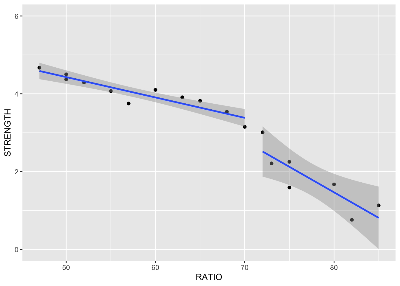
Although the plot above looks like the line pieces are attached, that is just the visualization of the plot itself. There is no prediction between the two lines.
Piecewise linear regression is built with typical linear regression functions with only some creation of new variables. In R, we can use the lm function on this cement data set. We are predicting STRENGTH using the RATIO variable as well the X2STAR variable which is \((x_1 - k)x_2\).
Code
library(ggplot2)cement.lm <-lm(STRENGTH ~ RATIO + X2STAR, data = cement)summary(cement.lm)
Call:
lm(formula = STRENGTH ~ RATIO + X2STAR, data = cement)

Residuals:
     Min       1Q   Median       3Q      Max
-0.72124 -0.09753 -0.00163  0.24297  0.49393

Coefficients:
            Estimate Std. Error t value Pr(>|t|)
(Intercept)  7.79198    0.67696  11.510 7.62e-09 ***
RATIO       -0.06633    0.01123  -5.904 2.89e-05 ***
X2STAR      -0.10119    0.02812  -3.598  0.00264 **
---
Signif. codes:  0 '***' 0.001 '**' 0.01 '*' 0.05 '.' 0.1 ' ' 1

Residual standard error: 0.3286 on 15 degrees of freedom
Multiple R-squared:  0.9385,    Adjusted R-squared:  0.9303
F-statistic: 114.4 on 2 and 15 DF,  p-value: 8.257e-10
Code
ggplot(cement, aes(x = RATIO, y = STRENGTH)) +geom_point() +geom_line(data = cement, aes(x = RATIO, y = cement.lm$fitted.values)) +ylim(0,6)
We can see in the plot above how at the knot value of 70, the slope and intercept of the regression line changes.
The previous example dealt with piecewise functions that are continuous - the lines stay attached. However, you could make a small adjustment to the model to make the linear discontinuous:
With the addition of the same \(x_2\) variable as previously defined on its own instead of attached to the \((x_1-k)\) piece, the lines are no longer attached.
Code
cement.lm <-lm(STRENGTH ~ RATIO + X2STAR + X2, data = cement)summary(cement.lm)
Call:
lm(formula = STRENGTH ~ RATIO + X2STAR + X2, data = cement)

Residuals:
     Min       1Q   Median       3Q      Max
-0.53167 -0.15513  0.06171  0.17239  0.49451

Coefficients:
            Estimate Std. Error t value Pr(>|t|)
(Intercept)  7.04975    0.68558  10.283  6.6e-08 ***
RATIO       -0.05240    0.01174  -4.463 0.000536 ***
X2STAR      -0.07888    0.02686  -2.937 0.010830 *
X2          -0.60388    0.26877  -2.247 0.041302 *
---
Signif. codes:  0 '***' 0.001 '**' 0.01 '*' 0.05 '.' 0.1 ' ' 1

Residual standard error: 0.2916 on 14 degrees of freedom
Multiple R-squared:  0.9548,    Adjusted R-squared:  0.9451
F-statistic: 98.57 on 3 and 14 DF,  p-value: 1.188e-09
Code
qplot(RATIO, STRENGTH, group = X2, geom =c('point', 'smooth'), method ='lm', data = cement, ylim =c(0,6))
The piecewise linear regression equation can be extended to have as many pieces as you want. An example with three lines (two knots) is as follows:
One of the problems with this structure is that we have to define the knot values ourselves. The next set of models can help do that for us!
MARS (and EARTH)
Multivariate adaptive regression splines (MARS) is a non-parametric technique that still has a linear form to the model (additive) but has nonlinearities and interaction between variables. Essentially, MARS uses piecewise regression approach to split into pieces then potentially uses either linear or nonlinear patterns for each piece.
MARS first looks for the point in the range of a predictor \(x_i\) where two linear functions on either side of the point provides the least squared error (linear regression).
The algorithm continues on each piece of the piecewise function until many knots are found. Take the example below that is more complicated than just splitting the data with one knot.
This will eventually overfit your data. However, the algorithm then works backwards to “prune” (or remove) the knots that do not contribute significantly to out of sample accuracy. This out of sample accuracy calculation is performed by using the generalized cross-validation (GCV) procedure - a computational short-cut for leave-one-out cross-validation. The algorithm does this for all of the variables in the data set and combines the outcomes together.
The actual MARS algorithm is trademarked by Salford Systems, so instead the common implementation in most software is enhanced adaptive regression through hinges - called EARTH.
Let’s go back to our Ames housing data set and the variables we were working with in the previous section. One of the variables in our data set is square footage of greater living area. It doesn’t have a straight-forward relationship with our target variable SalePrice as seen by the plot below.
Code
import seaborn as snsimport matplotlib.pyplot as pltplt.cla()sns.scatterplot(x = X_reduced["GrLivArea"], y = y)plt.xlabel("Greater Living Area")plt.ylabel("Sale Price")plt.show()
Let’s fit the EARTH algorithm between GrLivArea and SalePrice. In the pyearth2 package is the Earth function. The input is similar to most modeling functions in Python, a data frame of predictor variables and a target variable through the fit function. Here we will just look at the EARTH algorithm using only greater living area for now. We will then look at a summary of the output.
Code
from pyearth import Earth# Create Small Dataset for ExampleX_little = X_reduced[['GrLivArea']]model_earth = Earth()model_earth.fit(X_little, y)
Earth()
In a Jupyter environment, please rerun this cell to show the HTML representation or trust the notebook. On GitHub, the HTML representation is unable to render, please try loading this page with nbviewer.org.
Parameters
max_terms
None
max_degree
None
allow_missing
False
penalty
None
endspan_alpha
None
endspan
None
minspan_alpha
None
minspan
None
thresh
None
zero_tol
None
min_search_points
None
check_every
None
allow_linear
None
use_fast
None
fast_K
None
fast_h
None
smooth
None
enable_pruning
True
feature_importance_type
None
verbose
0
Code
print(model_earth.summary())
Earth Model
----------------------------------------
Basis Function     Pruned  Coefficient
----------------------------------------
(Intercept)        No      1.28727e+06
h(GrLivArea-3447)  Yes     None
h(3447-GrLivArea)  No      -710.528
h(GrLivArea-3112)  No      2626.75
h(3112-GrLivArea)  No      -1451.42
GrLivArea          Yes     None
h(GrLivArea-2828)  No      -2702.29
h(2828-GrLivArea)  Yes     None
h(GrLivArea-2775)  Yes     None
h(2775-GrLivArea)  No      2051.29
h(GrLivArea-1134)  Yes     None
h(1134-GrLivArea)  Yes     None
----------------------------------------
MSE: 3173856747.2406, GCV: 3253587655.8496, RSQ: 0.5270, GRSQ: 0.5160
From the output above we see 5 pieces of the function defined by 4 knots after pruning. The output shows all of the knots the algorithm found before it went back and removed some of them. Those four final knots correspond to the GrLivArea- ___ values above with the pruned column specifying “No.” The coefficients attached to each of those pieces are the same as what we would have in piecewise linear regression. The bottom of the output also shows the generalized \(R^2\) value as well as the typical \(R^2\) value.
To visualize the piecewise relationship between GrLivArea and SalePrice we can plot the predicted values on the scatterplot from above.
Code
import pandas as pdimport seaborn as snsimport matplotlib.pyplot as pltplt.cla()fitted_values = model_earth.predict(X_little)# Create a DataFrame for plottingdf_plot = pd.DataFrame({"GrLivArea": X_reduced["GrLivArea"],"SalePrice": y,"Fitted": fitted_values}).sort_values("GrLivArea")sns.scatterplot(data = df_plot, x ="GrLivArea", y ="SalePrice", color ='gray', label ="Observed", alpha=0.5)sns.lineplot(data = df_plot, x ="GrLivArea", y ="Fitted", color ="blue", label ="Fitted (MARS)")plt.xlabel("Greater Living Area")plt.ylabel("Sale Price")plt.legend()plt.show()
We can see that the sale price of the home stays relative linear until around 3,000 square feet. After that there is a slight increase before the function comes back down and starts to level off.
Now let’s build the algorithm on all the variables in the data set that we have. The only difference is that we are using the dataset with all of the reduced variables after initial variable screening instead of just the GrLivArea variable.
Code
earth_ames = Earth()earth_ames.fit(X_reduced, y)
Earth()
In a Jupyter environment, please rerun this cell to show the HTML representation or trust the notebook. On GitHub, the HTML representation is unable to render, please try loading this page with nbviewer.org.
Parameters
max_terms
None
max_degree
None
allow_missing
False
penalty
None
endspan_alpha
None
endspan
None
minspan_alpha
None
minspan
None
thresh
None
zero_tol
None
min_search_points
None
check_every
None
allow_linear
None
use_fast
None
fast_K
None
fast_h
None
smooth
None
enable_pruning
True
feature_importance_type
None
verbose
0
Code
print(earth_ames.summary())
Earth Model
-------------------------------------------
Basis Function        Pruned  Coefficient
-------------------------------------------
(Intercept)           No      -510753
OverallQual           No      12389.4
h(GrLivArea-1274)     Yes     None
h(1274-GrLivArea)     Yes     None
h(TotalBsmtSF-2121)   No      -105.357
h(2121-TotalBsmtSF)   Yes     None
YearBuilt             No      408.27
h(TotalBsmtSF-1656)   No      146.728
h(1656-TotalBsmtSF)   No      -29.9947
h(LotArea-15306)      No      0.365516
h(15306-LotArea)      No      -2.77509
h(2ndFlrSF-1392)      Yes     None
h(1392-2ndFlrSF)      No      1605.03
h(GrLivArea-3112)     Yes     None
h(3112-GrLivArea)     No      -260.497
h(YearRemodAdd-2009)  No      45101.5
h(2009-YearRemodAdd)  No      -221.372
h(GarageArea-364)     Yes     None
h(364-GarageArea)     No      67.8746
Fireplaces            No      10346.4
h(GrLivArea-1970)     No      56.2958
h(1970-GrLivArea)     Yes     None
BedroomAbvGr          No      -4513.63
h(1stFlrSF-2217)      No      -112.507
h(2217-1stFlrSF)      Yes     None
BsmtQual_Gd           No      -18155.3
BsmtQual_TA           No      -15850.5
h(2ndFlrSF-1330)      No      559.319
h(1330-2ndFlrSF)      No      -1621.16
h(GarageArea-1020)    No      -147.916
h(1020-GarageArea)    No      -50.6441
KitchenQual_TA        No      -35887.2
KitchenQual_Gd        No      -27325.1
KitchenQual_Fa        No      -38098.9
h(HalfBath-1)         No      -25714.6
h(1-HalfBath)         Yes     None
h(GrLivArea-2554)     No      -168.66
h(2554-GrLivArea)     No      242.786
WoodDeckSF            No      21.9665
-------------------------------------------
MSE: 721107802.8006, GCV: 828612902.1467, RSQ: 0.8925, GRSQ: 0.8767
Now that all of the variables have been added in, we see a lot of them remaining in the model to predict our target. There are knot values defined for all of the variables that are in the model. Right below the knot values in the output above we see that only 17 of the 47 original variables were used in the final model. Not surprisingly, the \(R^2\) and generalized \(R^2\) has increased with the addition of all these new variables. Notice how GrLivArea has different knot values then when we ran the algorithm on GrLivArea alone. That is because the algorithm prunes the knots with all of the variables in the model. Apparently, some of the other variables being in the model means we change our thoughts on the knots in the GrLivArea variable.
Let’s go back to our Ames housing data set and the variables we were working with in the previous section. One of the variables in our data set is square footage of greater living area. It doesn’t have a straight-forward relationship with our target variable SalePrice as seen by the plot below.
Code
df_reduced <-cbind(SalePrice = y, X_reduced)ggplot(df_reduced, aes(x = GrLivArea, y = SalePrice)) +geom_point()
Let’s fit the EARTH algorithm between GrLivArea and SalePrice. In the earth package is the earth function. The input is similar to most modeling functions in R, a formula to relate predictor variables to a target variable and an option to define the data set being used. Here we will just look at the EARTH algorithm using only greater living area for now. We will then look at a summary of the output.
Code
library(earth)mars1 <-earth(SalePrice ~ GrLivArea, data = df_reduced)summary(mars1)
Call: earth(formula=SalePrice~GrLivArea, data=df_reduced)

                  coefficients
(Intercept)          399880.89
h(GrLivArea-3194)       318.94
h(3447-GrLivArea)      -112.94
h(GrLivArea-3447)      -384.78

Selected 4 of 4 terms, and 1 of 1 predictors
Termination condition: RSq changed by less than 0.001 at 4 terms
Importance: GrLivArea
Number of terms at each degree of interaction: 1 3 (additive model)
GCV 3276234390    RSS 3.541756e+12    GRSq 0.5126316    RSq 0.5179628
From the output above we see 3 pieces of the function defined by 2 knots. Those two knots correspond to the GrLivArea- ___ values above. The coefficients attached to each of those pieces are the same as what we would have in piecewise linear regression. The bottom of the output also shows the generalized \(R^2\) value as well as the typical \(R^2\) value.
To visualize the piecewise relationship between GrLivArea and SalePrice we can plot the predicted values on the scatterplot from above.
Code
ggplot(df_reduced, aes(x = GrLivArea, y = SalePrice)) +geom_point() +geom_line(data = train, aes(x = GrLivArea, y = mars1$fitted.values), color ="blue")
We can see that the sale price of the home stays relative linear until just after 3,000 square feet. After that there is a slight increase before the function starts to level off.
Now let’s build the algorithm on all the variables in the data set that we have. The SalePrice ~ . notation tells the earth function to use all the variables in the data set to predict the sale price.
Code
mars2 <-earth(SalePrice ~ ., data = df_reduced)summary(mars2)
Call: earth(formula=SalePrice~., data=df_reduced)

                     coefficients
(Intercept)             473341.88
h(20896-LotArea)            -2.17
h(7-OverallQual)         -9145.10
h(OverallQual-7)         32772.77
h(YearBuilt-1904)        -1608.26
h(2007-YearBuilt)        -1928.42
h(YearBuilt-2007)        19920.49
h(YearRemodAdd-1965)       508.31
h(TotalBsmtSF-1567)         98.80
h(2109-TotalBsmtSF)        -26.81
h(TotalBsmtSF-2109)        -66.88
h(2129-FirstFlrSF)         -26.77
h(FirstFlrSF-2129)         -81.09
h(SecondFlrSF-1259)        973.15
h(SecondFlrSF-1320)      -4092.73
h(1360-SecondFlrSF)        -34.77
h(SecondFlrSF-1360)       3683.37
h(GrLivArea-1776)           32.25
h(GrLivArea-2622)          175.52
h(GrLivArea-2945)         -335.90
h(4-BedroomAbvGr)         3611.78
h(BedroomAbvGr-4)       -20314.80
h(TotRmsAbvGrd-9)         9693.62
h(1-Fireplaces)          -6429.38
h(Fireplaces-1)          16837.30
h(GarageArea-900)          484.33
h(995-GarageArea)          -20.75
h(GarageArea-995)         -742.77
h(436-WoodDeckSF)          -24.14

Selected 29 of 34 terms, and 13 of 47 predictors
Termination condition: RSq changed by less than 0.001 at 34 terms
Importance: OverallQual, GrLivArea, SecondFlrSF, LotArea, YearBuilt, ...
Number of terms at each degree of interaction: 1 28 (additive model)
GCV 766722175    RSS 754429412956    GRSq 0.8859434    RSq 0.8973213
Now that all of the variables have been added in, we see a lot of them remaining in the model to predict our target. There are knot values defined for all of the variables that are in the model. Right below the knot values in the output above we see that only 13 of the 47 original variables were used in the final model. Two lines below that we see variables listed by importance. We will look at this more below. Not surprisingly, the \(R^2\) and generalized \(R^2\) has increased with the addition of all these new variables. Notice how GrLivArea has different knot values then when we ran the algorithm on GrLivArea alone. That is because the algorithm prunes the knots with all of the variables in the model. Apparently, some of the other variables being in the model means we change our thoughts on the knots in the GrLivArea variable.
Let’s talk more about that variable importance metric in the above output. For each model size (1 term, 2 terms, etc.) there is one “subset” model - the best model for that size. EARTH ranks variables by how many of these “best models” of each size that variable appears in. The more subsets (or “best models”) that a variable appears in, the more important the variable. We can get this full output using the evimp function on our earth model object.
The nsubsets above is the number of subsets that the variable appears in. The rss above stands for residual sum of squares (or sum of squares error) is a scaled version of the decrease in residual sum of squares relative to the previous subset. Since it is scaled, the top variable always has a value of 100 while the remaining ones decrease from there. The gcv value is an approximation of rss on leave-one-out cross-validation and is also scaled.
Interpretability of relationships between predictor variables and the target variable starts to get more complicated with the EARTH (or MARS) algorithm. You can plot the relationship as we see above, but those relationships can still be rather complicated and hard to explain to a client.
Smoothing
Generalized additive models can be made up of any non-parametric function of the predictor variables. Another popular technique is to use smoothing functions so the piecewise linear regressions are not so jagged. The following are different types of smoothing functions:
LOESS (localized regression)
Smoothing splines & regression splines
LOESS
Locally estimated scatterplot smoothing (LOESS) is a popular smoothing technique. The idea of LOESS is to perform weighted linear regression in small windows of a scatterplot of data between two variables. This weighted linear regression is done around each point as the window moves from the low end of the scatterplot values to the high end. An example is shown below:
LOESS Regression
The predictions of the these regression lines in each window are connected together to form the smoothed curve through the scatterplot as shown above.
Smoothing Splines
Smoothing splines take a different approach as compared to LOESS. Smoothing splines have a knot at every single observation for piecewise regression which leads to overfitting. There is a penalty parameter used to counterbalance the “wiggle” of the spline curve.
Smoothing splines try to find the function \(s(x_i)\) that optimally fits \(x_i\) to the target variable through the following equation:
By thinking of \(s(x_i)\) as a prediction of \(y\), the front half of the equation is equal to the sum of squared errors in your model. The second half of the equation above has the \(\lambda\) penalty applied to the integral of the second derivative of the smoothing function. To conceptually think of this second derivative we can think of it as the “slope of slopes” which is large when the curve has a lot of “wiggle”. The optimal value of the \(\lambda\) penalty is estimated with another approximation of leave-one-out cross-validation.
These splines allow curves to be fit to your data instead of just piecewise lines. Take the same data shown in the section on piecewise regression, but now fit with cubic splines.
Regression splines are just a computationally nicer version of smoothing splines so they will not be covered in detail here.
Let’s see how to do GAM’s with splines in each software!
Continuing to use our Ames housing data set, we will build a GAM using the GLMGam and BSplines functions from the stasmodels.gam.api package in Python. Similar to previous functions the inputs are the target variable object as well as the predictor variable data frame. We will also use the smoother option to let the GLMGam function know which variables are being splined. The BSplines function used as an input to the GLMGam function is where we define the variables we want splined and to what degree we are splining them.
LinearGAM
=============================================== ==========================================================
Distribution:                        NormalDist Effective DoF:                                     10.7275
Link Function:                     IdentityLink Log Likelihood:                                -24916.3555
Number of Samples:                         1095 AIC:                                             49856.166
                                                AICc:                                           49856.4418
                                                GCV:                                       3096380776.4665
                                                Scale:                                     3041826638.1671
                                                Pseudo R-Squared:                                   0.5511
==========================================================================================================
Feature Function                  Lambda               Rank         EDoF         P > x        Sig. Code
================================= ==================== ============ ============ ============ ============
s(0)                              [0.6]                20           10.7         1.11e-16     ***
intercept                                              1            0.0          1.11e-16     ***
==========================================================================================================
Significance codes:  0 '***' 0.001 '**' 0.01 '*' 0.05 '.' 0.1 ' ' 1

WARNING: Fitting splines and a linear function to a feature introduces a model identifiability problem
         which can cause p-values to appear significant when they are not.

WARNING: p-values calculated in this manner behave correctly for un-penalized models or models with
         known smoothing parameters, but when smoothing parameters have been estimated, the p-values
         are typically lower than they should be, meaning that the tests reject the null too readily.
None
From the output above we see the p-values attached to the spline values of GrLivArea shows the significance of that variable to the model as a whole. Similar to the EARTH algorithm, we can view a plot of the relationship between the variable and its predictions of the target. Here we use the scatterplot and lineplot functions on the model object’s predicted values (fittedvalues).
Code
import seaborn as snsimport matplotlib.pyplot as pltimport numpy as np# Create grid for GAM predictionsX_grid = np.linspace(X_little["GrLivArea"].min(), X_little["GrLivArea"].max(), 200).reshape(-1, 1)y_pred = gam1.predict(X_grid)confidence = gam1.prediction_intervals(X_grid, width=0.95)# Prepare DataFrame for plottingdf_plot = pd.DataFrame({"GrLivArea": X_little["GrLivArea"],"SalePrice": y})# Scatter plot of observed datasns.scatterplot(data=df_plot, x="GrLivArea", y="SalePrice", color='gray', alpha=0.5, label="Observed")# Fitted lineplt.plot(X_grid, y_pred, color='blue', label="Fitted GAM")# Shaded confidence intervalplt.fill_between(X_grid.flatten(), confidence[:,0], confidence[:,1], color='blue', alpha=0.2, label='95% CI')plt.xlabel("Greater Living Area")plt.ylabel("Sale Price")plt.legend()plt.show()
Similar to the relationship we saw with EARTH, there is a relatively linear increase in sales prices (not perfectly linear) as square footage goes up until around 3,000 square feet. After that the impact of size of the home diminishes and levels off.
Let’s build out a GAM with all of the variables in our data set. Since we will only spline our continuous predictor variables, the first thing we need to do is split our predictor variables into two dataframes - categorical and continuous. Since our data is already dummy coded as binary variables for all categorical variables, we simply just count which ones have only 2 unique values and which have more. From there we will put the continuous variable dataframe into the BSplines function along with options filled out for every variable in the df and degree options. These will go into the smoother option in GLMGam while the categorical variables are input into the exog option for exogenous variables without splines. Lastly, we will summarize the output with the summary function call.
Code
from pygam import LinearGAM, s, lfrom pygam.terms import TermList# Identify binary vs continuous columnsbinary_cols = [col for col in X_reduced.columns if X_reduced[col].nunique() ==2]continuous_cols = [col for col in X_reduced.columns if X_reduced[col].nunique() >2]# Map columns to indicescol_idx = {col: i for i, col inenumerate(X_reduced.columns)}# Create term list correctlyterms = l(col_idx[binary_cols[0]])for col in binary_cols[1:]: terms += l(col_idx[col])for col in continuous_cols: terms += s(col_idx[col])gam = LinearGAM(terms).fit(X_reduced.values, y)gam.summary()
LinearGAM
=============================================== ==========================================================
Distribution:                        NormalDist Effective DoF:                                    163.5864
Link Function:                     IdentityLink Log Likelihood:                                -23082.8775
Number of Samples:                         1095 AIC:                                            46494.9278
                                                AICc:                                           46553.5739
                                                GCV:                                        775335618.8062
                                                Scale:                                      570095738.4479
                                                Pseudo R-Squared:                                   0.9277
==========================================================================================================
Feature Function                  Lambda               Rank         EDoF         P > x        Sig. Code
================================= ==================== ============ ============ ============ ============
l(19)                             [0.6]                1            0.9          4.58e-01
l(20)                             [0.6]                1            1.0          6.54e-01
l(21)                             [0.6]                1            1.0          3.08e-01
l(22)                             [0.6]                1            1.0          1.72e-02     *
l(23)                             [0.6]                1            1.0          8.61e-01
l(24)                             [0.6]                1            1.0          8.67e-01
l(25)                             [0.6]                1            0.9          3.13e-01
l(26)                             [0.6]                1            1.0          2.13e-01
l(27)                             [0.6]                1            1.0          4.65e-01
l(28)                             [0.6]                1            1.0          1.19e-01
l(29)                             [0.6]                1            1.0          6.72e-01
l(30)                             [0.6]                1            1.0          2.22e-01
l(31)                             [0.6]                1            1.0          7.68e-01
l(32)                             [0.6]                1            0.9          7.87e-01
l(33)                             [0.6]                1            1.0          6.45e-03     **
l(34)                             [0.6]                1            0.9          7.59e-01
l(35)                             [0.6]                1            1.0          1.23e-03     **
l(36)                             [0.6]                1            1.0          2.28e-02     *
l(37)                             [0.6]                1            1.0          5.07e-04     ***
l(38)                             [0.6]                1            1.0          2.19e-04     ***
l(39)                             [0.6]                1            1.0          8.47e-07     ***
l(40)                             [0.6]                1            1.0          2.16e-02     *
l(41)                             [0.6]                1            1.0          4.63e-01
l(42)                             [0.6]                1            1.0          2.79e-01
l(43)                             [0.6]                1            1.0          1.97e-01
l(44)                             [0.6]                1            0.9          1.75e-02     *
l(45)                             [0.6]                1            1.0          5.25e-01
l(46)                             [0.6]                1            0.8          2.82e-01
s(0)                              [0.6]                20           10.7         3.62e-05     ***
s(1)                              [0.6]                20           9.4          1.99e-11     ***
s(2)                              [0.6]                20           9.3          1.11e-16     ***
s(3)                              [0.6]                20           13.8         4.52e-05     ***
s(4)                              [0.6]                20           11.2         7.16e-04     ***
s(5)                              [0.6]                20           7.3          1.52e-13     ***
s(6)                              [0.6]                20           8.2          1.11e-16     ***
s(7)                              [0.6]                20           9.3          1.11e-16     ***
s(8)                              [0.6]                20           6.5          1.11e-16     ***
s(9)                              [0.6]                20           3.3          9.89e-01
s(10)                             [0.6]                20           2.5          6.99e-02     .
s(11)                             [0.6]                20           6.2          2.94e-03     **
s(12)                             [0.6]                20           7.2          1.16e-02     *
s(13)                             [0.6]                20           2.3          1.58e-03     **
s(14)                             [0.6]                20           8.3          8.65e-02     .
s(15)                             [0.6]                20           3.3          2.32e-02     *
s(16)                             [0.6]                20           7.6          1.90e-07     ***
s(17)                             [0.6]                20           7.3          1.45e-01
s(18)                             [0.6]                20           2.9          2.74e-01
intercept                                              1            0.0          1.11e-16     ***
==========================================================================================================
Significance codes:  0 '***' 0.001 '**' 0.01 '*' 0.05 '.' 0.1 ' ' 1

WARNING: Fitting splines and a linear function to a feature introduces a model identifiability problem
         which can cause p-values to appear significant when they are not.

WARNING: p-values calculated in this manner behave correctly for un-penalized models or models with
         known smoothing parameters, but when smoothing parameters have been estimated, the p-values
         are typically lower than they should be, meaning that the tests reject the null too readily.
<string>:1: UserWarning: KNOWN BUG: p-values computed in this summary are likely much smaller than they should be.

Please do not make inferences based on these values!

Collaborate on a solution, and stay up to date at:
github.com/dswah/pyGAM/issues/163
Code
term_names = binary_cols + continuous_cols# gam.statistics_['p_values'] gives all p-values in term order# Drop the last p-value (intercept)p_values_no_intercept = gam.statistics_['p_values'][:-1]# Combine with term namessummary_df = pd.DataFrame({'Feature': term_names,'P-value': p_values_no_intercept})print(summary_df)
The top half of the output has the variables not in splines, while the bottom half has the spline variables. There are some variables with high p-values that could be removed from the model.
Continuing to use our Ames housing data set, we will build a gam using the mgcv package in R. Similar to previous functions the inputs are the formula for the model and the data = option to define the data set. We will also use the summary function to view the output. Inside of the formula, we use the s function to inform the gam function to which variables should have splines fit to them.
Code
library(mgcv)gam1 <- mgcv::gam(SalePrice ~s(GrLivArea), data = df_reduced)summary(gam1)
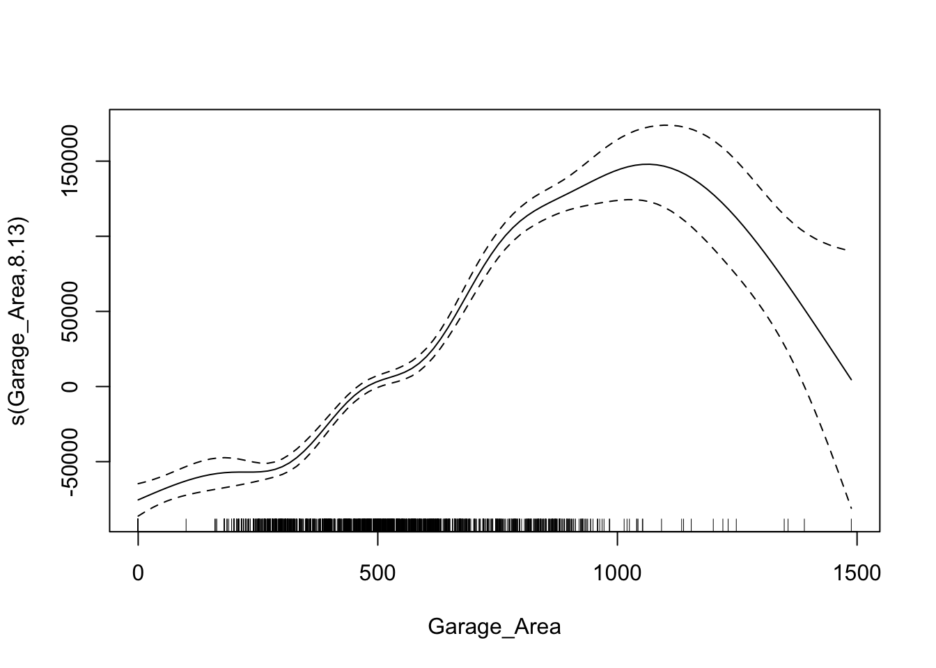
From the output above we see two different sections - a section for coefficients that are not involved in splines and a section for smoothing terms. The p-value attached to the spline of GrLivArea shows the significance of that variable to the model as a whole. Similar to the EARTH algorithm, we can view a plot of the relationship between the variable and its predictions of the target. Here we use the plot function on the gam model object.
Code
plot(gam1)
This nonlinear and complex relationship between GrLivArea and Sale_Price is similar to the plot we saw earlier with EARTH. This shouldn’t be too surprising. Both algorithms are trying to relate these two variables together, just in different ways.
Let’s build out a GAM with all of the variables in our data set. The categorical variables are entered as either character variables or with the factor function. The continuous variables are defined with the spline function s.
Code
library(mgcv)# Identify variable types based on number of unique valuesbinary_vars <-names(X_reduced)[sapply(X_reduced, function(x) length(unique(x)) ==2)]continuous_vars <-names(X_reduced)[sapply(X_reduced, function(x) length(unique(x)) >2)]# Smooth terms for continuous predictorsspline_terms <-paste0("s(", continuous_vars, ", k = 3)", collapse =" + ")# Linear terms for binary predictorsbinary_terms <-paste(binary_vars, collapse =" + ")# Combine everythingrhs <-paste(c(binary_terms, spline_terms), collapse =" + ")gam_formula <-as.formula(paste("SalePrice ~", rhs))gam_ames <-gam(formula = gam_formula,data = df_reduced,method ="REML")summary(gam_ames)
The top half of the output has the variables not in splines, while the bottom half has the spline variables.
There are some variables with high p-values that could be removed from the model. One of the benefits of the gam function from the mgcv package is the select option. If we set select = TRUE then the model will penalize variables’ edf values. You can think of an edf value almost like a polynomial term. The selection technique will zero out this edf value - essentially, zeroing out the variable itself.
An example is shown below where the GarageYrBlt and MiscVal variables are essentially zeroed from the model.
Models are nothing but potentially complicated formulas or rules. Once we determine the optimal model, we can score any new observations we want with the equation.
Scoring
It’s the process of applying a fitted model to input data to generate outputs like predicted values, probabilities, classifications, or scores.
Scoring data does not mean that we are re-running the model/algorithm on this new data. It just means that we are asking the model for predictions on this new data - plugging the new data into the equation and recording the output. This means that our data must be in the same format as the data put into the model. Therefore, if you created any new variables, made any variable transformations, or imputed missing values, the same process must be taken with the new data you are about to score.
For this problem we will score our test dataset that we have previously set aside as we were building our model. The test dataset is for comparing final models and reporting final model metrics. Make sure that you do NOT go back and rebuild your model after you score the test dataset. This would no longer make the test dataset an honest assessment of how good your model is actually doing. That also means that we should NOT just build hundreds of iterations of our same model to compare to the test dataset. That would essentially be doing the same thing as going back and rebuilding the model as you would be letting the test dataset decide on your final model.
Without going into all of the same detail as before, the following code transforms the test dataset we originally created in the same way that we did for the training dataset by dropping necessary variables, making missing value imputations, and getting our same data objects.
Code
predictors_test = test.drop(columns=['SalePrice'])ames_dummied = pd.get_dummies(ames, drop_first=True)test_ids = test.indextest_dummied = ames_dummied.loc[test_ids]predictors_test = test_dummied.astype(float)predictors_test = predictors_test.drop(['GarageType_Missing', 'GarageQual_Missing','GarageCond_Missing'], axis=1)# Impute Missing for Continuous Variablesnum_cols = predictors_test.select_dtypes(include='number').columnsfor col in num_cols:if predictors_test[col].isnull().any(): predictors_test[f'{col}_was_missing'] = predictors_test[col].isnull().astype(int)# Impute with median median = predictors_test[col].median() predictors_test[col] = predictors_test[col].fillna(median)X_test = predictors_testy_test = test['SalePrice']y_test_log = np.log(test['SalePrice'])# Subset the DataFrame to selected featuresX_test_selected = X_test[selected_features].copy()
Now that our data is ready for scoring we can use the predict function on our model object we created with our GAM. The only input to the predict function is the dataset we prepared for scoring.
From the sklearn.metrics package we have a variety of model metric functions. We will use the mean_absolute_error (MAE) and mean_absolute_percentage_error (MAPE) metrics like the ones we described in the section on Model Building.
Code
from sklearn.metrics import mean_absolute_errorfrom sklearn.metrics import mean_absolute_percentage_error# 1. Make sure columns are in the same order as X_reducedX_test_aligned = X_test_selected[X_reduced.columns]# 2. Convert to NumPy arrayX_test_values = X_test_aligned.values# 3. Get predictionsgam_pred = gam.predict(X_test_values)# Optional: predict confidence intervalsy_pred_intervals = gam.prediction_intervals(X_test_values, width=0.95)#gam_pred = gam_ames.predict(X_test_selected)mae = mean_absolute_error(y_test, gam_pred)mape = mean_absolute_percentage_error(y_test, gam_pred)print(f"MAE: {mae:.2f}")
MAE: 18154.31
Code
print(f"MAPE: {mape:.2%}")
MAPE: 11.40%
From the above output we can see that the linear regression model still beats the ridge regression model and is extremely comparable with the GAM. The GAM beats the linear regression slightly in MAE, but the linear regression slightly beats the GAM in terms of MAPE.
Model
MAE
MAPE
Linear Regression
$18,160.24
11.36%
Ridge Regression
$19.572.19
12.25%
GAM
$18,154.31
11.40%
To make sure that we are using the same test dataset between Python and R we will import our Python dataset here into R. There are a few variables that need to be renamed with the names function to work best in R.
Now that our data is ready for scoring we can use the predict function on our model object we created with our GAM. The only input to the predict function is the dataset we prepared for scoring with the newdata option.
From the Metrics package we have a variety of model metric functions. We will use the mae (mean absolute error) and mape (mean absolute percentage error) metrics like the ones we described in the section on Model Building.
From the above output we can see that the linear regression model still beats the ridge regression model and newly added GAM. The GAM however does beat the ridge regression.
Model
MAE
MAPE
Linear Regression
$18,160.24
11.36%
Ridge Regression
$22,040.76
13.37%
GAM
$19,479.79
12.23%
Summary
In summary, GAM’s are good models to use for prediction, but explanation becomes more difficult and complex. Some of the advantages of using GAM’s:
Allows nonlinear relationships without trying out many transformations manually
Improved predictions
Limited “interpretation” still available
Computationally fast for small numbers of variables
There are some disadvantages though:
Interactions are possible, but computationally intensive
Not good for large number of variables so prescreening is needed
Multicollinearity still a problem.
Source Code
---title: "Generalized Additive Models"format: html: code-fold: show code-tools: trueeditor: visual---```{r}#| include: false#| warning: false#| error: false#| message: falselibrary(reticulate)reticulate::use_condaenv("wfu_fall_ml_mars", required =TRUE)``````{python}#| include: false#| warning: false#| error: false#| message: falsefrom sklearn.datasets import fetch_openmlimport pandas as pdfrom sklearn.feature_selection import SelectKBest, f_classifimport numpy as npimport matplotlib.pyplot as plt# Load Ames Housing datadata = fetch_openml(name="house_prices", as_frame=True)ames = data.frame# Remove Business Logic Variablesames = ames.drop(['Id', 'MSSubClass','Functional','MSZoning','Neighborhood', 'LandSlope','Condition2','OverallCond','RoofStyle','RoofMatl','Exterior1st','Exterior2nd','MasVnrType','MasVnrArea','ExterCond','BsmtCond','BsmtExposure','BsmtFinType1','BsmtFinSF1','BsmtFinType2','BsmtFinSF2','BsmtUnfSF','Electrical','LowQualFinSF','BsmtFullBath','BsmtHalfBath','KitchenAbvGr','GarageFinish','SaleType','SaleCondition'], axis=1)# Remove Missingness Variablesames = ames.drop(['PoolQC', 'MiscFeature','Alley', 'Fence'], axis=1)# Impute Missingness for Categorical Variablescat_cols = ames.select_dtypes(include=['object', 'category']).columnsames[cat_cols] = ames[cat_cols].fillna('Missing')# Remove Low Variability Variablesames = ames.drop(['Street', 'Utilities','Heating'], axis=1)# Train / Test Splitfrom sklearn.model_selection import train_test_splittrain, test = train_test_split(ames, test_size =0.25, random_state =1234)# Impute Missing for Continuous Variablesnum_cols = train.select_dtypes(include='number').columnsfor col in num_cols:if train[col].isnull().any():# Create missing flag column train[f'{col}_was_missing'] = train[col].isnull().astype(int)# Impute with median median = train[col].median() train[col] = train[col].fillna(median)# Prepare X and y Objectsimport statsmodels.api as smpredictors = train.drop(columns=['SalePrice'])predictors = pd.get_dummies(predictors, drop_first=True)predictors = predictors.astype(float)predictors = predictors.drop(['GarageType_Missing', 'GarageQual_Missing','GarageCond_Missing'], axis=1)X = predictorsy = train['SalePrice']y_log = np.log(train['SalePrice'])# Initial Variable Selectionselector = SelectKBest(score_func=f_classif, k='all') selector.fit(X, y)pval_df = pd.DataFrame({'Feature': X.columns,'F_score': selector.scores_,'p_value': selector.pvalues_})selected_features = pval_df[pval_df['p_value'] <0.009]['Feature']X_reduced = X[selected_features.tolist()]``````{r}#| include: false#| warning: false#| error: false#| message: falsetrain = py$traintest = py$testX_reduced = py$X_reducedy = py$yy_log = py$y_lognames(X_reduced)[names(X_reduced) =="1stFlrSF"] <-"FirstFlrSF"names(X_reduced)[names(X_reduced) =="2ndFlrSF"] <-"SecondFlrSF"names(X_reduced)[names(X_reduced) =="3SsnPorch"] <-"ThreeStoryPorch"```# General StructureGeneralized Additive Models (GAM's) provide a general framework for adding of non-linear functions together instead of the typical linear structure of linear regression. GAM's can be used for either continuous or categorical target variables. The structure of GAM's are the following:$$y = \beta_0 + f_1(x_1) + \cdots + f_p(x_p) + \varepsilon$$The $f_i(x_i)$ functions are complex, nonlinear functions on the predictor variables. GAM's add these complex, yet individual functions together. This allows for many complex relationships to try and model with to potentially predict your target variable better. We will examine a few different forms of GAM's below.# Piecewise Linear RegressionThe slope of the linear relationship between a predictor variable and a target variable can change over different values of the predictor variable. The typical straight-line model $\hat{y} = \beta_0 + \beta_1x_1$ will not be a good fit for this type of data.Here is an example of a data set that exhibits this behavior - comprehensive strength of concrete and the proportion of water mixed with cement. The comprehensive strength decreases at a much faster rate for batches with a greater than 70% water/cement ratio.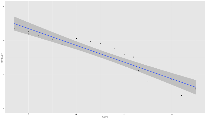{fig-align="center" width="6in"}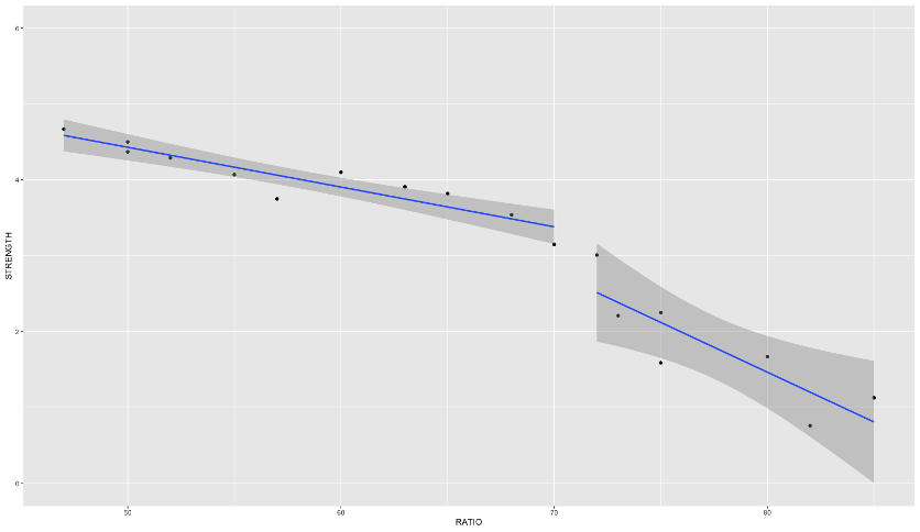{fig-align="center" width="6in"}If you were to fit a linear regression as the first image above, it wouldn't represent the data very well. However, this is perfect for a **piecewise linear regression**. Piecewise linear regression is a model where there are different straight-line relationships for different intervals in the predictor variable. The following piecewise linear regression is for two slopes:$$y = \beta_0 + \beta_1x_1 + \beta_2(x_1-k)x_2 + \varepsilon$$The $k$ value in the equation above is called the **knot value** for $x_1$. The $x_2$ variable is defined as a value of 1 when $x_1 > k$ and a value of 0 when $x_1 \le k$. With $x_2$ defined this way, when $x_1 \le k$, the equation becomes $y = \beta_0 + \beta_1x_1 + \varepsilon$. When $x1 > k$, the equation gets a new intercept and slope: $y = (\beta_0 - k\beta_2) + (\beta_1 + \beta_2)x_1 + \varepsilon$.Let's see this in each software!```{r}#| warning: false#| error: false#| message: false#| include: falsecement <-read.csv("data/cement.csv", header =TRUE)``````{python}#| warning: false#| error: false#| message: false#| include: falsecement = r.cement```::: {.panel-tabset .nav-pills}## PythonPiecewise linear regression is built with typical linear regression functions with only some creation of new variables. In Python, we can use the `ols` function from `statsmodels.formula.api` on this cement data set. We are predicting `STRENGTH` using the `RATIO` variable as well the `X2STAR` variable which is $(x_1-k)x_2$.```{python}#| warning: false#| error: false#| message: falseimport statsmodels.formula.api as smffrom matplotlib import pyplot as pltimport seaborn as snscement_lm = smf.ols("STRENGTH ~ RATIO + X2STAR", data = cement).fit()cement_lm.summary()fig, ax = plt.subplots(figsize=(6, 4))sns.scatterplot(x ='RATIO', y='STRENGTH', data = cement, ax = ax)x_pred = cement['RATIO']y_pred = cement_lm.fittedvaluessns.lineplot(x = x_pred, y = y_pred, ax = ax)```We can see in the plot above how at the knot value of 70, the slope and intercept of the regression line changes.The previous example dealt with piecewise functions that are continuous - the lines stay attached. However, you could make a small adjustment to the model to make the linear discontinuous:$$y = \beta_0 + \beta_1x_1 + \beta_2(x_1-k)x_2 + \beta_3x_2 + \varepsilon$$With the addition of the same $x_2$ variable as previously defined on its own instead of attached to the $(x_1-k)$ piece, the lines are no longer attached.```{python}#| warning: false#| error: false#| message: falsecement_lm = smf.ols("STRENGTH ~ RATIO + X2STAR + X2", data = cement).fit()cement_lm.summary()fig, ax = plt.subplots(figsize=(6, 4))sns.scatterplot(x ='RATIO', y='STRENGTH', data = cement, ax = ax)x_pred = cement['RATIO']y_pred = cement_lm.fittedvaluessns.lineplot(x = x_pred, y = y_pred, ax = ax)```Although the plot above looks like the line pieces are attached, that is just the visualization of the plot itself. There is no prediction between the two lines.## RPiecewise linear regression is built with typical linear regression functions with only some creation of new variables. In R, we can use the `lm` function on this cement data set. We are predicting `STRENGTH` using the `RATIO` variable as well the `X2STAR` variable which is $(x_1 - k)x_2$.```{r}#| warning: false#| error: false#| message: falselibrary(ggplot2)cement.lm <-lm(STRENGTH ~ RATIO + X2STAR, data = cement)summary(cement.lm)ggplot(cement, aes(x = RATIO, y = STRENGTH)) +geom_point() +geom_line(data = cement, aes(x = RATIO, y = cement.lm$fitted.values)) +ylim(0,6)```We can see in the plot above how at the knot value of 70, the slope and intercept of the regression line changes.The previous example dealt with piecewise functions that are continuous - the lines stay attached. However, you could make a small adjustment to the model to make the linear discontinuous:$$y = \beta_0 + \beta_1x_1 + \beta_2(x_1 - k)x_2 + \beta_3x_2 + \varepsilon$$With the addition of the same $x_2$ variable as previously defined on its own instead of attached to the $(x_1-k)$ piece, the lines are no longer attached.```{r}#| warning: false#| error: false#| message: falsecement.lm <-lm(STRENGTH ~ RATIO + X2STAR + X2, data = cement)summary(cement.lm)qplot(RATIO, STRENGTH, group = X2, geom =c('point', 'smooth'), method ='lm', data = cement, ylim =c(0,6))```:::The piecewise linear regression equation can be extended to have as many pieces as you want. An example with three lines (two knots) is as follows:$$y = \beta_0 +\beta_1x_1 + \beta_2(x_1-k_1)x_2 + \beta_3(x_1-k_2)x_3 + \varepsilon$$One of the problems with this structure is that we have to define the knot values ourselves. The next set of models can help do that for us!# MARS (and EARTH)Multivariate adaptive regression splines (MARS) is a non-parametric technique that still has a linear form to the model (additive) but has nonlinearities and interaction between variables. Essentially, MARS uses piecewise regression approach to split into pieces then potentially uses either linear or nonlinear patterns for each piece.MARS first looks for the point in the range of a predictor $x_i$ where two linear functions on either side of the point provides the least squared error (linear regression).```{python}#| echo: false#| warning: false#| error: false#| message: falsecement_lm = smf.ols("STRENGTH ~ RATIO + X2STAR", data = cement).fit()fig, ax = plt.subplots(figsize=(6, 4))sns.scatterplot(x ='RATIO', y='STRENGTH', data = cement, ax = ax)x_pred = cement['RATIO']y_pred = cement_lm.fittedvaluessns.lineplot(x = x_pred, y = y_pred, ax = ax)```The algorithm continues on each piece of the piecewise function until many knots are found. Take the example below that is more complicated than just splitting the data with one knot.```{python}#| echo: false#| warning: false#| error: false#| message: falseimport numpy as npimport matplotlib.pyplot as pltfrom sklearn.linear_model import LinearRegressionfrom sklearn.metrics import mean_squared_errorfrom itertools import combinationsimport warningswarnings.filterwarnings("ignore") # To keep output clean# 1. Generate highly curvy data — "an S that fell on its face"np.random.seed(1234)X_fake = np.linspace(-5, 5, 1000)y_fake =20* np.sin(X_fake) +10* np.tanh(1.5* X_fake) + np.random.normal(scale=20, size=X_fake.shape[0])# 2. Function to generate piecewise linear (hinge) featuresdef piecewise_linear(X, knots): X = np.array(X) X_feat = [X]for knot in knots: X_feat.append(np.maximum(0, X - knot))return np.vstack(X_feat).T# 3. Function to find best knots (greedy selection from candidates)def find_best_knots(X, y, num_knots, candidate_knots): best_rmse = np.inf best_knots =Nonefor knot_combo in combinations(candidate_knots, num_knots): X_pw = piecewise_linear(X, knot_combo) model = LinearRegression().fit(X_pw, y) y_pred = model.predict(X_pw) rmse = np.sqrt(mean_squared_error(y, y_pred))if rmse < best_rmse: best_rmse = rmse best_knots = knot_comboreturnlist(best_knots), best_rmse# 4. Function to plot model with best knots and RMSEdef plot_piecewise_fit(X, y, knots, ax, rmse): X_pw = piecewise_linear(X, knots) model = LinearRegression().fit(X_pw, y) y_pred = model.predict(X_pw) ax.scatter(X, y, s=10, color='gray', alpha=0.6, label='Data') ax.plot(X, y_pred, color='crimson', linewidth=2, label='Fit')for knot in knots: ax.axvline(knot, color='blue', linestyle='--', alpha=0.3) ax.set_title(f'{len(knots)} Knots | RMSE = {rmse:.2f}') ax.legend()# 5. Candidate knot positions (uniform grid, avoiding endpoints)num_candidates =20candidate_knots = np.linspace(X_fake.min() +0.5, X_fake.max() -0.5, num_candidates)# 6. Plot grid with automatic knot selectionfig, axs = plt.subplots(2, 2, figsize=(12, 10))axs = axs.flatten()for i, num_knots inenumerate([1, 2, 3, 4]): best_knots, best_rmse = find_best_knots(X_fake, y_fake, num_knots, candidate_knots) plot_piecewise_fit(X_fake, y_fake, best_knots, axs[i], best_rmse)plt.tight_layout()plt.show()```This will eventually overfit your data. However, the algorithm then works backwards to "prune" (or remove) the knots that do not contribute significantly to out of sample accuracy. This out of sample accuracy calculation is performed by using the **generalized cross-validation** (GCV) procedure - a computational short-cut for leave-one-out cross-validation. The algorithm does this for all of the variables in the data set and combines the outcomes together.The actual MARS algorithm is trademarked by Salford Systems, so instead the common implementation in most software is **enhanced adaptive regression through hinges** - called EARTH.Let's see how to do this in each software!::: {.panel-tabset .nav-pills}## PythonLet's go back to our Ames housing data set and the variables we were working with in the previous section. One of the variables in our data set is square footage of greater living area. It doesn't have a straight-forward relationship with our target variable *SalePrice* as seen by the plot below.```{python}#| warning: false#| error: false#| message: falseimport seaborn as snsimport matplotlib.pyplot as pltplt.cla()sns.scatterplot(x = X_reduced["GrLivArea"], y = y)plt.xlabel("Greater Living Area")plt.ylabel("Sale Price")plt.show()```Let's fit the EARTH algorithm between *GrLivArea* and *SalePrice*. In the `pyearth2` package is the `Earth` function. The input is similar to most modeling functions in Python, a data frame of predictor variables and a target variable through the `fit` function. Here we will just look at the EARTH algorithm using only greater living area for now. We will then look at a `summary` of the output.```{python}#| warning: false#| error: false#| message: falsefrom pyearth import Earth# Create Small Dataset for ExampleX_little = X_reduced[['GrLivArea']]model_earth = Earth()model_earth.fit(X_little, y)print(model_earth.summary())```From the output above we see 5 pieces of the function defined by 4 knots after pruning. The output shows all of the knots the algorithm found before it went back and removed some of them. Those four final knots correspond to the *GrLivArea*`- ___` values above with the pruned column specifying "No." The coefficients attached to each of those pieces are the same as what we would have in piecewise linear regression. The bottom of the output also shows the generalized $R^2$ value as well as the typical $R^2$ value.To visualize the piecewise relationship between *GrLivArea* and *SalePrice* we can plot the predicted values on the scatterplot from above.```{python}#| warning: false#| error: false#| message: falseimport pandas as pdimport seaborn as snsimport matplotlib.pyplot as pltplt.cla()fitted_values = model_earth.predict(X_little)# Create a DataFrame for plottingdf_plot = pd.DataFrame({"GrLivArea": X_reduced["GrLivArea"],"SalePrice": y,"Fitted": fitted_values}).sort_values("GrLivArea")sns.scatterplot(data = df_plot, x ="GrLivArea", y ="SalePrice", color ='gray', label ="Observed", alpha=0.5)sns.lineplot(data = df_plot, x ="GrLivArea", y ="Fitted", color ="blue", label ="Fitted (MARS)")plt.xlabel("Greater Living Area")plt.ylabel("Sale Price")plt.legend()plt.show()```We can see that the sale price of the home stays relative linear until around 3,000 square feet. After that there is a slight increase before the function comes back down and starts to level off.Now let's build the algorithm on all the variables in the data set that we have. The only difference is that we are using the dataset with all of the reduced variables after initial variable screening instead of just the *GrLivArea* variable.```{python}#| warning: false#| error: false#| message: falseearth_ames = Earth()earth_ames.fit(X_reduced, y)print(earth_ames.summary())```Now that all of the variables have been added in, we see a lot of them remaining in the model to predict our target. There are knot values defined for all of the variables that are in the model. Right below the knot values in the output above we see that only 17 of the 47 original variables were used in the final model. Not surprisingly, the $R^2$ and generalized $R^2$ has increased with the addition of all these new variables. Notice how *GrLivArea* has different knot values then when we ran the algorithm on *GrLivArea* alone. That is because the algorithm prunes the knots with all of the variables in the model. Apparently, some of the other variables being in the model means we change our thoughts on the knots in the *GrLivArea* variable.## RLet's go back to our Ames housing data set and the variables we were working with in the previous section. One of the variables in our data set is square footage of greater living area. It doesn't have a straight-forward relationship with our target variable *SalePrice* as seen by the plot below.```{r}#| warning: false#| error: false#| message: falsedf_reduced <-cbind(SalePrice = y, X_reduced)ggplot(df_reduced, aes(x = GrLivArea, y = SalePrice)) +geom_point()```Let's fit the EARTH algorithm between *GrLivArea* and *SalePrice*. In the `earth` package is the `earth` function. The input is similar to most modeling functions in R, a formula to relate predictor variables to a target variable and an option to define the data set being used. Here we will just look at the EARTH algorithm using only greater living area for now. We will then look at a `summary` of the output.```{r}#| warning: false#| error: false#| message: falselibrary(earth)mars1 <-earth(SalePrice ~ GrLivArea, data = df_reduced)summary(mars1)```From the output above we see 3 pieces of the function defined by 2 knots. Those two knots correspond to the *GrLivArea*`- ___` values above. The coefficients attached to each of those pieces are the same as what we would have in piecewise linear regression. The bottom of the output also shows the generalized $R^2$ value as well as the typical $R^2$ value.To visualize the piecewise relationship between *GrLivArea* and *SalePrice* we can plot the predicted values on the scatterplot from above.```{r}#| warning: false#| error: false#| message: falseggplot(df_reduced, aes(x = GrLivArea, y = SalePrice)) +geom_point() +geom_line(data = train, aes(x = GrLivArea, y = mars1$fitted.values), color ="blue")```We can see that the sale price of the home stays relative linear until just after 3,000 square feet. After that there is a slight increase before the function starts to level off.Now let's build the algorithm on all the variables in the data set that we have. The `SalePrice ~ .` notation tells the `earth` function to use all the variables in the data set to predict the sale price.```{r}#| warning: false#| error: false#| message: falsemars2 <-earth(SalePrice ~ ., data = df_reduced)summary(mars2)```Now that all of the variables have been added in, we see a lot of them remaining in the model to predict our target. There are knot values defined for all of the variables that are in the model. Right below the knot values in the output above we see that only 13 of the 47 original variables were used in the final model. Two lines below that we see variables listed by importance. We will look at this more below. Not surprisingly, the $R^2$ and generalized $R^2$ has increased with the addition of all these new variables. Notice how *GrLivArea* has different knot values then when we ran the algorithm on *GrLivArea* alone. That is because the algorithm prunes the knots with all of the variables in the model. Apparently, some of the other variables being in the model means we change our thoughts on the knots in the *GrLivArea* variable.Let's talk more about that variable importance metric in the above output. For each model size (1 term, 2 terms, etc.) there is one "subset" model - the best model for that size. EARTH ranks variables by how many of these "best models" of each size that variable appears in. The more subsets (or "best models") that a variable appears in, the more important the variable. We can get this full output using the `evimp` function on our `earth` model object.```{r}#| warning: false#| error: false#| message: falseevimp(mars2)```The `nsubsets` above is the number of subsets that the variable appears in. The `rss` above stands for residual sum of squares (or sum of squares error) is a scaled version of the decrease in residual sum of squares relative to the previous subset. Since it is scaled, the top variable always has a value of 100 while the remaining ones decrease from there. The `gcv` value is an approximation of `rss` on leave-one-out cross-validation and is also scaled.:::Interpretability of relationships between predictor variables and the target variable starts to get more complicated with the EARTH (or MARS) algorithm. You can plot the relationship as we see above, but those relationships can still be rather complicated and hard to explain to a client.# SmoothingGeneralized additive models can be made up of any non-parametric function of the predictor variables. Another popular technique is to use **smoothing functions** so the piecewise linear regressions are not so jagged. The following are different types of smoothing functions:- LOESS (localized regression)- Smoothing splines & regression splines## LOESSLocally estimated scatterplot smoothing (LOESS) is a popular smoothing technique. The idea of LOESS is to perform weighted linear regression in small windows of a scatterplot of data between two variables. This weighted linear regression is done around each point as the window moves from the low end of the scatterplot values to the high end. An example is shown below:{fig-align="center" width="8in"}The predictions of the these regression lines in each window are connected together to form the smoothed curve through the scatterplot as shown above.## Smoothing SplinesSmoothing splines take a different approach as compared to LOESS. Smoothing splines have a knot at every single observation for piecewise regression which leads to overfitting. There is a penalty parameter used to counterbalance the "wiggle" of the spline curve.Smoothing splines try to find the function $s(x_i)$ that optimally fits $x_i$ to the target variable through the following equation:$$\min\sum_{i=1}^n (y_i - s(x_i))^2 + \lambda\int s''(t_i)^2 dt$$By thinking of $s(x_i)$ as a prediction of $y$, the front half of the equation is equal to the sum of squared errors in your model. The second half of the equation above has the $\lambda$ penalty applied to the integral of the second derivative of the smoothing function. To conceptually think of this second derivative we can think of it as the "slope of slopes" which is large when the curve has a lot of "wiggle". The optimal value of the $\lambda$ penalty is estimated with another approximation of leave-one-out cross-validation.These splines allow curves to be fit to your data instead of just piecewise lines. Take the same data shown in the section on piecewise regression, but now fit with cubic splines.```{python}#| echo: false#| warning: false#| error: false#| message: falseimport numpy as npimport matplotlib.pyplot as pltfrom sklearn.linear_model import LinearRegressionfrom sklearn.metrics import mean_squared_errorfrom itertools import combinationsfrom patsy import dmatriximport warningswarnings.filterwarnings("ignore")# 1. Generate curvy data — same as beforenp.random.seed(1234)X_fake = np.linspace(-5, 5, 1000)y_fake =20* np.sin(X_fake) +10* np.tanh(1.5* X_fake) + np.random.normal(scale=20, size=X_fake.shape[0])# 2. Cubic spline basis generator using patsydef cubic_spline(X, knots):return dmatrix("bs(x, knots=knots, degree=3, include_intercept=True)", {"x": X, "knots": knots}, return_type='dataframe' )# 3. Greedy knot optimizer (searches for best knot positions)def find_best_knots(X, y, num_knots, candidate_knots): best_rmse = np.inf best_knots =Nonefor knot_combo in combinations(candidate_knots, num_knots): X_basis = cubic_spline(X, list(knot_combo)) model = LinearRegression().fit(X_basis, y) y_pred = model.predict(X_basis) rmse = np.sqrt(mean_squared_error(y, y_pred))if rmse < best_rmse: best_rmse = rmse best_knots =list(knot_combo)return best_knots, best_rmse# 4. Plotting functiondef plot_spline_fit(X, y, knots, ax, rmse): X_basis = cubic_spline(X, knots) model = LinearRegression().fit(X_basis, y) y_pred = model.predict(X_basis) ax.scatter(X, y, s=10, color='gray', alpha=0.6, label='Data') ax.plot(X, y_pred, color='crimson', linewidth=2, label='Spline Fit')for knot in knots: ax.axvline(knot, color='blue', linestyle='--', alpha=0.3) ax.set_title(f'Cubic Spline: {len(knots)} knots | RMSE = {rmse:.2f}') ax.legend()# 5. Define candidate knots (for optimization)num_candidates =20candidate_knots = np.linspace(X_fake.min() +0.5, X_fake.max() -0.5, num_candidates)# 6. Create 2x2 grid of cubic spline fits with 1–4 knotsfig, axs = plt.subplots(2, 2, figsize=(12, 10))axs = axs.flatten()for i, num_knots inenumerate([1, 2, 3, 4]): best_knots, best_rmse = find_best_knots(X_fake, y_fake, num_knots, candidate_knots) plot_spline_fit(X_fake, y_fake, best_knots, axs[i], best_rmse)plt.tight_layout()plt.show()```Regression splines are just a computationally nicer version of smoothing splines so they will not be covered in detail here.Let's see how to do GAM's with splines in each software!::: {.panel-tabset .nav-pills}## PythonContinuing to use our Ames housing data set, we will build a GAM using the `GLMGam` and `BSplines` functions from the `stasmodels.gam.api` package in Python. Similar to previous functions the inputs are the target variable object as well as the predictor variable data frame. We will also use the `smoother` option to let the `GLMGam` function know which variables are being splined. The `BSplines` function used as an input to the `GLMGam` function is where we define the variables we want splined and to what degree we are splining them.```{python}#| warning: false#| error: false#| message: falsefrom pygam import LinearGAM, sX_np = X_little[['GrLivArea']].to_numpy()# Define GAM: spline onlygam1 = LinearGAM(s(0)).fit(X_np, y)print(gam1.summary())```From the output above we see the p-values attached to the spline values of *GrLivArea* shows the significance of that variable to the model as a whole. Similar to the EARTH algorithm, we can view a plot of the relationship between the variable and its predictions of the target. Here we use the `scatterplot` and `lineplot` functions on the model object's predicted values (`fittedvalues`).```{python}#| warning: false#| error: false#| message: falseimport seaborn as snsimport matplotlib.pyplot as pltimport numpy as np# Create grid for GAM predictionsX_grid = np.linspace(X_little["GrLivArea"].min(), X_little["GrLivArea"].max(), 200).reshape(-1, 1)y_pred = gam1.predict(X_grid)confidence = gam1.prediction_intervals(X_grid, width=0.95)# Prepare DataFrame for plottingdf_plot = pd.DataFrame({"GrLivArea": X_little["GrLivArea"],"SalePrice": y})# Scatter plot of observed datasns.scatterplot(data=df_plot, x="GrLivArea", y="SalePrice", color='gray', alpha=0.5, label="Observed")# Fitted lineplt.plot(X_grid, y_pred, color='blue', label="Fitted GAM")# Shaded confidence intervalplt.fill_between(X_grid.flatten(), confidence[:,0], confidence[:,1], color='blue', alpha=0.2, label='95% CI')plt.xlabel("Greater Living Area")plt.ylabel("Sale Price")plt.legend()plt.show()```Similar to the relationship we saw with EARTH, there is a relatively linear increase in sales prices (not perfectly linear) as square footage goes up until around 3,000 square feet. After that the impact of size of the home diminishes and levels off.Let's build out a GAM with all of the variables in our data set. Since we will only spline our continuous predictor variables, the first thing we need to do is split our predictor variables into two dataframes - categorical and continuous. Since our data is already dummy coded as binary variables for all categorical variables, we simply just count which ones have only 2 unique values and which have more. From there we will put the continuous variable dataframe into the `BSplines` function along with options filled out for every variable in the `df` and `degree` options. These will go into the `smoother` option in `GLMGam` while the categorical variables are input into the `exog` option for exogenous variables without splines. Lastly, we will summarize the output with the `summary` function call.```{python}from pygam import LinearGAM, s, lfrom pygam.terms import TermList# Identify binary vs continuous columnsbinary_cols = [col for col in X_reduced.columns if X_reduced[col].nunique() ==2]continuous_cols = [col for col in X_reduced.columns if X_reduced[col].nunique() >2]# Map columns to indicescol_idx = {col: i for i, col inenumerate(X_reduced.columns)}# Create term list correctlyterms = l(col_idx[binary_cols[0]])for col in binary_cols[1:]: terms += l(col_idx[col])for col in continuous_cols: terms += s(col_idx[col])gam = LinearGAM(terms).fit(X_reduced.values, y)gam.summary()``````{python}#| warning: false#| error: false#| message: falseterm_names = binary_cols + continuous_cols# gam.statistics_['p_values'] gives all p-values in term order# Drop the last p-value (intercept)p_values_no_intercept = gam.statistics_['p_values'][:-1]# Combine with term namessummary_df = pd.DataFrame({'Feature': term_names,'P-value': p_values_no_intercept})print(summary_df)```The top half of the output has the variables not in splines, while the bottom half has the spline variables. There are some variables with high p-values that could be removed from the model.## RContinuing to use our Ames housing data set, we will build a `gam` using the `mgcv` package in R. Similar to previous functions the inputs are the formula for the model and the `data =` option to define the data set. We will also use the `summary` function to view the output. Inside of the formula, we use the `s` function to inform the `gam` function to which variables should have splines fit to them.```{r}#| warning: false#| error: false#| message: falselibrary(mgcv)gam1 <- mgcv::gam(SalePrice ~s(GrLivArea), data = df_reduced)summary(gam1)```From the output above we see two different sections - a section for coefficients that are not involved in splines and a section for smoothing terms. The p-value attached to the spline of `GrLivArea` shows the significance of that variable to the model as a whole. Similar to the EARTH algorithm, we can view a plot of the relationship between the variable and its predictions of the target. Here we use the `plot` function on the `gam` model object.```{r}#| warning: false#| error: false#| message: falseplot(gam1)```This nonlinear and complex relationship between `GrLivArea` and `Sale_Price` is similar to the plot we saw earlier with EARTH. This shouldn't be too surprising. Both algorithms are trying to relate these two variables together, just in different ways.Let's build out a GAM with all of the variables in our data set. The categorical variables are entered as either character variables or with the `factor` function. The continuous variables are defined with the spline function `s`.```{r}#| warning: false#| error: false#| message: falselibrary(mgcv)# Identify variable types based on number of unique valuesbinary_vars <-names(X_reduced)[sapply(X_reduced, function(x) length(unique(x)) ==2)]continuous_vars <-names(X_reduced)[sapply(X_reduced, function(x) length(unique(x)) >2)]# Smooth terms for continuous predictorsspline_terms <-paste0("s(", continuous_vars, ", k = 3)", collapse =" + ")# Linear terms for binary predictorsbinary_terms <-paste(binary_vars, collapse =" + ")# Combine everythingrhs <-paste(c(binary_terms, spline_terms), collapse =" + ")gam_formula <-as.formula(paste("SalePrice ~", rhs))gam_ames <-gam(formula = gam_formula,data = df_reduced,method ="REML")summary(gam_ames)```The top half of the output has the variables not in splines, while the bottom half has the spline variables.There are some variables with high p-values that could be removed from the model. One of the benefits of the `gam` function from the `mgcv` package is the `select` option. If we set `select = TRUE` then the model will penalize variables' edf values. You can think of an edf value almost like a polynomial term. The selection technique will zero out this edf value - essentially, zeroing out the variable itself.An example is shown below where the `GarageYrBlt` and `MiscVal` variables are essentially zeroed from the model.```{r}#| warning: false#| error: false#| message: falsegam_ames <-gam(formula = gam_formula,data = df_reduced,method ="REML",select =TRUE)summary(gam_ames)```:::# PredictionsModels are nothing but potentially complicated formulas or rules. Once we determine the optimal model, we can **score** any new observations we want with the equation.::: callout-tip## ScoringIt's the process of applying a fitted model to input data to generate outputs like predicted values, probabilities, classifications, or scores.:::Scoring data **does not** mean that we are re-running the model/algorithm on this new data. It just means that we are asking the model for predictions on this new data - plugging the new data into the equation and recording the output. This means that our data must be in the same format as the data put into the model. Therefore, if you created any new variables, made any variable transformations, or imputed missing values, the same process must be taken with the new data you are about to score.For this problem we will score our test dataset that we have previously set aside as we were building our model. The test dataset is for comparing final models and reporting final model metrics. Make sure that you do **NOT** go back and rebuild your model after you score the test dataset. This would no longer make the test dataset an honest assessment of how good your model is actually doing. That also means that we should **NOT** just build hundreds of iterations of our same model to compare to the test dataset. That would essentially be doing the same thing as going back and rebuilding the model as you would be letting the test dataset decide on your final model.Let's score our data in each software!::: {.panel-tabset .nav-pills}## PythonWithout going into all of the same detail as before, the following code transforms the test dataset we originally created in the same way that we did for the training dataset by dropping necessary variables, making missing value imputations, and getting our same data objects.```{python}#| warning: false#| error: false#| message: falsepredictors_test = test.drop(columns=['SalePrice'])ames_dummied = pd.get_dummies(ames, drop_first=True)test_ids = test.indextest_dummied = ames_dummied.loc[test_ids]predictors_test = test_dummied.astype(float)predictors_test = predictors_test.drop(['GarageType_Missing', 'GarageQual_Missing','GarageCond_Missing'], axis=1)# Impute Missing for Continuous Variablesnum_cols = predictors_test.select_dtypes(include='number').columnsfor col in num_cols:if predictors_test[col].isnull().any(): predictors_test[f'{col}_was_missing'] = predictors_test[col].isnull().astype(int)# Impute with median median = predictors_test[col].median() predictors_test[col] = predictors_test[col].fillna(median)X_test = predictors_testy_test = test['SalePrice']y_test_log = np.log(test['SalePrice'])# Subset the DataFrame to selected featuresX_test_selected = X_test[selected_features].copy()```Now that our data is ready for scoring we can use the `predict` function on our model object we created with our GAM. The only input to the `predict` function is the dataset we prepared for scoring.From the `sklearn.metrics` package we have a variety of model metric functions. We will use the `mean_absolute_error` (MAE) and `mean_absolute_percentage_error` (MAPE) metrics like the ones we described in the section on Model Building.```{python}#| warning: false#| error: false#| message: falsefrom sklearn.metrics import mean_absolute_errorfrom sklearn.metrics import mean_absolute_percentage_error# 1. Make sure columns are in the same order as X_reducedX_test_aligned = X_test_selected[X_reduced.columns]# 2. Convert to NumPy arrayX_test_values = X_test_aligned.values# 3. Get predictionsgam_pred = gam.predict(X_test_values)# Optional: predict confidence intervalsy_pred_intervals = gam.prediction_intervals(X_test_values, width=0.95)#gam_pred = gam_ames.predict(X_test_selected)mae = mean_absolute_error(y_test, gam_pred)mape = mean_absolute_percentage_error(y_test, gam_pred)print(f"MAE: {mae:.2f}")print(f"MAPE: {mape:.2%}")```From the above output we can see that the linear regression model still beats the ridge regression model and is extremely comparable with the GAM. The GAM beats the linear regression slightly in MAE, but the linear regression slightly beats the GAM in terms of MAPE.| Model | MAE | MAPE ||:-----------------:|:-----------:|:------:|| Linear Regression | \$18,160.24 | 11.36% || Ridge Regression | \$19.572.19 | 12.25% || GAM | \$18,154.31 | 11.40% |## RTo make sure that we are using the same test dataset between Python and R we will import our Python dataset here into R. There are a few variables that need to be renamed with the `names` function to work best in R.```{r}#| warning: false#| error: false#| message: falsey_test <- py$y_testX_test_selected <- py$X_test_selectednames(X_test_selected)[names(X_test_selected) =="1stFlrSF"] <-"FirstFlrSF"names(X_test_selected)[names(X_test_selected) =="2ndFlrSF"] <-"SecondFlrSF"names(X_test_selected)[names(X_test_selected) =="3SsnPorch"] <-"ThreeStoryPorch"```Now that our data is ready for scoring we can use the `predict` function on our model object we created with our GAM. The only input to the `predict` function is the dataset we prepared for scoring with the `newdata` option.From the `Metrics` package we have a variety of model metric functions. We will use the `mae` (mean absolute error) and `mape` (mean absolute percentage error) metrics like the ones we described in the section on Model Building.```{r}#| warning: false#| error: false#| message: falselibrary(Metrics)predictions <-predict(gam_ames, newdata = X_reduced)gam_pred <-predict(gam_ames, newdata = X_test_selected)mae <-mae(y_test, gam_pred)mape <-mape(y_test, gam_pred)cat(sprintf("MAE: %.2f\n", mae))cat(sprintf("MAPE: %.2f%%\n", mape *100))```From the above output we can see that the linear regression model still beats the ridge regression model and newly added GAM. The GAM however does beat the ridge regression.| Model | MAE | MAPE ||:-----------------:|:-----------:|:------:|| Linear Regression | \$18,160.24 | 11.36% || Ridge Regression | \$22,040.76 | 13.37% || GAM | \$19,479.79 | 12.23% |:::# SummaryIn summary, GAM's are good models to use for prediction, but explanation becomes more difficult and complex. Some of the advantages of using GAM's:- Allows nonlinear relationships without trying out many transformations manually- Improved predictions- Limited "interpretation" still available- Computationally fast for small numbers of variablesThere are some disadvantages though:- Interactions are possible, but computationally intensive- Not good for large number of variables so prescreening is needed- Multicollinearity still a problem.