The mean of the target is accurately modeled by a linear function of the predictors.
The random error term, \(\varepsilon\), is assumed to have a constant variance, \(\sigma^2\).
The random error term, \(\varepsilon\), is assumed to have a normal distribution with a mean of 0.
The errors are independent of each other.
Sometimes, people state a 5th assumption:
No perfect collinearity
To start, we will deal with the first four assumptions as they are the primary assumptions of linear regression. Notice how each of the first four assumptions deal with the errors in some capacity. Assumptions 2 - 4 directly mention assumptions. The first assumption around linearity deals with a model not being fit well which results in patterns in our errors.
Let’s look at those first four assumptions visually:
Visual Representation of Linear Regression Assumptions
Notice how we have a relationship between the predictor variable and target variable. That relationship is not perfect and has some errors. However, those errors follow normal distributions at every point along the regression line. These errors all have the same spread, or variance, along the whole regression line as well.
We do not actually view the true errors of our model, \(\varepsilon_i\), in practice.
We do not observe actual errors because we don’t know the actual \(\beta\) coefficients. Instead, we have an estimate of the error - called a residual.
These residuals are just the difference between the true value of our target at each observation and the predicted values from our model of those observations. The following is a visual representation of that concept:
Residuals vs. True Errors from Regression Model
Let’s see how to get these residuals from each software!
We are going to use the final variable list from our cross-validated stepwise regression from the previous section. These selected variables will go into an object called X_selected. We then use the statsmodels.api package and the add_constant function to add a column of 1’s for the intercept term. Lasty, using a combination of the OLS and fit functions we have our linear regression model. The results are printed out with the summary function.
Code
import numpy as npimport pandas as pdimport seaborn as snsimport matplotlib.pyplot as pltimport statsmodels.api as smfrom scipy import statsselected_features = ['OverallQual', 'YearBuilt', 'YearRemodAdd', 'GrLivArea', 'Fireplaces', 'GarageYrBlt', 'GarageCars', 'WoodDeckSF', 'ScreenPorch', 'GarageYrBlt_was_missing', 'LotShape_IR2', 'LotShape_Reg', 'LandContour_HLS', 'LotConfig_CulDSac', 'Condition1_Norm', 'BldgType_2fmCon', 'BldgType_Duplex', 'BldgType_Twnhs', 'HouseStyle_2Story', 'ExterQual_Fa', 'ExterQual_TA', 'Foundation_CBlock', 'Foundation_PConc', 'BsmtQual_Fa', 'BsmtQual_Gd', 'BsmtQual_Missing', 'BsmtQual_TA', 'HeatingQC_Gd', 'HeatingQC_TA', 'KitchenQual_Fa', 'KitchenQual_Gd', 'KitchenQual_TA', 'GarageType_Missing', 'GarageQual_Fa', 'GarageQual_Missing', 'GarageQual_TA', 'GarageCond_Missing']# Subset the DataFrame to selected features and build modelX_selected = X_reduced[selected_features].copy()X_selected = sm.add_constant(X_selected)model = sm.OLS(y, X_selected).fit()# Summary with p-values, coefficients, R², etc.print(model.summary())
The results above are there for comparison of later adjustments to the model if needed. To do residual analysis we need to gather the predicted values and residuals from our model. The fittedvalues function gives us predicted values from our training data. The resid function gives us the corresponding residuals.
Later calculations will require our residuals to be standardized. Here we are calculating the standardized residuals by dividing the residuals by the model’s \(RMSE\).
Recall from the previous section that the \(RMSE\) is the estimated standard deviation of the residuals. To get the model’s \(MSE\) we use the mse_resid function. From there we just calculate its square root using the numpy package’s sqrt function.
We are going to use the final variable list from our cross-validated stepwise regression from the previous section. To make the results consistent between Python and R, we will just use the variables flagged by Python here. These selected variables will go into an object called X_selected. We then use the statsmodels.api package and the add_constant function to add a column of 1’s for the intercept term. Lasty, using a combination of the OLS and fit functions we have our linear regression model. The results are printed out with the summary function.
The results above are there for comparison of later adjustments to the model if needed. To do residual analysis we need to gather the predicted values and residuals from our model. The fittedvalues function gives us predicted values from our training data. The resid function gives us the corresponding residuals.
Later calculations will require our residuals to be standardized. Here we are calculating the standardized residuals by dividing the residuals by the model’s \(RMSE\).
Recall from the previous section that the \(RMSE\) is the estimated standard deviation of the residuals. To get the model’s \(MSE\) we use the mse_resid function. From there we just calculate its square root using the numpy package’s sqrt function.
Now that we have our residuals we can evaluate our assumptions.
Linearity / Lack-of-Fit
One of the assumptions of linear regression assumes that the expected value of the target variable is accurately modeled by a linear function of the predictor variables. We want our models to best represent the real relationship between our predictors and the target variable. If this is true, then we would expect our residual plots to be random scatter of observations (in other words, all of the “signal” was correctly captured in the model and there is just noise left over). If the residuals are not randomly scattered, then they are revealing potential misspecification (or lack-of-fit) of the model.
Here are the steps for detecting lack-of-fit in a model:
Plot residuals against the predicted values of the target variable.
Plot the partial residuals against each predictor variable.
Look for patterns in these plots:
Trends
Changes in variation
Isolated, extreme observations
Partial residuals measure the effect of an individual variable \(x_i\) after accounting for all of the other predictor variables. The partial residuals for the \(j^{th}\) variable, \(x_j\), are defined as:
Essentially, the variable \(x_j\) as well as its coefficient has been removed from our calculation. That will allow us to see how that variable impacts the relationship. If we see any non-linear patterns that would be a sign that more signal remains.
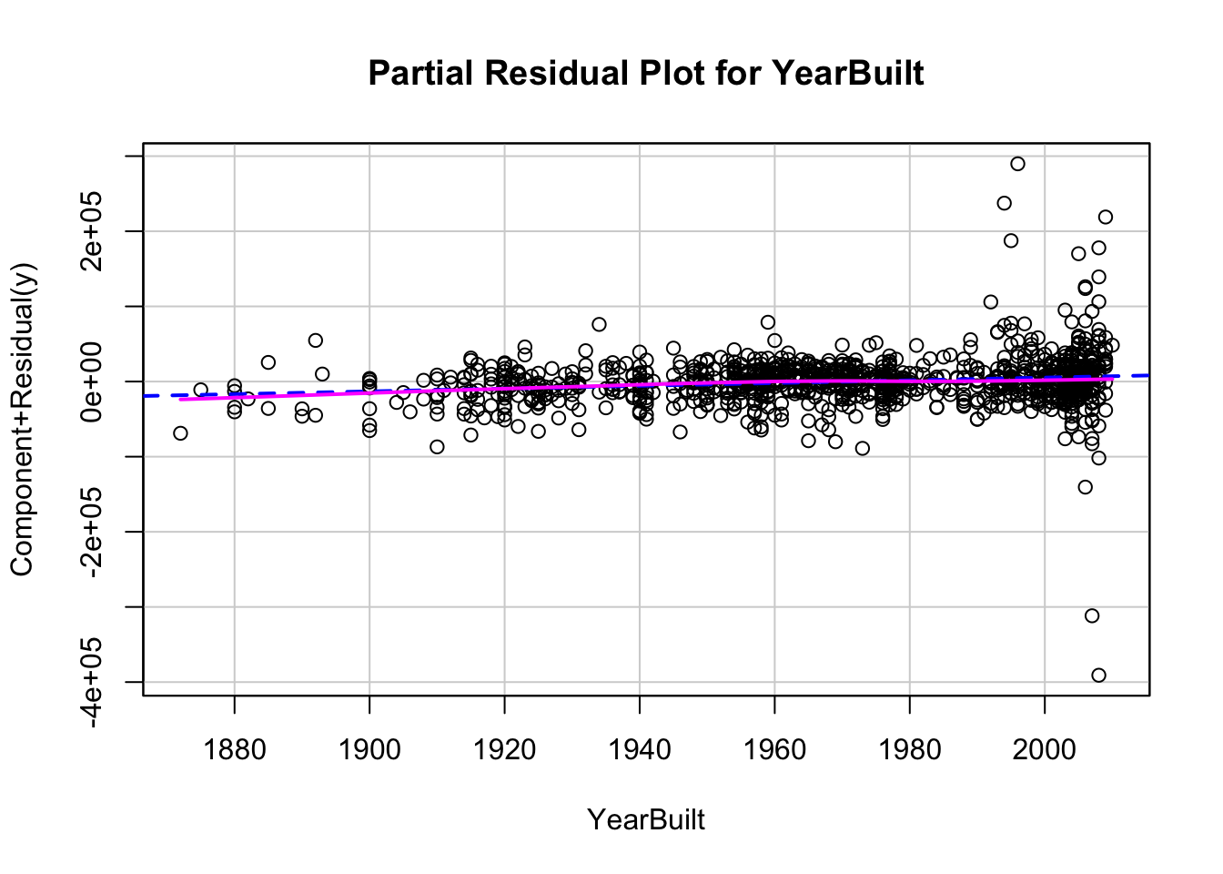
Let’s look at a plot of our residuals and partial residuals using each software!
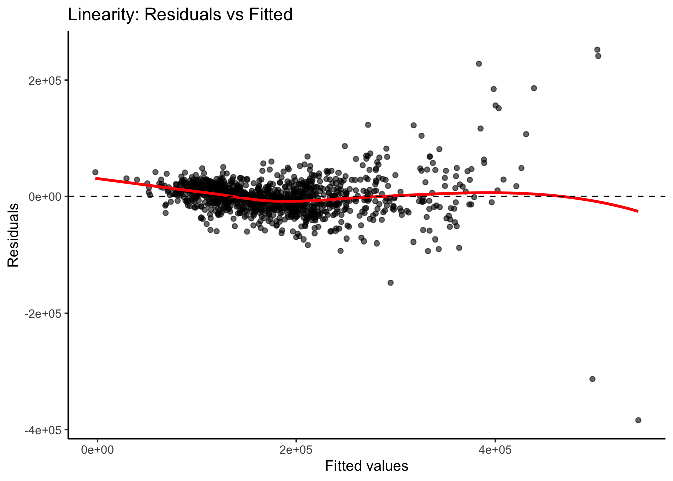
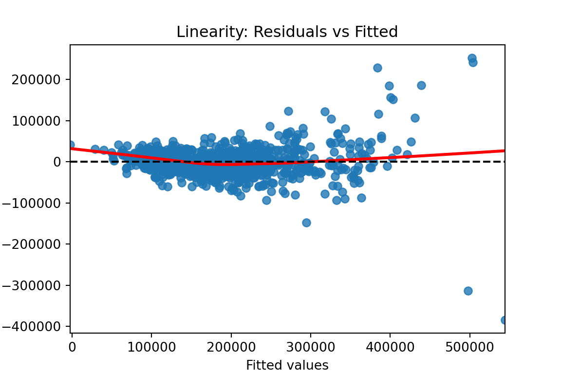
We previously calculated our predicted values and residuals in Python. Now we need to plot them. We will use the matplotlib and seaborn packages to do so. With the seaborn package’s residplot function we just put in the predicted values (fitted values) as well as the residuals into the x and y options respectively. The lowess = True option fits a smoothed curve through the data points. This can help us see if there is any remaining pattern. The last few options add a horizontal line at our residuals average value of 0 (axhline) and add some titles and labels to the plot.
Code
plt.figure(figsize = (6, 4))sns.residplot(x = fitted, y = residuals, lowess =True, line_kws = {'color': 'red'})plt.axhline(0, linestyle ='--', color ='black')plt.xlabel("Fitted values")plt.ylabel("Residuals")plt.title("Linearity: Residuals vs Fitted")plt.show()
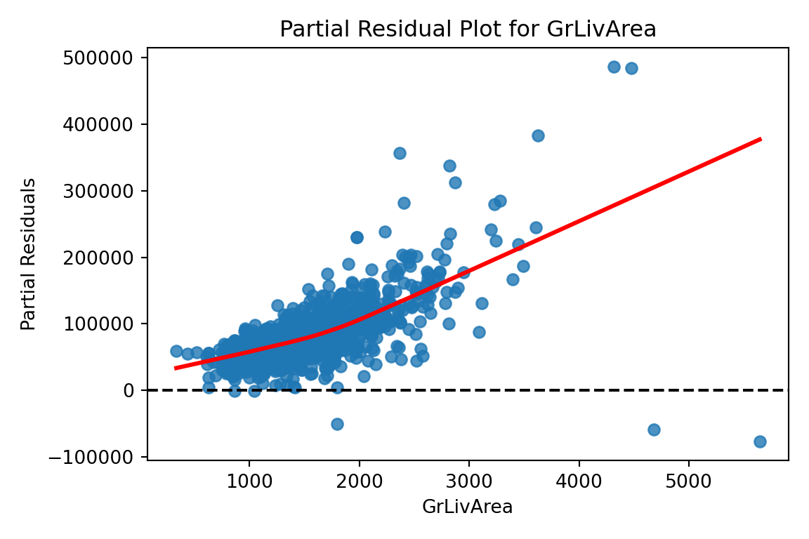
From the plot above we can see a few things. Immediately we notice some points that seem to be far away from the main cloud of data. The estimated line through our data points has a very slight curve. This subtle of a curve might not be enough to say there is a nonlinear pattern, especially with some of those extreme observations potentially skewing the curve. The points also seem to be closer together for lower predicted values and more spread apart for higher predicted values. This might break the equal variance assumption.
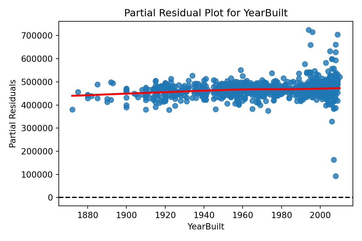
Now let’s explore our partial residuals. There is no easy function in Python to build these for us so we will have to build them by hand. First, we use the model.exog_names function to gather a list of our variable names from the model. Notice how we skip the first element (start at index 1 instead of 0) to skip the intercept. Next, we need to gather our three pieces for the calculation of partial residuals - the residuals themselves (resid), the \(\beta\) coefficient (params), and the variable values (model.exog specified at the specific variable name). From there we can easily calculate the partial residuals based on the simplified calculation from above. Lastly, we need to plot these partial residuals by the variable we are using with the regplot function from seaborn. We use a for loop to loop through all of the variables in our variable list.
The code below will plot all of the variables from our model, but we will only show a couple with our output.
Code
# Get list of predictors (exclude intercept)predictors = model.model.exog_names[1:] # Loop through predictors and generate partial residual plotsfor var in predictors: residuals = model.resid beta = model.params[var] x_var = model.model.exog[:, model.model.exog_names.index(var)] partial_residuals = residuals + beta * x_var# Plot plt.figure(figsize=(6, 4)) sns.regplot(x = x_var, y = partial_residuals, lowess =True, line_kws = {'color': 'red'}) plt.axhline(0, linestyle ='--', color ='black') plt.xlabel(var) plt.ylabel("Partial Residuals") plt.title(f"Partial Residual Plot for {var}") plt.tight_layout() plt.show()
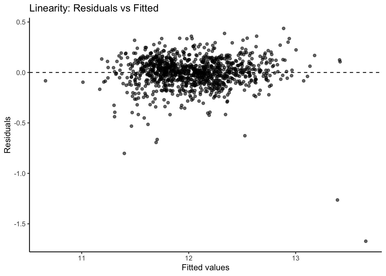
We previously calculated our predicted values and residuals in R. Now we need to plot them. We will use the ggplot2 and ggthemes packages to do so. First, our data needs to be in one dataframe. Using the data.frame function we input our predicted / fitted values and the residuals into one dataframe. With the ggplot2 package’s ggplot function we just put in the predicted values (fitted values) as well as the residuals into the x and y options respectively as well as the dataframe they are from. Inside of the geom_smooth function we use the method = "loess" option fits a smoothed curve through the data points. This can help us see if there is any remaining pattern. The last few options add a horizontal line at our residuals average value of 0 (geom_hline) and add some titles and labels to the plot along with a theme.
Code
library(ggplot2)library(ggthemes) resid_data <-data.frame(Fitted = fitted, Residuals = residuals)# Create the residual plotggplot(resid_data, aes(x = Fitted, y = Residuals)) +geom_point(alpha =0.6) +geom_smooth(method ="loess", se =FALSE, color ="red") +geom_hline(yintercept =0, linetype ="dashed", color ="black") +labs(x ="Fitted values",y ="Residuals",title ="Linearity: Residuals vs Fitted" ) +theme_classic()
From the plot above we can see a few things. Immediately we notice some points that seem to be far away from the main cloud of data. The estimated line through our data points has a very slight curve. This subtle of a curve might not be enough to say there is a nonlinear pattern, especially with some of those extreme observations potentially skewing the curve. The points also seem to be closer together for lower predicted values and more spread apart for higher predicted values. This might break the equal variance assumption.
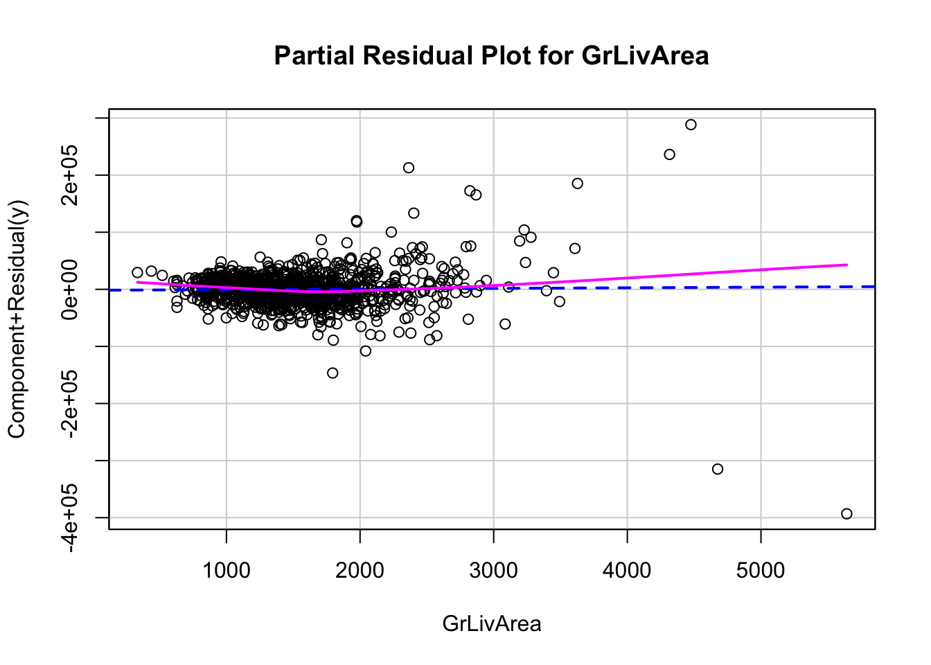
Now let’s explore our partial residuals. To do this we just use the crPlot function from the car package inside of a for loop. The for loop will loop through the crPlot function using all of the variable names obtained from the coef and names functions above it. Notice how we exclude the first element from the coefficient names since we do not want the intercept.
The code below will plot all of the variables from our model, but we will only show a couple with our output.
Code
library(car)# Get predictor names (excluding intercept)predictors <-names(coef(model))[-1]# Loop over each predictor and plotfor (pred in predictors) {crPlot(model, variable = pred,main =paste("Partial Residual Plot for", pred))}
Detecting Unequal Variance
One of the assumptions of linear regression is that the variance of the probability distribution of \(\varepsilon_i\) (usually denoted as \(\sigma^2\)) is constant. This property is called homoscedasticity. The breaking of this assumption is called heteroscedasticity. We want a model that is not more likely to be wrong by wider margins depending on if the prediction is a high or low prediction. We want regression models to have the same spread of errors no matter if the prediction is high or low.
One of the most common examples of when the assumption of homoscedasticity is broken is the following pattern to our residuals:
Example of Heteroscedastic Residuals
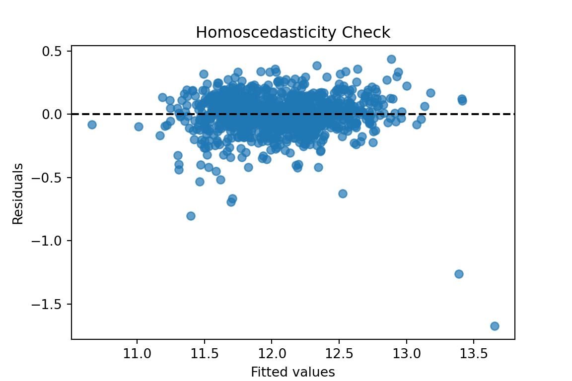
When looking at our residual plot there appears to be a similar pattern where we have low spread for low predictions and higher spread for higher predictions:
Visualizations are difficult to interpret and that interpretation is subjective at times. Formal statistical tests for heteroscedasticity put more of a scientific feel on the question of heteroscedasticity. One of the most popular test for heteroscedasticity is the Breusch-Pagan test. This test has the null hypothesis of homoscedasticity - the assumption of constant variance being met. The alternative hypothesis is heteroscedasticity - the assumption failing. This is a hypothesis test where we want a large (insignificant) p-value.
Let’s see how to calculate this test in each software!
All we need to run the Breusch-Pagan test in Python is the het_breuschpagan function from the statsmodels.stats.diagnostic package. The inputs to that function are residuals we calculated earlier as well as the values of each of the variables from the model (obtained with the model.exog function. From there we are just printing out the p-value from the test.
That p-value is extremely small and would be significant at any reasonable \(\alpha\)-level.
All we need to run the Breusch-Pagan test in Python is the bptest function from the lmtest package. The inputs to that function are just the model that built previously saved as model.
Code
library(lmtest)bptest(model)
    studentized Breusch-Pagan test

data:  model
BP = 318.18, df = 34, p-value < 2.2e-16
That p-value is extremely small and would be significant at any reasonable \(\alpha\)-level.
Based on the above tests there is a statistical problem with heteroscedasticity. The next step is to fix that problem.
One possibility is to transform your target variable with a variance stabilizing transformation. A variance stabilizing transformation is a mathematical transformation that converts a heteroscedastic model to a homoscedastic one. One of the most commonly used transformations to fix variance problems is the natural log.
Let’s transform our variables and explore the new model residuals in each software!
The log function from the numpy package transforms our target variable. We save this new variable as the object y2 instead. We now fit the same OLS regression using this new natural log of SalePrice. The results are printed below, but the main focus is on the new residuals.
Those residuals look much better in terms of heteroscedasticity. There are still some outliers that will make any statistical test say constant variance is broken, but the overall pattern looks much better than we had before.
The log function in R transforms our target variable. We save this new variable as the object y2 instead. We now fit the same OLS regression using this new natural log of SalePrice. The results are printed below, but the main focus is on the new residuals.
Code
y2 =log(train$SalePrice)# Build the linear regressionmodel2 <-lm(y2 ~ ., data = X_selected)# Print the model summary with p-values, coefficients, R², etc.summary(model2)
We calculate the predictions, residuals, and standardized residuals the same way we did before, but with the results form the new model.
Code
fitted2 <-fitted(model2)residuals2 <-residuals(model2)standardized_residuals2 <-rstandard(model2)resid_data2 <-data.frame(Fitted = fitted2, Residuals = residuals2)# Create the residual plotggplot(resid_data2, aes(x = Fitted, y = Residuals)) +geom_point(alpha =0.6) +geom_hline(yintercept =0, linetype ="dashed", color ="black") +labs(x ="Fitted values",y ="Residuals",title ="Linearity: Residuals vs Fitted" ) +theme_classic()
Those residuals look much better in terms of heteroscedasticity. There are still some outliers that will make any statistical test say constant variance is broken, but the overall pattern looks much better than we had before.
Normality
One of the assumptions of regression is that the probability distribution of \(\varepsilon_i\) is Normal. This is one of the hardest assumptions to meet in practice. However, if the assumption is not met on a small scale (symmetric, but not Normal, might be enough) then the results are not altered very much.
There are two common techniques to visually check for Normality of the error distribution.
Histograms of the residuals
Normal probability plots (Q-Q plots) of the residuals
Personally, I do not trust looking at histograms of data. Data is hard to check Normality with just histograms. This is because Normal distributions have specific properties that are hard to see visually. Although a histogram with symmetric that is in the shape of a bell-curve might be relatively easy to see, the thickness of the tails of a Normal distribution is hard to visualize and know for certain if it is Normal.
Q-Q plots are a far superior visual representation of Normality. These Normal probability plots compare the distribution of the residuals against expected quantiles from a Normal distribution with the same mean and standard deviation as the residuals. if the residuals are approximately equal to their expected points on the Normal distribution, then a straight, diagonal line is formed. Departures from a straight line are signs of the assumption not being met. The plot below shows when the assumption of Normality is being met as well as the common patterns from when it is not met:
Variety of Shapes of Q-Q Plots
If the Q-Q plot has a quadratic shape to it, that means that there is skewness in the data. The direction of the concavity of the quadratic curve shows which direction the skewness occurs. If you see an “S”-like or cubic shape to the Q-Q plot, then you have a kurtosis (thickness of tails) problem with your distribution. One of the deviations means your residuals have wider tails than a Normal distribution (Leptokurtic) and the other a more flat distribution (Platykurtic).
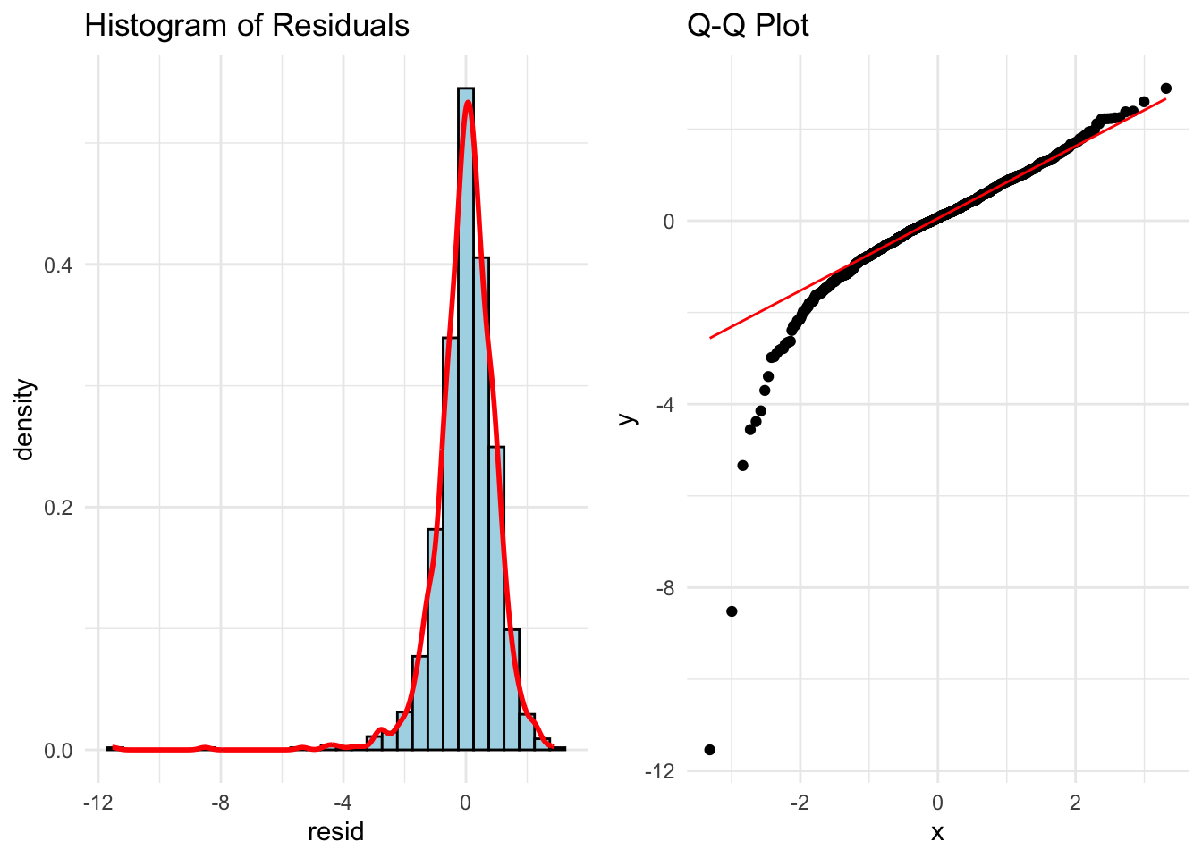
Let’s build histograms and Q-Q plots in each software!
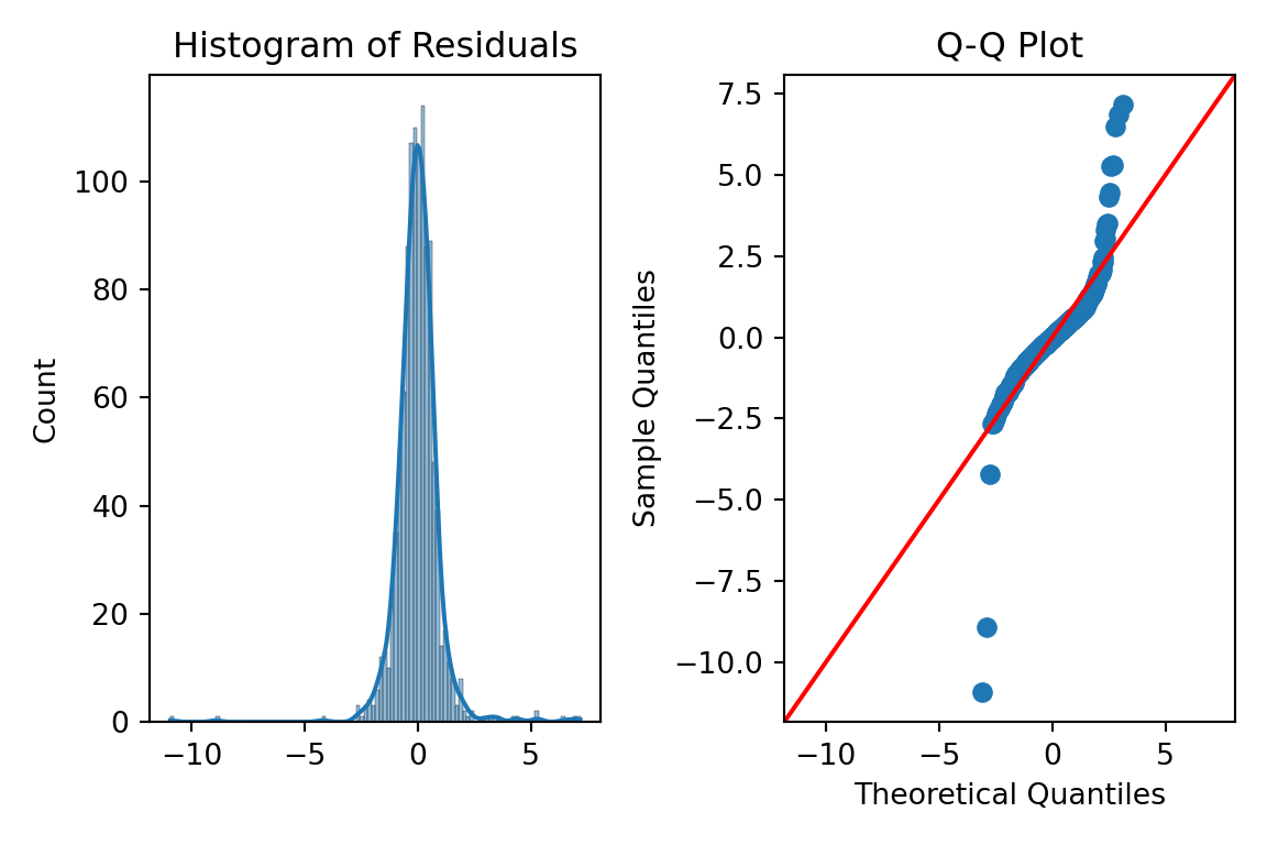
We can just use the histplot and qqplot functions from the seaborn package to easily build these for us. We will use the subpolots function from matplotlib to plot these beside each other for easier viewing. By putting in the standardized residuals we calculated from earlier in the code into each of these functions, we can evaluate their normality. Again, it is easier to truly evaluate normality with the Q-Q plot as compared to the histogram.
Code
fig, ax = plt.subplots(1, 2, figsize = (6, 4))# Histogram + Density Curvesns.histplot(standardized_residuals, kde =True, ax = ax[0])ax[0].set_title("Histogram of Residuals")# Q-Q plotsm.qqplot(standardized_residuals, line ='45', ax = ax[1])ax[1].set_title("Q-Q Plot")plt.tight_layout()plt.show()
Code
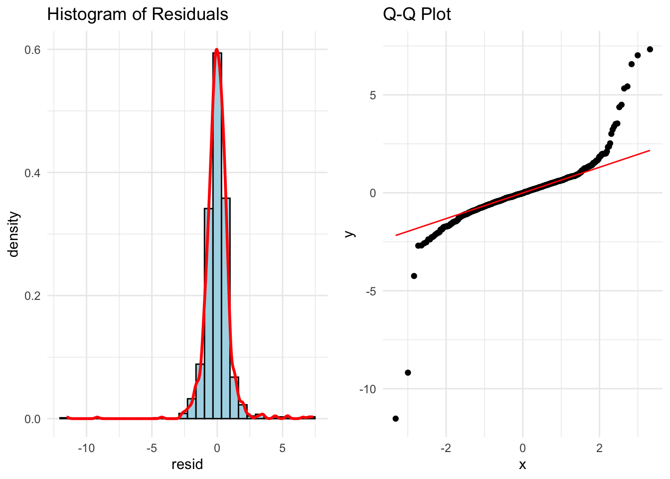
library(ggplot2)library(gridExtra)# Histogram + density plotp1 <-ggplot(data.frame(resid = standardized_residuals), aes(x = resid)) +geom_histogram(aes(y = ..density..), bins =30, fill ="lightblue", color ="black") +geom_density(color ="red", size =1) +ggtitle("Histogram of Residuals") +theme_minimal()# Q-Q plot using stats::qqnorm and qqlineqq_data <-data.frame(sample = standardized_residuals)p2 <-ggplot(qq_data, aes(sample = sample)) +stat_qq() +stat_qq_line(color ="red") +ggtitle("Q-Q Plot") +theme_minimal()# Arrange plots side-by-sidegrid.arrange(p1, p2, ncol =2)
Those Q-Q plots above show our residuals are not Normally distributed. However, visual inspection can be both difficult and subjective. There, we can add statistical tests for Normality to put more of a scientific feel on the question of Normality. There are many tests for Normality, but two of the most popular are the following:
Shapiro-Wilk (better for small to medium sample sizes < 2,000)
Anderson-Darling (better for larger sample sizes)
Both of these hypothesis test have the same null hypothesis - Normality. Since the alternative hypothesis for both tests is the distribution is not Normal, then we would prefer a larger p-value and these tests to not be statistically significant.
Let’s calculate both of these tests in each software!
In Python we just need to use the stats library from scipy. Inside of that library there is the shapiro and anderson functions to run each of our respective Normality tests on our previously calculated residuals.
Both of those tests show our data is statistically not Normally distributed at any reasonable \(\alpha\)-level.
In Python we just need to use the nortest package to the run the Anderson-Darling test. The Shapiro-Wilk test comes with base R’s preloaded stats package. Inside of those libraries there are the shapiro.test and ad.test functions to run each of our respective Normality tests on our previously calculated residuals.
Both of those tests show our data is statistically not Normally distributed at any reasonable \(\alpha\)-level.
We have ample evidence at this point to say that our residuals are definitely not Normally distributed.
One possible solution for having residuals that don’t follow a normal distribution is to transform the target variable. Similar to what we did for stabilizing variance for heteroscedasticity, when Normality is broken a transformation might help solve it.
A common statistical transformation is the Box-Coxtransformation:
The value of \(\lambda\) is optimized to best fit the data and typically done with the help of computers. Here are some common transformations based on their respective values of \(\lambda\):
Close to 1: No transformation
Close to 0: Natural log
Close to 0.5: Square root
Less than 0: Inverse
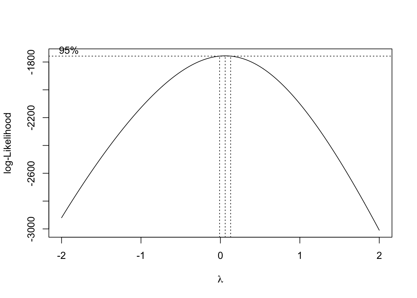
Let’s run the Box-Cox transformation in each software and try to fix our lack of Normality problem!
That value of \(\lambda\) is rather close to 0, but it is also negative. Therefore, either the natural log or inverse functions might work for our data. Let’s calculate each of those for our data.
The code is not shown to build the models and Q-Q plots for each as it would be just repeating a lot of the code above. Let’s just examine the Q-Q plots for each.
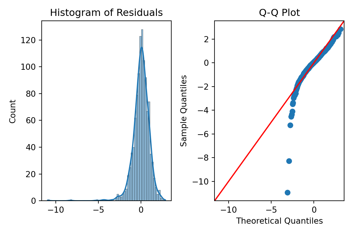
First, let’s look at the results from the natural log transformation on our target variable.
A majority of the plot looks really good except for the small part of the left hand tail still having some skewness. However, this skewness might be from a series of outliers in that tail.
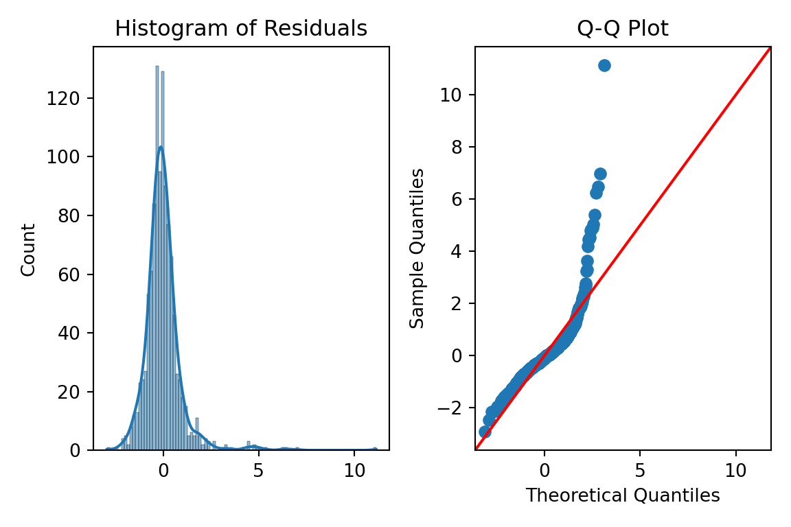
Next, let’s look at the results from the inverse transformation on our target variable.
We see a similar pattern here as we did with the natural log transformation, just in reverse. Here, we have some outliers causing skewness in the right hand tail instead.
We need the MASS package in R to calculate the Box-Cox transformation. The input to the boxcox function is the linear regression model object we previously built. We will evaluate \(\lambda\) values between -2 and 2 as those seem reasonable. Next, we extract the best \(\lambda\) value from our results using the which.max function.
That value of \(\lambda\) is rather close to 0, but it is also positive. Therefore, the natural log might work for our data. Luckily, we already calculated that transformation for our heteroscedasticity concerns earlier.
The code is not shown to build the models and Q-Q plots for this as it would be just repeating a lot of the code above. Let’s just examine the Q-Q plots for the natural log transformation on our target variable.
A majority of the plot looks really good except for the small part of the left hand tail still having some skewness. However, this skewness might be from a series of outliers in that tail.
Although not perfect, these plots look like they can get a strong majority of our data to be relatively normal. Since we needed the natural log transformation to help with heteroscedasticity already, it would be a logical choice to take that same transformation as a good solution to our Normality problem. There is still some skewness, but we have yet to evaluate outliers which we will do in subsequent sections.
Independence of Errors
Independence of errors typically is not a problem with a linear regression model built without using time series data. Cross-sectional data is collect across different individuals at a specific point in time. This is what we have with our housing dataset. Time series data on the other hand is collected for one individual (typically) across consecutive points in time. An example of this would be watching the average price of homes over time.
Regression models of time series data can lead to problems in the modeling process. The value of a time series at the point in time \(t\) is often related to the value at the point in time \(t+1\). For example, the average price of homes today is highly correlated to what that average price of homes will be tomorrow, but much less correlated to what the average price of homes will be in a decade. Errors are now correlated with each other which underestimates\(\beta\) coefficients.
The Durbin-Watson test is a populat statistical test to see if there is possible correlation across observations in our residuals. The null hypothesis for this test is no residual correlation, while the alternative is that there is residual correlation. The Durbin-Waston \(d\) test statistic for residual correlation is the following:
\[
d = \frac{\sum_{t=2}^n (\hat\varepsilon_t - \hat\varepsilon_{t-1})^2}{\sum_{t=1}^n \hat\varepsilon^2}
\]
The numerator in the above test statistic is the difference between errors at successive points in time. The \(d\) statistic has the following properties:
\(0 \le d \le 4\)
\(d \approx 2\): uncorrelated
\(d<2\): positively correlated
\(d>2\): negatively correlated
The sampling distribution of \(d\) is very complex, so no direct cut-off can be calculated for the statistic. This makes p-value calculations difficult and approximate.
Typically, we would not need to even run this test as our data is not recorded over time and therefore, we wouldn’t need to evaluate if it has correlation over time. However, just for completeness, let’s see how to do this in each software!
Not surprisingly, our Durbin-Watson test statistic is rather close to 2 and uncorrelated. Our data isn’t is ordered in any notion of time so again, this would not need calculating for our dataset.
We will again use a function from the lmtest package. Here we input our model object into the dwtest function to get the test statistic.
Not surprisingly, our Durbin-Watson test statistic is rather close to 2 and uncorrelated. Our data isn’t is ordered in any notion of time so again, this would not need calculating for our dataset.
Outliers and Influential Observations
We have seen through previous looks through the residuals of our data that there are observations in our data that seem to be out of line with a majority of the data.
Observations with residuals that are extremely large are called outliers. When we say extremely large, we typically mean 3 standard deviations away from the mean. Remember, the mean of the residuals is 0. Our standardized residuals that we calculated earlier help us with this evaluation:
These residuals are not just adjusted for scale, but also for the possibility of their influence, here measured with leverage, \(h_i\). Similar to standardized residuals, the typical value of 3 or more represents large studentized residuals.
The leverage of an observation, \(h_i\) is the influence of that particular observation on the respective predicted value. In other words, how do the respective values of the predictor variables for the \(i^{th}\) observation affect the prediction \(\hat y_i\). The equation for leverage is not show here due to its complication. We will just rely on our software.
Leverage is one way to measure the impact an observation has on the regression analysis. Any observations with large impacts on the regression analysis are called influence observations. The following leverage values would imply an observation has an extremely large influence on the model:
\[
h_i > \frac{2(k+1)}{n}
\]
Cook’s D (distance) is another way to determine is an observation is an influential observation. Cook’s D measure the influence of each observation on the estimated \(\beta\) coefficients overall.
The primary method of looking at outliers and influential observations in Python’s statsmodels package is the OLSInfluence function from the stats.outliers_influence part of statsmodels. We apply this OLSInfluence function on our model object. Here we are using the original model, but we could easily just use the second model where we transformed the target with the natural log. We already calculated the standardized residuals earlier and can examine if any of those take values over 3. However, here we will calculate the studentized residuals with the resid_studentized_internal function. From there we print our outliers.
The above output gives the row value for each outlier based on studentized residuals. Let’s compare these values to some of the influential observation calculations.
To calculate leverage we will use the hat_matrix_diag function. We will print out only the observations that are greater than our leverage cut-off as defined above.
The above output gives the row value for each influential observation based on leverage.
To get Cook’s D we will just use the cooks_distance function from the same OLSInfluence object we have been working with. Again, we will compare all of our observations to our cut-off defined above and print only the influential ones out.
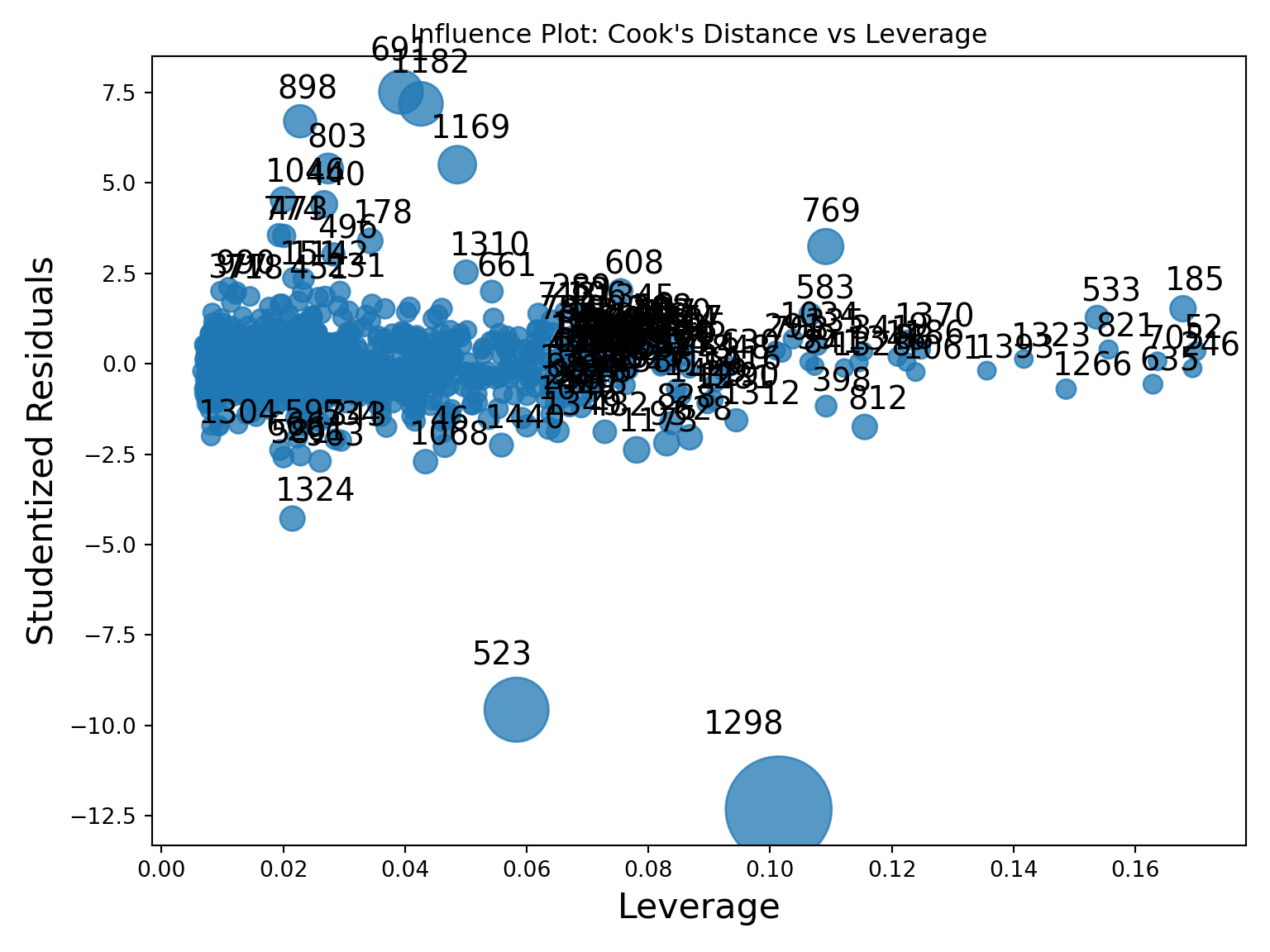
To try and view some of these all together, the statsmodels package has a graphics.influence_plot function. We just input our model object from before and specify the criterion = "cooks" option.
This plot compares all three of the above. The vertical axis shows studentized residuals. Points far away from the cloud vertically (with values above 3 or below -3) would be outliers. Points with high values of leverage would be points to the far right of the plot. The size of bubbles corresponds to Cook’s D so bigger bubbles are more influential too. We can see that observation 1298 seems to be both a high leverage point as well as an outlier. It also has a really large value for Cook’s D. Not all of these will always agree, but they do on this point.
Outliers and influential points should not just be dropped from an analysis without further inspecting the data point for possible errors or interesting factors that might be able to be included in a model. The code below takes the metrics we calculated, puts them into a pandasDataframe and then prints them out by descending values of Cook’s D.
Code
diagnostics = pd.DataFrame({'y': model.model.endog,'fitted': model.fittedvalues,'resid': model.resid,'std_resid': std_resid,'leverage': leverage,'cooks_d': cooks_d})# Sort by most Cook’s Dprint("\nTop 5 most influential observations:")
The primary method of looking at outliers and influential observations is R’s car package. We apply this rstudent function on our model object. Here we are using the original model, but we could easily just use the second model where we transformed the target with the natural log. We already calculated the standardized residuals earlier and can examine if any of those take values over 3. However, here we will calculate the studentized residuals. From there we print our outliers.
The above output gives the row value for each outlier based on studentized residuals. Let’s compare these values to some of the influential observation calculations.
To calculate leverage we will use the hatvalues function. We will print out only the observations that are greater than our leverage cut-off as defined above.
The above output gives the row value for each influential observation based on leverage.
To get Cook’s D we will just use the cooks.distance function from the same model object we have been working with. Again, we will compare all of our observations to our cut-off defined above and print only the influential ones out.
Code
cooks_d <-cooks.distance(model)influential_points <-which(cooks_d >4/ n)cat(sprintf("Influential points (Cook's D > %.3f): %s\n", 4/ n, toString(influential_points)))
This plot compares all three of the above. The vertical axis shows studentized residuals. Points far away from the cloud vertically (with values above 3 or below -3) would be outliers. Points with high values of leverage would be points to the far right of the plot. The size of bubbles corresponds to Cook’s D so bigger bubbles are more influential too. We can see that observation 1298 seems to be both a high leverage point as well as an outlier. It also has a really large value for Cook’s D. Not all of these will always agree, but they do on this point.
Outliers and influential points should not just be dropped from an analysis without further inspecting the data point for possible errors or interesting factors that might be able to be included in a model. The code below takes the metrics we calculated, puts them into a dataframe and then prints them out by descending values of Cook’s D.
Code
# ---- Combine into a DataFrame ----diagnostics <-data.frame(y = model$model[[1]],fitted =fitted(model),resid =resid(model),std_resid =rstudent(model),leverage =hatvalues(model),cooks_d =cooks.distance(model))cat("\nTop 5 most influential observations (by Cook's D):\n")
Top 5 most influential observations (by Cook's D):
Multicollinearity Occurs when two or more of the predictor variables in a regression model are correlated with each other. If two inputs are correlated, they could be bringing similar information to the prediction of the target variable. To be a problem the correlation must be high, which is good because it is difficult to find predictor variables that are not correlated with each other.
High correlation between multiple predictor variables could lead to the following problems:
Errors in the calculation of the parameter estimates
Errors in the calculation of the standard errors
Results that are counterintuitive (parameters estimates with opposite signs)
There are some easy signs for the presence of severe multicollinearity in a regression model:
Incorrect signs of coefficients on predictor variables
Extreme differences in coefficients of predictor variables after the addition (or deletion) of another predictor variable
Switches in significance of predictor variables
A more formal way to evaluate if there are problems with multicollinearity is the variance inflation factor (VIF). The VIF is the amount of inflation of the standard error of the parameter estimates due to multicollinearity. Recall the equation for standard errors of parameter estimates in multiple linear regression:
The value of \((1-R^2_j)\) is called the tolerance. The inverse of the tolerance, \(\frac{1}{(1-R_j^2)}\), is the VIF. In linear regression, when the VIF is greater than 10, we have a problem of multicollinearity.
The solutions to high multicollinearity are the following:
Drop one of the correlated variables
Avoid making inferences about the parameter estimates
Biased regression techniques
The easiest solution to multicollinearity is the first one - dropping one of the variables causing the problem. If there are two variables that are highly correlated with each other we do not want to drop them both. They have made it this far in the analysis because they provide valuable information. However, they are just providing a severe overlap of information. Dropping all but one of these variables usually solves the multicollinearity problem.
The second solution is not as helpful, especially in the business world where we can’t just ignore what a variable’s stated impact is on the regression model. The third solution, biased regression techniques, will be covered in a subsequent section of this code deck.
In Python we can just use the variance_inflation_factor function from the statsmodels.stats.outliers_influence package. We just need to input the values of our predictor variables. We just create a blank pandasDataFrame to store our column names and VIF values. The columns function will grab the names while the variance_inflation_factor function applied to the values of our predictor variables will calculate the VIF’s. We are just using a for loop to use this function across all predictor variables in the range of our predictor variables.
Code
from statsmodels.stats.outliers_influence import variance_inflation_factorvif_data = pd.DataFrame()vif_data["feature"] = X_selected.columnsvif_data["VIF"] = [variance_inflation_factor(X_selected.values, i) for i inrange(X_selected.shape[1])]print(vif_data)
We can see there are some problems in the above output. We have some extremely large values of infinity. Those infinite values mean that we have perfect multicollinearity. Perfect multicollinearity occurs when two or more predictor variables are perfect combinations of each other (or take the exact same values). As we explore these variables we see they are all missing flag variables for things related to the home’s garage.
Let’s drop three of those variables are rerun the code to see what the VIF values are now!
Code
X_selected = X_selected.drop(['GarageType_Missing', 'GarageQual_Missing','GarageCond_Missing'], axis=1)vif_data = pd.DataFrame()vif_data["feature"] = X_selected.columnsvif_data["VIF"] = [variance_inflation_factor(X_selected.values, i) for i inrange(X_selected.shape[1])]print(vif_data)
Those VIF values are all much more reasonable as they are all below 10.
In R, we can simply use the vif function from the car package. The input to the vif function is just the same model object we have been using from our linear regression model. We then create a data.frame to store all of our values to print them out.
However, if you were to run the following code, R would report an error around aliased coefficients.
Those aliased coefficients are the ones in the linear regression output that have NA values. Those mean that we have perfect multicollinearity. Perfect multicollinearity occurs when two or more predictor variables are perfect combinations of each other (or take the exact same values).
The car package also has an alias function where you can put in your model object to discover the problem variables. In all of the output below it shows the values of not 0 where there are problems.
As we explore these variables we see they are all missing flag variables for things related to the home’s garage. Let’s drop three of those variables are rerun the code to see what the VIF values are now!
Those VIF values are all much more reasonable as they are all below 10.
Another option outside of the popular vif function from the car package is the check_collinearity function from the performance package. This function is not bothered by aliased coefficients like the vif function and just drops them in the calculation of the VIF.
We see the same final results here as we got after dropping the variables with perfect multicollinearity.
Source Code
---title: "Diagnostics"format: html: code-fold: show code-tools: trueengine: knitreditor: visual---```{r}#| include: false#| warning: false#| error: false#| message: falselibrary(reticulate)reticulate::use_condaenv("wfu_fall_ml", required =TRUE)``````{python}#| warning: false#| error: false#| message: false#| include: falsefrom sklearn.datasets import fetch_openmlimport pandas as pdfrom sklearn.feature_selection import SelectKBest, f_regression# Load Ames Housing datadata = fetch_openml(name="house_prices", as_frame=True)ames = data.frame# Remove Business Logic Variablesames = ames.drop(['Id', 'MSSubClass','Functional','MSZoning','Neighborhood', 'LandSlope','Condition2','OverallCond','RoofStyle','RoofMatl','Exterior1st','Exterior2nd','MasVnrType','MasVnrArea','ExterCond','BsmtCond','BsmtExposure','BsmtFinType1','BsmtFinSF1','BsmtFinType2','BsmtFinSF2','BsmtUnfSF','Electrical','LowQualFinSF','BsmtFullBath','BsmtHalfBath','KitchenAbvGr','GarageFinish','SaleType','SaleCondition'], axis=1)# Remove Missingness Variablesames = ames.drop(['PoolQC', 'MiscFeature','Alley', 'Fence'], axis=1)# Impute Missingness for Categorical Variablescat_cols = ames.select_dtypes(include=['object', 'category']).columnsames[cat_cols] = ames[cat_cols].fillna('Missing')# Remove Low Variability Variablesames = ames.drop(['Street', 'Utilities','Heating'], axis=1)# Train / Test Splitfrom sklearn.model_selection import train_test_splittrain, test = train_test_split(ames, test_size =0.25, random_state =1234)# Impute Missing for Continuous Variablesnum_cols = train.select_dtypes(include='number').columnsfor col in num_cols:if train[col].isnull().any():# Create missing flag column train[f'{col}_was_missing'] = train[col].isnull().astype(int)# Impute with median median = train[col].median() train[col] = train[col].fillna(median)# Prepare X and y Objectsimport statsmodels.api as smpredictors = train.drop(columns=['SalePrice'])predictors = pd.get_dummies(predictors, drop_first=True)predictors = predictors.astype(float)X = predictorsy = train['SalePrice']# Initial Variable Selectionselector = SelectKBest(score_func=f_regression, k='all') selector.fit(X, y)pval_df = pd.DataFrame({'Feature': X.columns,'F_score': selector.scores_,'p_value': selector.pvalues_})selected_features = pval_df[pval_df['p_value'] <0.009]['Feature']X_reduced = X[selected_features.tolist()]``````{r}#| warning: false#| error: false#| message: false#| include: falselibrary(tidyverse)library(broom)library(dplyr)train <- py$traintest <- py$testy <- train$SalePricepredictors <- train %>%select(-SalePrice)# Dummy Code the Categorical VariablesX <-model.matrix(~ . -1, data = predictors) %>%as.data.frame()names(X)[names(X) =="`1stFlrSF`"] <-"FirstFlrSF"names(X)[names(X) =="`2ndFlrSF`"] <-"SecondFlrSF"names(X)[names(X) =="`3SsnPorch`"] <-"ThreeStoryPorch"features <-names(X)# Loop through each feature, run univariate linear regression, and sortscores_df <-lapply(features, function(feat) { model <-lm(as.formula(paste("y ~", feat)), data =cbind(y = y, X)) f_val <-summary(model)$fstatisticdata.frame(Feature = feat,F_score = f_val[1],p_value =pf(f_val[1], f_val[2], f_val[3], lower.tail =FALSE) )}) %>%bind_rows() %>%arrange(desc(F_score))# Filter for features with p-value < 0.009selected_features <- scores_df %>%filter(p_value <0.009) %>%pull(Feature)# Create a new data frame with only those selected columnsX_reduced <- X[, selected_features, drop =FALSE]```# Residual AnalysisLinear regression models have key assumptions:1. The mean of the target is accurately modeled by a linear function of the predictors.2. The random error term, $\varepsilon$, is assumed to have a constant variance, $\sigma^2$.3. The random error term, $\varepsilon$, is assumed to have a normal distribution with a mean of 0.4. The errors are independent of each other.Sometimes, people state a 5th assumption:5. No perfect collinearityTo start, we will deal with the first four assumptions as they are the primary assumptions of linear regression. Notice how each of the first four assumptions deal with the errors in some capacity. Assumptions 2 - 4 directly mention assumptions. The first assumption around linearity deals with a model not being fit well which results in patterns in our errors.Let's look at those first four assumptions visually:{fig-align="center" width="7.61in"}Notice how we have a relationship between the predictor variable and target variable. That relationship is not perfect and has some errors. However, those errors follow normal distributions at every point along the regression line. These errors all have the same spread, or variance, along the whole regression line as well.We do not actually view the true errors of our model, $\varepsilon_i$, in practice.$$y_i = \beta_0 + \beta_1 x_{1,i} + \cdots + \beta_k x_{k,i} + \varepsilon_i$$$$\varepsilon_i = y_i - (\beta_0 + \beta_1 x_{1,i} + \cdots + \beta_k x_{k,i})$$We do not observe actual errors because we don't know the actual $\beta$ coefficients. Instead, we have an estimate of the error - called a **residual**.$$\hat{\varepsilon}_i = y_i - (\hat{\beta}_0 + \hat{\beta}_1 x_{1,i} + \cdots + \hat{\beta}_k x_{k,i})$$$$\hat{\varepsilon}_i = y_i - \hat{y}_i$$These residuals are just the difference between the true value of our target at each observation and the predicted values from our model of those observations. The following is a visual representation of that concept:{fig-align="center" width="5.64in"}Let's see how to get these residuals from each software!::: {.panel-tabset .nav-pills}## PythonWe are going to use the final variable list from our cross-validated stepwise regression from the previous section. These selected variables will go into an object called `X_selected`. We then use the `statsmodels.api` package and the `add_constant` function to add a column of 1's for the intercept term. Lasty, using a combination of the `OLS` and `fit` functions we have our linear regression model. The results are printed out with the `summary` function.```{python}#| warning: false#| error: false#| message: falseimport numpy as npimport pandas as pdimport seaborn as snsimport matplotlib.pyplot as pltimport statsmodels.api as smfrom scipy import statsselected_features = ['OverallQual', 'YearBuilt', 'YearRemodAdd', 'GrLivArea', 'Fireplaces', 'GarageYrBlt', 'GarageCars', 'WoodDeckSF', 'ScreenPorch', 'GarageYrBlt_was_missing', 'LotShape_IR2', 'LotShape_Reg', 'LandContour_HLS', 'LotConfig_CulDSac', 'Condition1_Norm', 'BldgType_2fmCon', 'BldgType_Duplex', 'BldgType_Twnhs', 'HouseStyle_2Story', 'ExterQual_Fa', 'ExterQual_TA', 'Foundation_CBlock', 'Foundation_PConc', 'BsmtQual_Fa', 'BsmtQual_Gd', 'BsmtQual_Missing', 'BsmtQual_TA', 'HeatingQC_Gd', 'HeatingQC_TA', 'KitchenQual_Fa', 'KitchenQual_Gd', 'KitchenQual_TA', 'GarageType_Missing', 'GarageQual_Fa', 'GarageQual_Missing', 'GarageQual_TA', 'GarageCond_Missing']# Subset the DataFrame to selected features and build modelX_selected = X_reduced[selected_features].copy()X_selected = sm.add_constant(X_selected)model = sm.OLS(y, X_selected).fit()# Summary with p-values, coefficients, R², etc.print(model.summary())```The results above are there for comparison of later adjustments to the model if needed. To do residual analysis we need to gather the predicted values and residuals from our model. The `fittedvalues` function gives us predicted values from our training data. The `resid` function gives us the corresponding residuals.Later calculations will require our residuals to be standardized. Here we are calculating the standardized residuals by dividing the residuals by the model's $RMSE$.$$\hat{\varepsilon}_i^* = \frac{\hat{\varepsilon}_i}{\sqrt{MSE}}$$Recall from the previous section that the $RMSE$ is the estimated standard deviation of the residuals. To get the model's $MSE$ we use the `mse_resid` function. From there we just calculate its square root using the `numpy` package's `sqrt` function.```{python}#| warning: false#| error: false#| message: falsefitted = model.fittedvaluesresiduals = model.residstandardized_residuals = residuals / np.sqrt(model.mse_resid) ```## RWe are going to use the final variable list from our cross-validated stepwise regression from the previous section. To make the results consistent between Python and R, we will just use the variables flagged by Python here. These selected variables will go into an object called `X_selected`. We then use the `statsmodels.api` package and the `add_constant` function to add a column of 1's for the intercept term. Lasty, using a combination of the `OLS` and `fit` functions we have our linear regression model. The results are printed out with the `summary` function.```{r}#| warning: false#| error: false#| message: falseX_reduced <- py$X_reducedselected_features <-c('OverallQual', 'YearBuilt', 'YearRemodAdd', 'GrLivArea', 'Fireplaces', 'GarageYrBlt', 'GarageCars', 'WoodDeckSF', 'ScreenPorch', 'GarageYrBlt_was_missing', 'LotShape_IR2', 'LotShape_Reg', 'LandContour_HLS', 'LotConfig_CulDSac', 'Condition1_Norm', 'BldgType_2fmCon', 'BldgType_Duplex', 'BldgType_Twnhs', 'HouseStyle_2Story', 'ExterQual_Fa', 'ExterQual_TA', 'Foundation_CBlock', 'Foundation_PConc', 'BsmtQual_Fa', 'BsmtQual_Gd', 'BsmtQual_Missing', 'BsmtQual_TA', 'HeatingQC_Gd', 'HeatingQC_TA', 'KitchenQual_Fa', 'KitchenQual_Gd', 'KitchenQual_TA', 'GarageType_Missing', 'GarageQual_Fa', 'GarageQual_Missing', 'GarageQual_TA', 'GarageCond_Missing')X_selected <- X_reduced[, selected_features]# Build the linear regressionmodel <-lm(y ~ ., data = X_selected)# Print the model summary with p-values, coefficients, R², etc.summary(model)```The results above are there for comparison of later adjustments to the model if needed. To do residual analysis we need to gather the predicted values and residuals from our model. The `fittedvalues` function gives us predicted values from our training data. The `resid` function gives us the corresponding residuals.Later calculations will require our residuals to be standardized. Here we are calculating the standardized residuals by dividing the residuals by the model's $RMSE$.$$\hat{\varepsilon}_i^* = \frac{\hat{\varepsilon}_i}{\sqrt{MSE}}$$Recall from the previous section that the $RMSE$ is the estimated standard deviation of the residuals. To get the model's $MSE$ we use the `mse_resid` function. From there we just calculate its square root using the `numpy` package's `sqrt` function.```{r}#| warning: false#| error: false#| message: falsefitted <-fitted(model)residuals <-residuals(model)standardized_residuals <-rstandard(model)```:::Now that we have our residuals we can evaluate our assumptions.## Linearity / Lack-of-FitOne of the assumptions of linear regression assumes that the expected value of the target variable is accurately modeled by a linear function of the predictor variables. We want our models to best represent the real relationship between our predictors and the target variable. If this is true, then we would expect our residual plots to be random scatter of observations (in other words, all of the “signal” was correctly captured in the model and there is just noise left over). If the residuals are not randomly scattered, then they are revealing potential misspecification (or **lack-of-fit**) of the model.Here are the steps for detecting lack-of-fit in a model:1. Plot residuals against the predicted values of the target variable.2. Plot the partial residuals against each predictor variable.3. Look for patterns in these plots: - Trends - Changes in variation - Isolated, extreme observationsPartial residuals measure the effect of an individual variable $x_i$ after accounting for all of the other predictor variables. The partial residuals for the $j^{th}$ variable, $x_j$, are defined as:$$e_i^* = y_i - (\hat{\beta}_0 + \hat{\beta}_1 x_{1,i} + \cdots + \hat{\beta}_{j-1} x_{j-1,i} + \hat{\beta}_{j+1} x_{j+1,i} + \cdots + \hat{\beta}_k x_{k,i})$$$$e_i^* = \hat{\varepsilon}_i + \hat\beta_j x_j$$Essentially, the variable $x_j$ as well as its coefficient has been removed from our calculation. That will allow us to see how that variable impacts the relationship. If we see any non-linear patterns that would be a sign that more signal remains.Let's look at a plot of our residuals and partial residuals using each software!::: {.panel-tabset .nav-pills}## PythonWe previously calculated our predicted values and residuals in Python. Now we need to plot them. We will use the `matplotlib` and `seaborn` packages to do so. With the `seaborn` package's `residplot` function we just put in the predicted values (fitted values) as well as the residuals into the `x` and `y` options respectively. The `lowess = True` option fits a smoothed curve through the data points. This can help us see if there is any remaining pattern. The last few options add a horizontal line at our residuals average value of 0 (`axhline`) and add some titles and labels to the plot.```{python}#| warning: false#| error: false#| message: falseplt.figure(figsize = (6, 4))sns.residplot(x = fitted, y = residuals, lowess =True, line_kws = {'color': 'red'})plt.axhline(0, linestyle ='--', color ='black')plt.xlabel("Fitted values")plt.ylabel("Residuals")plt.title("Linearity: Residuals vs Fitted")plt.show()```From the plot above we can see a few things. Immediately we notice some points that seem to be far away from the main cloud of data. The estimated line through our data points has a very slight curve. This subtle of a curve might not be enough to say there is a nonlinear pattern, especially with some of those extreme observations potentially skewing the curve. The points also seem to be closer together for lower predicted values and more spread apart for higher predicted values. This might break the equal variance assumption.Now let's explore our partial residuals. There is no easy function in Python to build these for us so we will have to build them by hand. First, we use the `model.exog_names` function to gather a list of our variable names from the model. Notice how we skip the first element (start at index 1 instead of 0) to skip the intercept. Next, we need to gather our three pieces for the calculation of partial residuals - the residuals themselves (`resid`), the $\beta$ coefficient (`params`), and the variable values (`model.exog` specified at the specific variable name). From there we can easily calculate the partial residuals based on the simplified calculation from above. Lastly, we need to plot these partial residuals by the variable we are using with the `regplot` function from `seaborn`. We use a `for` loop to loop through all of the variables in our variable list.The code below will plot all of the variables from our model, but we will only show a couple with our output.```{python}#| warning: false#| error: false#| message: false#| eval: false# Get list of predictors (exclude intercept)predictors = model.model.exog_names[1:] # Loop through predictors and generate partial residual plotsfor var in predictors: residuals = model.resid beta = model.params[var] x_var = model.model.exog[:, model.model.exog_names.index(var)] partial_residuals = residuals + beta * x_var# Plot plt.figure(figsize=(6, 4)) sns.regplot(x = x_var, y = partial_residuals, lowess =True, line_kws = {'color': 'red'}) plt.axhline(0, linestyle ='--', color ='black') plt.xlabel(var) plt.ylabel("Partial Residuals") plt.title(f"Partial Residual Plot for {var}") plt.tight_layout() plt.show()``````{python}#| warning: false#| error: false#| message: false#| echo: false# Get list of predictors (exclude intercept)predictors = ['GrLivArea', 'YearBuilt']# Loop through predictors and generate partial residual plotsfor var in predictors: residuals = model.resid beta = model.params[var] x_var = model.model.exog[:, model.model.exog_names.index(var)] partial_residuals = residuals + beta * x_var# Plot plt.figure(figsize=(6, 4)) sns.regplot(x=x_var, y=partial_residuals, lowess=True, line_kws = {'color': 'red'}) plt.axhline(0, linestyle='--', color='black') plt.xlabel(var) plt.ylabel("Partial Residuals") plt.title(f"Partial Residual Plot for {var}") plt.tight_layout() plt.show()```## RWe previously calculated our predicted values and residuals in R. Now we need to plot them. We will use the `ggplot2` and `ggthemes` packages to do so. First, our data needs to be in one dataframe. Using the `data.frame` function we input our predicted / fitted values and the residuals into one dataframe. With the `ggplot2` package's `ggplot` function we just put in the predicted values (fitted values) as well as the residuals into the `x` and `y` options respectively as well as the dataframe they are from. Inside of the `geom_smooth` function we use the `method = "loess"` option fits a smoothed curve through the data points. This can help us see if there is any remaining pattern. The last few options add a horizontal line at our residuals average value of 0 (`geom_hline`) and add some titles and labels to the plot along with a theme.```{r}#| warning: false#| error: false#| message: falselibrary(ggplot2)library(ggthemes) resid_data <-data.frame(Fitted = fitted, Residuals = residuals)# Create the residual plotggplot(resid_data, aes(x = Fitted, y = Residuals)) +geom_point(alpha =0.6) +geom_smooth(method ="loess", se =FALSE, color ="red") +geom_hline(yintercept =0, linetype ="dashed", color ="black") +labs(x ="Fitted values",y ="Residuals",title ="Linearity: Residuals vs Fitted" ) +theme_classic()```From the plot above we can see a few things. Immediately we notice some points that seem to be far away from the main cloud of data. The estimated line through our data points has a very slight curve. This subtle of a curve might not be enough to say there is a nonlinear pattern, especially with some of those extreme observations potentially skewing the curve. The points also seem to be closer together for lower predicted values and more spread apart for higher predicted values. This might break the equal variance assumption.Now let's explore our partial residuals. To do this we just use the `crPlot` function from the `car` package inside of a `for` loop. The `for` loop will loop through the `crPlot` function using all of the variable names obtained from the `coef` and `names` functions above it. Notice how we exclude the first element from the coefficient names since we do not want the intercept.The code below will plot all of the variables from our model, but we will only show a couple with our output.```{r}#| warning: false#| error: false#| message: false#| eval: falselibrary(car)# Get predictor names (excluding intercept)predictors <-names(coef(model))[-1]# Loop over each predictor and plotfor (pred in predictors) {crPlot(model, variable = pred,main =paste("Partial Residual Plot for", pred))}``````{r}#| warning: false#| error: false#| message: false#| echo: falselibrary(car)X_reduced_p <- X_reduced %>%select(-GarageType_Missing, -GarageQual_Missing, -GarageCond_Missing )model_p <-lm(y ~ ., data = X_reduced_p)# Get predictor names (excluding intercept)predictors <-c("GrLivArea", "YearBuilt")# Loop over each predictor and plotfor (pred in predictors) {crPlot(model_p, variable = pred,main =paste("Partial Residual Plot for", pred))}```:::## Detecting Unequal VarianceOne of the assumptions of linear regression is that the variance of the probability distribution of $\varepsilon_i$ (usually denoted as $\sigma^2$) is constant. This property is called **homoscedasticity**. The breaking of this assumption is called **heteroscedasticity**. We want a model that is not more likely to be wrong by wider margins depending on if the prediction is a high or low prediction. We want regression models to have the same spread of errors no matter if the prediction is high or low.One of the most common examples of when the assumption of homoscedasticity is broken is the following pattern to our residuals: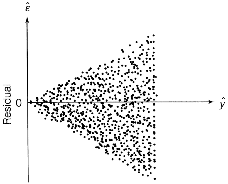{fig-align="center" width="4.95in"}When looking at our residual plot there appears to be a similar pattern where we have low spread for low predictions and higher spread for higher predictions:```{python}#| warning: false#| error: false#| message: false#| echo: falseplt.figure(figsize = (6, 4))sns.residplot(x = fitted, y = residuals, lowess =True, line_kws = {'color': 'red'})plt.axhline(0, linestyle ='--', color ='black')plt.xlabel("Fitted values")plt.ylabel("Residuals")plt.title("Linearity: Residuals vs Fitted")plt.show()```Visualizations are difficult to interpret and that interpretation is subjective at times. Formal statistical tests for heteroscedasticity put more of a scientific feel on the question of heteroscedasticity. One of the most popular test for heteroscedasticity is the Breusch-Pagan test. This test has the null hypothesis of homoscedasticity - the assumption of constant variance being met. The alternative hypothesis is heteroscedasticity - the assumption failing. This is a hypothesis test where we want a large (insignificant) p-value.Let's see how to calculate this test in each software!::: {.panel-tabset .nav-pills}## PythonAll we need to run the Breusch-Pagan test in Python is the `het_breuschpagan` function from the `statsmodels.stats.diagnostic` package. The inputs to that function are residuals we calculated earlier as well as the values of each of the variables from the model (obtained with the `model.exog` function. From there we are just printing out the p-value from the test.```{python}#| warning: false#| error: false#| message: falsefrom statsmodels.stats.diagnostic import het_breuschpaganbp_test = het_breuschpagan(residuals, model.model.exog)print(f"Breusch-Pagan test: p-value = {bp_test[1]:.3f}")```That p-value is extremely small and would be significant at any reasonable $\alpha$-level.## RAll we need to run the Breusch-Pagan test in Python is the `bptest` function from the `lmtest` package. The inputs to that function are just the model that built previously saved as `model`.```{r}#| warning: false#| error: false#| message: falselibrary(lmtest)bptest(model)```That p-value is extremely small and would be significant at any reasonable $\alpha$-level.:::Based on the above tests there is a statistical problem with heteroscedasticity. The next step is to fix that problem.One possibility is to transform your target variable with a **variance stabilizing transformation**. A variance stabilizing transformation is a mathematical transformation that converts a heteroscedastic model to a homoscedastic one. One of the most commonly used transformations to fix variance problems is the natural log.Let's transform our variables and explore the new model residuals in each software!::: {.panel-tabset .nav-pills}## PythonThe `log` function from the `numpy` package transforms our target variable. We save this new variable as the object `y2` instead. We now fit the same `OLS` regression using this new natural log of `SalePrice`. The results are printed below, but the main focus is on the new residuals.```{python}#| warning: false#| error: false#| message: falsey2 = np.log(train['SalePrice'])model2 = sm.OLS(y2, X_selected).fit()# Summary with p-values, coefficients, R², etc.print(model2.summary())```We calculate the predictions, residuals, and standardized residuals the same way we did before, but with the results form the new model.```{python}#| warning: false#| error: false#| message: falsefitted2 = model2.fittedvaluesresiduals2 = model2.residstandardized_residuals2 = residuals2 / np.sqrt(model2.mse_resid) plt.figure(figsize=(6, 4))plt.scatter(fitted2, residuals2, alpha=0.7)plt.axhline(0, linestyle='--', color='black')plt.xlabel("Fitted values")plt.ylabel("Residuals")plt.title("Homoscedasticity Check")plt.show()```Those residuals look much better in terms of heteroscedasticity. There are still some outliers that will make any statistical test say constant variance is broken, but the overall pattern looks much better than we had before.## RThe `log` function in R transforms our target variable. We save this new variable as the object `y2` instead. We now fit the same `OLS` regression using this new natural log of `SalePrice`. The results are printed below, but the main focus is on the new residuals.```{r}#| warning: false#| error: false#| message: falsey2 =log(train$SalePrice)# Build the linear regressionmodel2 <-lm(y2 ~ ., data = X_selected)# Print the model summary with p-values, coefficients, R², etc.summary(model2)```We calculate the predictions, residuals, and standardized residuals the same way we did before, but with the results form the new model.```{r}#| warning: false#| error: false#| message: falsefitted2 <-fitted(model2)residuals2 <-residuals(model2)standardized_residuals2 <-rstandard(model2)resid_data2 <-data.frame(Fitted = fitted2, Residuals = residuals2)# Create the residual plotggplot(resid_data2, aes(x = Fitted, y = Residuals)) +geom_point(alpha =0.6) +geom_hline(yintercept =0, linetype ="dashed", color ="black") +labs(x ="Fitted values",y ="Residuals",title ="Linearity: Residuals vs Fitted" ) +theme_classic()```Those residuals look much better in terms of heteroscedasticity. There are still some outliers that will make any statistical test say constant variance is broken, but the overall pattern looks much better than we had before.:::## NormalityOne of the assumptions of regression is that the probability distribution of $\varepsilon_i$ is Normal. This is one of the hardest assumptions to meet in practice. However, if the assumption is not met on a small scale (symmetric, but not Normal, might be enough) then the results are not altered very much.There are two common techniques to visually check for Normality of the error distribution.1. Histograms of the residuals2. Normal probability plots (Q-Q plots) of the residualsPersonally, I do not trust looking at histograms of data. Data is hard to check Normality with just histograms. This is because Normal distributions have specific properties that are hard to see visually. Although a histogram with symmetric that is in the shape of a bell-curve might be relatively easy to see, the thickness of the tails of a Normal distribution is hard to visualize and know for certain if it is Normal.Q-Q plots are a far superior visual representation of Normality. These Normal probability plots compare the distribution of the residuals against expected quantiles from a Normal distribution with the same mean and standard deviation as the residuals. if the residuals are approximately equal to their expected points on the Normal distribution, then a straight, diagonal line is formed. Departures from a straight line are signs of the assumption **not** being met. The plot below shows when the assumption of Normality is being met as well as the common patterns from when it is not met: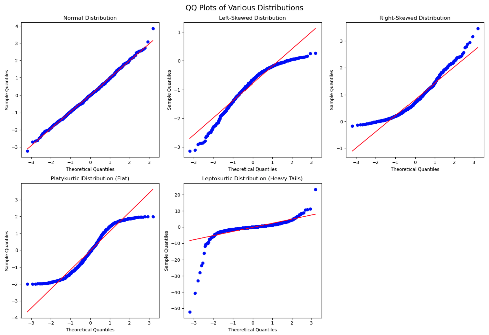{fig-align="center" width="7.29in"}If the Q-Q plot has a quadratic shape to it, that means that there is skewness in the data. The direction of the concavity of the quadratic curve shows which direction the skewness occurs. If you see an "S"-like or cubic shape to the Q-Q plot, then you have a kurtosis (thickness of tails) problem with your distribution. One of the deviations means your residuals have wider tails than a Normal distribution (Leptokurtic) and the other a more flat distribution (Platykurtic).Let's build histograms and Q-Q plots in each software!::: {.panel-tabset .nav-pills}## PythonWe can just use the `histplot` and `qqplot` functions from the `seaborn` package to easily build these for us. We will use the `subpolots` function from `matplotlib` to plot these beside each other for easier viewing. By putting in the standardized residuals we calculated from earlier in the code into each of these functions, we can evaluate their normality. Again, it is easier to truly evaluate normality with the Q-Q plot as compared to the histogram.```{python}#| warning: false#| error: false#| message: falsefig, ax = plt.subplots(1, 2, figsize = (6, 4))# Histogram + Density Curvesns.histplot(standardized_residuals, kde =True, ax = ax[0])ax[0].set_title("Histogram of Residuals")# Q-Q plotsm.qqplot(standardized_residuals, line ='45', ax = ax[1])ax[1].set_title("Q-Q Plot")plt.tight_layout()plt.show()```## R```{r}#| warning: false#| error: false#| message: falselibrary(ggplot2)library(gridExtra)# Histogram + density plotp1 <-ggplot(data.frame(resid = standardized_residuals), aes(x = resid)) +geom_histogram(aes(y = ..density..), bins =30, fill ="lightblue", color ="black") +geom_density(color ="red", size =1) +ggtitle("Histogram of Residuals") +theme_minimal()# Q-Q plot using stats::qqnorm and qqlineqq_data <-data.frame(sample = standardized_residuals)p2 <-ggplot(qq_data, aes(sample = sample)) +stat_qq() +stat_qq_line(color ="red") +ggtitle("Q-Q Plot") +theme_minimal()# Arrange plots side-by-sidegrid.arrange(p1, p2, ncol =2)```:::Those Q-Q plots above show our residuals are **not** Normally distributed. However, visual inspection can be both difficult and subjective. There, we can add statistical tests for Normality to put more of a scientific feel on the question of Normality. There are many tests for Normality, but two of the most popular are the following:1. Shapiro-Wilk (better for small to medium sample sizes \< 2,000)2. Anderson-Darling (better for larger sample sizes)Both of these hypothesis test have the same null hypothesis - Normality. Since the alternative hypothesis for both tests is the distribution is **not** Normal, then we would prefer a larger p-value and these tests to not be statistically significant.Let's calculate both of these tests in each software!::: {.panel-tabset .nav-pills}## PythonIn Python we just need to use the `stats` library from `scipy`. Inside of that library there is the `shapiro` and `anderson` functions to run each of our respective Normality tests on our previously calculated residuals.```{python}#| warning: false#| error: false#| message: falsefrom scipy import statsshapiro_test = stats.shapiro(residuals)print(f"Shapiro-Wilk test: Statistic = {shapiro_test.statistic:.3f}, p-value = {shapiro_test.pvalue:.3f}")anderson_test = stats.anderson(residuals)print(f"Anderson-Darling test: Statistic = {anderson_test.statistic:.3f}")print(f"Significance level: {anderson_test.significance_level}%")print(f"Critical value: {anderson_test.critical_values}")```Both of those tests show our data is statistically **not** Normally distributed at any reasonable $\alpha$-level.## RIn Python we just need to use the `nortest` package to the run the Anderson-Darling test. The Shapiro-Wilk test comes with base R's preloaded `stats` package. Inside of those libraries there are the `shapiro.test` and `ad.test` functions to run each of our respective Normality tests on our previously calculated residuals.```{r}#| warning: false#| error: false#| message: falselibrary(nortest)shapiro_test <-shapiro.test(residuals)cat(sprintf("Shapiro-Wilk test: Statistic = %.3f, p-value = %.3f\n", shapiro_test$statistic, shapiro_test$p.value))ad_test <-ad.test(residuals)cat(sprintf("Anderson-Darling test: Statistic = %.3f, p-value = %.3f\n", ad_test$statistic, ad_test$p.value))```Both of those tests show our data is statistically **not** Normally distributed at any reasonable $\alpha$-level.:::We have ample evidence at this point to say that our residuals are definitely **not** Normally distributed.One possible solution for having residuals that don't follow a normal distribution is to **transform the target variable**. Similar to what we did for stabilizing variance for heteroscedasticity, when Normality is broken a transformation might help solve it.A common statistical transformation is the **Box-Cox** **transformation**:$$y^` = \begin{cases}\frac{y^\lambda-1}{\lambda} & \text{if } \lambda \ne 0 \\ \log(y) & \text{if } \lambda = 0\end{cases}$$The value of $\lambda$ is optimized to best fit the data and typically done with the help of computers. Here are some common transformations based on their respective values of $\lambda$:- Close to 1: No transformation- Close to 0: Natural log- Close to 0.5: Square root- Less than 0: InverseLet's run the Box-Cox transformation in each software and try to fix our lack of Normality problem!::: {.panel-tabset .nav-pills}## PythonStill using the `stats` library from `scipiy` we can use the `boxcox` function to give us an optimal value of $\lambda$ for our target variable `y`.```{python}#| warning: false#| error: false#| message: falsenew_data, best_lambda = stats.boxcox(y)print(f"Optimal λ (lambda): {best_lambda:.4f}")```That value of $\lambda$ is rather close to 0, but it is also negative. Therefore, either the natural log or inverse functions might work for our data. Let's calculate each of those for our data.```{python}#| warning: false#| error: false#| message: falsey2 = np.log(train['SalePrice'])y3 =1/(train['SalePrice'])```The code is not shown to build the models and Q-Q plots for each as it would be just repeating a lot of the code above. Let's just examine the Q-Q plots for each.First, let's look at the results from the natural log transformation on our target variable.```{python}#| warning: false#| error: false#| message: false#| echo: falsefig, ax = plt.subplots(1, 2, figsize=(6, 4))# Histogram + KDEsns.histplot(standardized_residuals2, kde=True, ax=ax[0])ax[0].set_title("Histogram of Residuals")# Q-Q plotsm.qqplot(standardized_residuals2, line='45', ax=ax[1])ax[1].set_title("Q-Q Plot")plt.tight_layout()plt.show()```A majority of the plot looks really good except for the small part of the left hand tail still having some skewness. However, this skewness might be from a series of outliers in that tail.Next, let's look at the results from the inverse transformation on our target variable.```{python}#| warning: false#| error: false#| message: false#| echo: falsey3 =1/(train['SalePrice'])model3 = sm.OLS(y3, X_selected).fit()fitted3 = model3.fittedvaluesresiduals3 = model3.residstandardized_residuals3 = residuals3 / np.sqrt(model3.mse_resid) fig, ax = plt.subplots(1, 2, figsize=(6, 4))# Histogram + KDEsns.histplot(standardized_residuals3, kde=True, ax=ax[0])ax[0].set_title("Histogram of Residuals")# Q-Q plotsm.qqplot(standardized_residuals3, line='45', ax=ax[1])ax[1].set_title("Q-Q Plot")plt.tight_layout()plt.show()```We see a similar pattern here as we did with the natural log transformation, just in reverse. Here, we have some outliers causing skewness in the right hand tail instead.## RWe need the `MASS` package in R to calculate the Box-Cox transformation. The input to the `boxcox` function is the linear regression model object we previously built. We will evaluate $\lambda$ values between -2 and 2 as those seem reasonable. Next, we extract the best $\lambda$ value from our results using the `which.max` function.```{r}#| warning: false#| error: false#| message: falselibrary(MASS)boxcox_result <-boxcox(model, lambda =seq(-2, 2, 0.01))best_lambda <- boxcox_result$x[which.max(boxcox_result$y)]cat(sprintf("Optimal λ (lambda): %.4f\n", best_lambda))```That value of $\lambda$ is rather close to 0, but it is also positive. Therefore, the natural log might work for our data. Luckily, we already calculated that transformation for our heteroscedasticity concerns earlier.The code is not shown to build the models and Q-Q plots for this as it would be just repeating a lot of the code above. Let's just examine the Q-Q plots for the natural log transformation on our target variable.```{r}#| warning: false#| error: false#| message: false#| echo: falselibrary(ggplot2)library(gridExtra)# Histogram + density plotp1 <-ggplot(data.frame(resid = standardized_residuals2), aes(x = resid)) +geom_histogram(aes(y = ..density..), bins =30, fill ="lightblue", color ="black") +geom_density(color ="red", size =1) +ggtitle("Histogram of Residuals") +theme_minimal()# Q-Q plot using stats::qqnorm and qqlineqq_data <-data.frame(sample = standardized_residuals2)p2 <-ggplot(qq_data, aes(sample = sample)) +stat_qq() +stat_qq_line(color ="red") +ggtitle("Q-Q Plot") +theme_minimal()# Arrange plots side-by-sidegrid.arrange(p1, p2, ncol =2)```A majority of the plot looks really good except for the small part of the left hand tail still having some skewness. However, this skewness might be from a series of outliers in that tail.:::Although not perfect, these plots look like they can get a strong majority of our data to be relatively normal. Since we needed the natural log transformation to help with heteroscedasticity already, it would be a logical choice to take that same transformation as a good solution to our Normality problem. There is still some skewness, but we have yet to evaluate outliers which we will do in subsequent sections.## Independence of ErrorsIndependence of errors typically is not a problem with a linear regression model built without using time series data. **Cross-sectional** data is collect across different individuals at a specific point in time. This is what we have with our housing dataset. **Time series** data on the other hand is collected for one individual (typically) across consecutive points in time. An example of this would be watching the average price of homes over time.Regression models of time series data can lead to problems in the modeling process. The value of a time series at the point in time $t$ is often related to the value at the point in time $t+1$. For example, the average price of homes today is highly correlated to what that average price of homes will be tomorrow, but much less correlated to what the average price of homes will be in a decade. Errors are now correlated with each other which **underestimates** $\beta$ coefficients.The Durbin-Watson test is a populat statistical test to see if there is possible correlation across observations in our residuals. The null hypothesis for this test is no residual correlation, while the alternative is that there is residual correlation. The Durbin-Waston $d$ test statistic for residual correlation is the following:$$d = \frac{\sum_{t=2}^n (\hat\varepsilon_t - \hat\varepsilon_{t-1})^2}{\sum_{t=1}^n \hat\varepsilon^2}$$The numerator in the above test statistic is the difference between errors at successive points in time. The $d$ statistic has the following properties:- $0 \le d \le 4$- $d \approx 2$: uncorrelated- $d<2$: positively correlated- $d>2$: negatively correlatedThe sampling distribution of $d$ is very complex, so no direct cut-off can be calculated for the statistic. This makes p-value calculations difficult and approximate.Typically, we would not need to even run this test as our data is not recorded over time and therefore, we wouldn't need to evaluate if it has correlation over time. However, just for completeness, let's see how to do this in each software!::: {.panel-tabset .nav-pills}## PythonThe `durbin_watson` test that we will use on our residuals is found in the `statsmodels` package's `stats.stattools` library.```{python}#| warning: false#| error: false#| message: falsedw_stat = sm.stats.stattools.durbin_watson(residuals)print(f"Durbin-Watson statistic: {dw_stat:.3f}")```Not surprisingly, our Durbin-Watson test statistic is rather close to 2 and uncorrelated. Our data isn't is ordered in any notion of time so again, this would not need calculating for our dataset.## RWe will again use a function from the `lmtest` package. Here we input our model object into the `dwtest` function to get the test statistic.```{r}#| warning: false#| error: false#| message: falselibrary(lmtest)dw_result <-dwtest(model)cat(sprintf("Durbin-Watson statistic: %.3f, p-value: %.4f\n", dw_result$statistic, dw_result$p.value))```Not surprisingly, our Durbin-Watson test statistic is rather close to 2 and uncorrelated. Our data isn't is ordered in any notion of time so again, this would not need calculating for our dataset.:::## Outliers and Influential ObservationsWe have seen through previous looks through the residuals of our data that there are observations in our data that seem to be out of line with a majority of the data.Observations with residuals that are extremely large are called **outliers**. When we say extremely large, we typically mean 3 standard deviations away from the mean. Remember, the mean of the residuals is 0. Our standardized residuals that we calculated earlier help us with this evaluation:$$\hat{\varepsilon}_i^* = \frac{\hat{\varepsilon}_i}{\sqrt{MSE}} = \frac{(y_i - \hat y_i)}{s}$$Instead of just calculating standardized residuals, some people also calculate **studentized residuals**:$$\hat{\varepsilon}_i^{**} = \frac{\hat{\varepsilon}_i}{\sqrt{MSE \times (1-h_i)}} = \frac{(y_i - \hat y_i)}{s \sqrt{1-h_i}}$$These residuals are not just adjusted for scale, but also for the possibility of their influence, here measured with **leverage**, $h_i$. Similar to standardized residuals, the typical value of 3 or more represents large studentized residuals.The leverage of an observation, $h_i$ is the influence of that particular observation on the respective predicted value. In other words, how do the respective values of the predictor variables for the $i^{th}$ observation affect the prediction $\hat y_i$. The equation for leverage is not show here due to its complication. We will just rely on our software.Leverage is one way to measure the impact an observation has on the regression analysis. Any observations with large impacts on the regression analysis are called **influence observations**. The following leverage values would imply an observation has an extremely large influence on the model:$$h_i > \frac{2(k+1)}{n}$$Cook's D (distance) is another way to determine is an observation is an influential observation. Cook's D measure the influence of each observation on the estimated $\beta$ coefficients overall.$$D_i = \frac{(y_i - \hat y_i)^2}{(k+1)MSE}(\frac{h_i}{(1-h_i)^2})$$Observations with large values of Cook's D are considered influential. Large values of Cook's D are the following:$$D_i > \frac{4}{n}$$Let's see how to calculate each of these in each software!::: {.panel-tabset .nav-pills}## PythonThe primary method of looking at outliers and influential observations in Python's `statsmodels` package is the `OLSInfluence` function from the `stats.outliers_influence` part of `statsmodels`. We apply this `OLSInfluence` function on our model object. Here we are using the original model, but we could easily just use the second model where we transformed the target with the natural log. We already calculated the standardized residuals earlier and can examine if any of those take values over 3. However, here we will calculate the studentized residuals with the `resid_studentized_internal` function. From there we print our outliers.```{python}#| warning: false#| error: false#| message: falsefrom statsmodels.stats.outliers_influence import OLSInfluence# Influence summaryinfluence = OLSInfluence(model)# Studentized Residualsstd_resid = influence.resid_studentized_internal# Flag potential outliersoutliers = np.where(np.abs(std_resid) >3)[0]print(f"Potential outliers (|standardized residual| > 3): {outliers.tolist()}")```The above output gives the row value for each outlier based on studentized residuals. Let's compare these values to some of the influential observation calculations.To calculate leverage we will use the `hat_matrix_diag` function. We will print out only the observations that are greater than our leverage cut-off as defined above.```{python}#| warning: false#| error: false#| message: falseleverage = influence.hat_matrix_diagn = model.nobsk = model.df_modelleverage_threshold =2* (k +1) / nhigh_leverage = np.where(leverage > leverage_threshold)[0]print(f"High leverage points (leverage > {leverage_threshold:.3f}): {high_leverage.tolist()}")```The above output gives the row value for each influential observation based on leverage.To get Cook's D we will just use the `cooks_distance` function from the same `OLSInfluence` object we have been working with. Again, we will compare all of our observations to our cut-off defined above and print only the influential ones out.```{python}#| warning: false#| error: false#| message: falsecooks_d = influence.cooks_distance[0]influential_points = np.where(cooks_d >4/ n)[0]print(f"Influential points (Cook's D > {4/n:.3f}): {influential_points.tolist()}")```To try and view some of these all together, the `statsmodels` package has a `graphics.influence_plot` function. We just input our model object from before and specify the `criterion = "cooks"` option.```{python}#| warning: false#| error: false#| message: falsefig, ax = plt.subplots(figsize=(8, 6))sm.graphics.influence_plot(model, criterion ="cooks", ax = ax)plt.title("Influence Plot: Cook's Distance vs Leverage")plt.tight_layout()plt.show()```This plot compares all three of the above. The vertical axis shows studentized residuals. Points far away from the cloud vertically (with values above 3 or below -3) would be outliers. Points with high values of leverage would be points to the far right of the plot. The size of bubbles corresponds to Cook's D so bigger bubbles are more influential too. We can see that observation 1298 seems to be both a high leverage point as well as an outlier. It also has a really large value for Cook's D. Not all of these will always agree, but they do on this point.Outliers and influential points should not just be dropped from an analysis without further inspecting the data point for possible errors or interesting factors that might be able to be included in a model. The code below takes the metrics we calculated, puts them into a `pandas``Dataframe` and then prints them out by descending values of Cook's D.```{python}#| warning: false#| error: false#| message: falsediagnostics = pd.DataFrame({'y': model.model.endog,'fitted': model.fittedvalues,'resid': model.resid,'std_resid': std_resid,'leverage': leverage,'cooks_d': cooks_d})# Sort by most Cook’s Dprint("\nTop 5 most influential observations:")print(diagnostics.sort_values('cooks_d', ascending =False).head())```## RThe primary method of looking at outliers and influential observations is R's `car` package. We apply this `rstudent` function on our model object. Here we are using the original model, but we could easily just use the second model where we transformed the target with the natural log. We already calculated the standardized residuals earlier and can examine if any of those take values over 3. However, here we will calculate the studentized residuals. From there we print our outliers.```{r}#| warning: false#| error: false#| message: falselibrary(car)library(broom)library(dplyr)std_resid <-rstudent(model)outliers <-which(abs(std_resid) >3)cat("Potential outliers (|studentized residual| > 3):", outliers, "\n")```The above output gives the row value for each outlier based on studentized residuals. Let's compare these values to some of the influential observation calculations.To calculate leverage we will use the `hatvalues` function. We will print out only the observations that are greater than our leverage cut-off as defined above.```{r}#| warning: false#| error: false#| message: falseleverage <-hatvalues(model)n <-nobs(model)k <-length(coefficients(model)) -1leverage_threshold <-2* (k +1) / nhigh_leverage <-which(leverage > leverage_threshold)cat(sprintf("High leverage points (leverage > %.3f): %s\n", leverage_threshold, toString(high_leverage)))```The above output gives the row value for each influential observation based on leverage.To get Cook's D we will just use the `cooks.distance` function from the same `model` object we have been working with. Again, we will compare all of our observations to our cut-off defined above and print only the influential ones out.```{r}#| warning: false#| error: false#| message: falsecooks_d <-cooks.distance(model)influential_points <-which(cooks_d >4/ n)cat(sprintf("Influential points (Cook's D > %.3f): %s\n", 4/ n, toString(influential_points)))```To try and view some of these all together, the `car` package has a `influencePlot` function. We just input our model object from before.```{r}#| warning: false#| error: false#| message: falselibrary(car)influencePlot(model,id.method ="identify",main ="Influence Plot",sub ="Bubble size = Cook's distance") ```This plot compares all three of the above. The vertical axis shows studentized residuals. Points far away from the cloud vertically (with values above 3 or below -3) would be outliers. Points with high values of leverage would be points to the far right of the plot. The size of bubbles corresponds to Cook's D so bigger bubbles are more influential too. We can see that observation 1298 seems to be both a high leverage point as well as an outlier. It also has a really large value for Cook's D. Not all of these will always agree, but they do on this point.Outliers and influential points should not just be dropped from an analysis without further inspecting the data point for possible errors or interesting factors that might be able to be included in a model. The code below takes the metrics we calculated, puts them into a dataframe and then prints them out by descending values of Cook's D.```{r}#| warning: false#| error: false#| message: false# ---- Combine into a DataFrame ----diagnostics <-data.frame(y = model$model[[1]],fitted =fitted(model),resid =resid(model),std_resid =rstudent(model),leverage =hatvalues(model),cooks_d =cooks.distance(model))cat("\nTop 5 most influential observations (by Cook's D):\n")top_influential <- diagnostics %>%arrange(desc(cooks_d)) %>%head(5)print(top_influential)```:::# Multicollinearity**Multicollinearity** Occurs when two or more of the predictor variables in a regression model are correlated with each other. If two inputs are correlated, they could be bringing similar information to the prediction of the target variable. To be a problem the correlation must be high, which is good because it is difficult to find predictor variables that are not correlated with each other.High correlation between multiple predictor variables could lead to the following problems:- Errors in the calculation of the parameter estimates- Errors in the calculation of the standard errors- Results that are counterintuitive (parameters estimates with opposite signs)There are some easy signs for the presence of severe multicollinearity in a regression model:- Incorrect signs of coefficients on predictor variables- Extreme differences in coefficients of predictor variables after the addition (or deletion) of another predictor variable- Switches in significance of predictor variablesA more formal way to evaluate if there are problems with multicollinearity is the **variance inflation factor** (VIF). The VIF is the amount of inflation of the standard error of the parameter estimates due to multicollinearity. Recall the equation for standard errors of parameter estimates in multiple linear regression:$$s_{\hat \beta_j}^2 = \frac{MSE}{(1-R_j^2)\times \sum_{i=1}^n (x_{j,i} - \bar x_j)} = \frac{1}{(1-R_j^2)} \times \frac{MSE}{\sum_{i=1}^n (x_{j,i} - \bar x_j)}$$The value of $(1-R^2_j)$ is called the **tolerance**. The inverse of the tolerance, $\frac{1}{(1-R_j^2)}$, is the VIF. In linear regression, when the VIF is greater than 10, we have a problem of multicollinearity.The solutions to high multicollinearity are the following:1. Drop one of the correlated variables2. Avoid making inferences about the parameter estimates3. Biased regression techniquesThe easiest solution to multicollinearity is the first one - dropping one of the variables causing the problem. If there are two variables that are highly correlated with each other we do **not** want to drop them both. They have made it this far in the analysis because they provide valuable information. However, they are just providing a severe overlap of information. Dropping all but one of these variables usually solves the multicollinearity problem.The second solution is not as helpful, especially in the business world where we can't just ignore what a variable's stated impact is on the regression model. The third solution, biased regression techniques, will be covered in a subsequent section of this code deck.Let's calculate the VIF in each software!::: {.panel-tabset .nav-pills}## PythonIn Python we can just use the `variance_inflation_factor` function from the `statsmodels.stats.outliers_influence` package. We just need to input the values of our predictor variables. We just create a blank `pandas``DataFrame` to store our column names and VIF values. The `columns` function will grab the names while the `variance_inflation_factor` function applied to the `values` of our predictor variables will calculate the VIF's. We are just using a `for` loop to use this function across all predictor variables `in` the `range` of our predictor variables.```{python}#| warning: false#| error: false#| message: falsefrom statsmodels.stats.outliers_influence import variance_inflation_factorvif_data = pd.DataFrame()vif_data["feature"] = X_selected.columnsvif_data["VIF"] = [variance_inflation_factor(X_selected.values, i) for i inrange(X_selected.shape[1])]print(vif_data)```We can see there are some problems in the above output. We have some extremely large values of infinity. Those infinite values mean that we have **perfect multicollinearity**. Perfect multicollinearity occurs when two or more predictor variables are perfect combinations of each other (or take the exact same values). As we explore these variables we see they are all missing flag variables for things related to the home's garage.Let's drop three of those variables are rerun the code to see what the VIF values are now!```{python}#| warning: false#| error: false#| message: falseX_selected = X_selected.drop(['GarageType_Missing', 'GarageQual_Missing','GarageCond_Missing'], axis=1)vif_data = pd.DataFrame()vif_data["feature"] = X_selected.columnsvif_data["VIF"] = [variance_inflation_factor(X_selected.values, i) for i inrange(X_selected.shape[1])]print(vif_data)```Those VIF values are all much more reasonable as they are all below 10.## RIn R, we can simply use the `vif` function from the `car` package. The input to the `vif` function is just the same `model` object we have been using from our linear regression model. We then create a `data.frame` to store all of our values to print them out.However, if you were to run the following code, R would report an error around aliased coefficients.```{r}#| warning: false#| error: false#| message: false#| eval: falselibrary(car)vif_values <-vif(model)vif_data <-data.frame(feature =names(vif_values),VIF =as.numeric(vif_values))print(vif_data)```Those aliased coefficients are the ones in the linear regression output that have `NA` values. Those mean that we have **perfect multicollinearity**. Perfect multicollinearity occurs when two or more predictor variables are perfect combinations of each other (or take the exact same values).The `car` package also has an `alias` function where you can put in your `model` object to discover the problem variables. In all of the output below it shows the values of not 0 where there are problems.```{r}#| warning: false#| error: false#| message: falselibrary(car)alias(model)```As we explore these variables we see they are all missing flag variables for things related to the home's garage. Let's drop three of those variables are rerun the code to see what the VIF values are now!```{r}#| warning: false#| error: false#| message: falselibrary(car)X_selected <- X_selected %>% dplyr::select(-GarageType_Missing, -GarageQual_Missing, -GarageCond_Missing )model <-lm(y ~ ., data = X_selected)vif_values <-vif(model)vif_data <-data.frame(feature =names(vif_values),VIF =as.numeric(vif_values))print(vif_data)```Those VIF values are all much more reasonable as they are all below 10.Another option outside of the popular `vif` function from the `car` package is the `check_collinearity` function from the `performance` package. This function is not bothered by aliased coefficients like the `vif` function and just drops them in the calculation of the VIF.```{r}#| warning: false#| error: false#| message: falselibrary(performance)vif_data <-check_collinearity(model)print(vif_data)```We see the same final results here as we got after dropping the variables with perfect multicollinearity.:::