
Correlation Functions
Dependencies
Time series data analysis typically assumes a dependency between observations over time. These relationships would imply correlations with a variable and itself at different points in time. When evaluating correlation of a variable with itself at different points in time, we call this autocorrelation. Two common autocorrelation measures are:
- Autocorrelation
- Partial autocorrelation
Autocorrelation Function
Autocorrelation is the correlation between two sets of observations, from the same series, that are separated by k points in time. The autocorrelation function (ACF) is the function of all autocorrelations (between two sets of observations, \(Y_t\) and \(Y_{t-k}\)) across time for all values of k.
\[ \rho_k = Corr(Y_t, Y_{t-k}) \]
Let’s look through an example of data in the table below of the monthly US airline passengers.
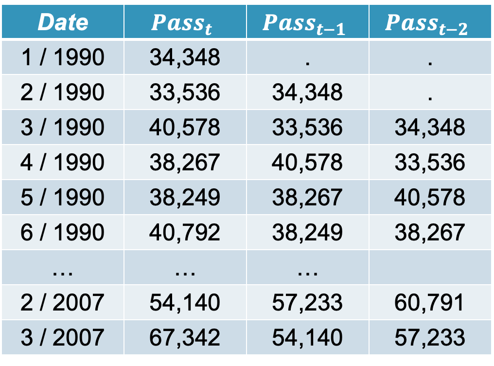
The \(Pass_t\) column is the monthly number of passengers on US airlines. The \(Pass_{t-1}\) column is the first lag of the \(Pass_t\) column. A lagged variable is a variable based on another variable, but shifted in time. The first lag column just represents the data point at the previous point in time. For our example, the lag on February 1990 is the value in January 1990. The autocorrelation function at lag one is the Pearson correlation between \(Pass_t\) and \(Pass_{t-1}\). For our data this correlation is 0.821.
The autocorrelation function at lag two is the Pearson correlation between \(Pass_t\) and \(Pass_{t-2}\). This value in our data is 0.752. Let’s plot the autocorrelation function for the first 12 lags of our data.
What does this correlation of 0.821 mean for our first autocorrelation lag. It means that consecutive points in time are highly, linearly related to each other in their value. For example, January’s are related to February’s, February’s are related to March’s, etc.
This relationship can be both positive and negative. For positive correlations, it implies that high values in one time period, tend to lead to high values in the next time period. The reverse is also true with low values in one time period leading to low values in the next time period. In other words, positive correlations imply that that the series (the original data and its lagged value) move in the same direction. A negative correlation would imply that they move in opposite directions. For example, high values in one time period would lead to low values in the next time period.
Let’s see how to build these in each of our softwares!
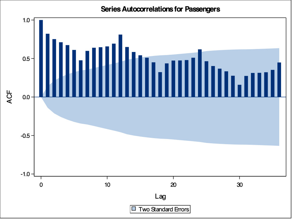
The gg_tsdisplay function in R provides some great initial plots to look at and explore with your data. By using the gg_tsdisplay function on the Passengers variable from our training dataset we see a plot of the original data followed by two autocorrelation plots. The left-hand plot is the one we are interested in for now, the autocorrelation function. The lag = option controls how many lags into the past you want the ACF plot to display. A good rule for how many lags would be approximately three seasons into the past for seasonal data. For non-seasonal data it becomes a lot more dependent on your data and trial and error might be appropriate. The plot_type = 'partial' option shows both of these correlation plots as compared to switching out the right hand side for another plot.
Code
train %>%
  gg_tsdisplay(Passengers, lag = 36, plot_type='partial')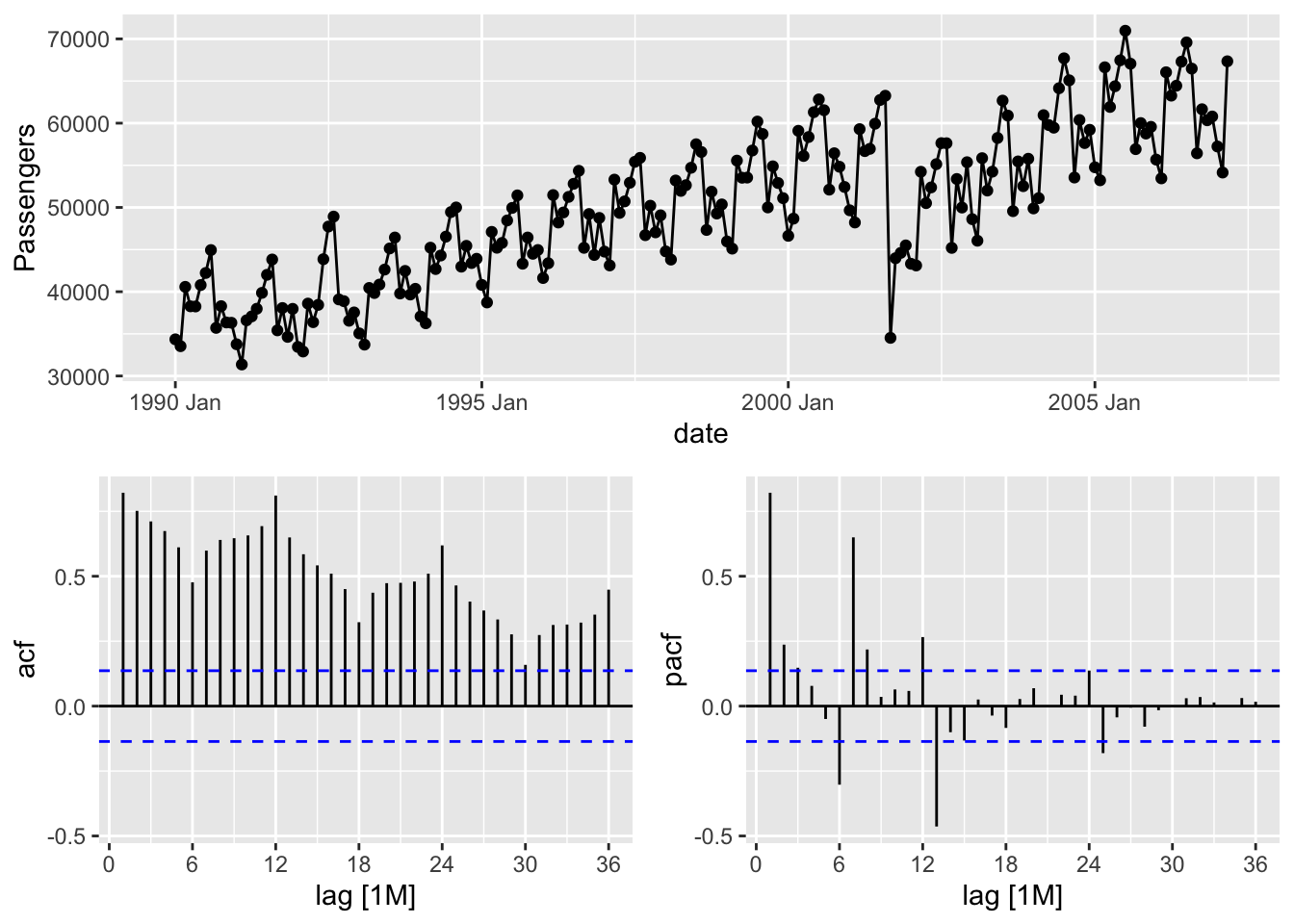
Based on the above plot we can see that there is a lot of correlation over time. If you would like to isolate the ACF into its own plot, then we can use the Acf function from the forecast package. The same lag = option exists here as well.
Code
forecast::Acf(train$Passengers, lag = 36, main = "Autocorrelation of US Passengers")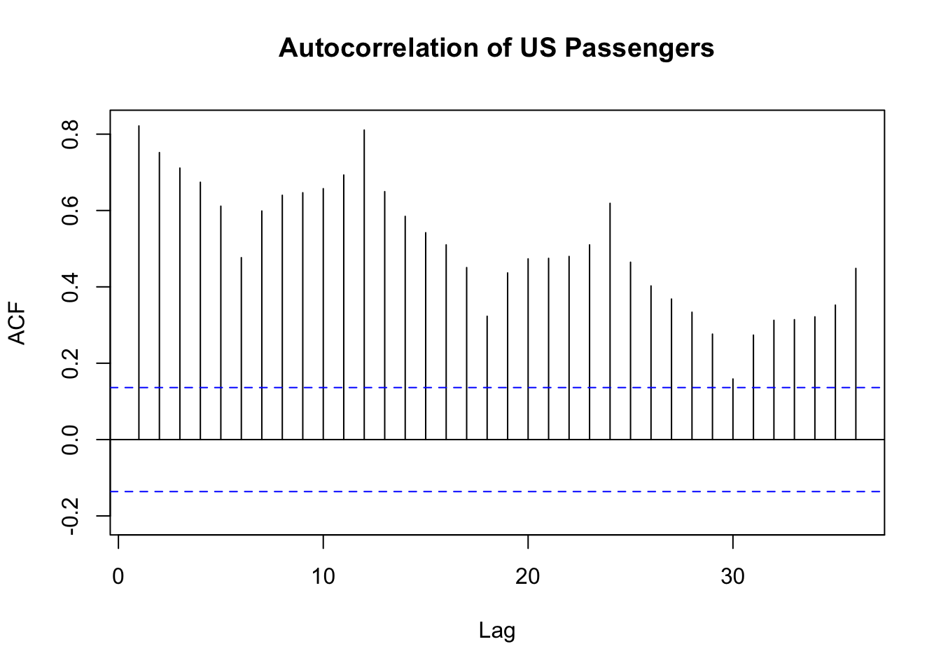
The above plot is a more zoomed in version of the ACF plot. In this plot we can see that there also appears to be some higher correlations on the seasonal lengths of 12 and its multiples. This shouldn’t be surprising with seasonal data as this would imply that this January looks a lot like (is highly, positively correlated with) last January, and so on. We will deal with this phenomenon more when we discuss season modeling in a later section.
The plot_acf function in Python from the statsmodels.api.graphics.tsa package provides the autocorrelation function. By using the plot_acf function on the Passengers variable from our training dataset we see a plot of the autocorrelation function. The lag = option controls how many lags into the past you want the ACF plot to display. A good rule for how many lags would be approximately three seasons into the past for seasonal data. For non-seasonal data it becomes a lot more dependent on your data and trial and error might be appropriate.
Code
import statsmodels.api as sm

sm.graphics.tsa.plot_acf(train['Passengers'],  lags = 36)

plt.show()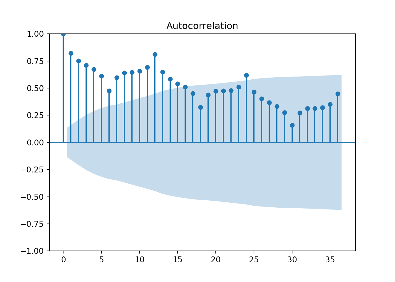
Based on the above plot we can see that there is a lot of correlation over time. Unlike R, this plot shows the ACF at lag 0, the correlation of \(Y_t\) with itself. This always takes a value of 1. In this plot we can see that there also appears to be some higher correlations on the seasonal lengths of 12 and its multiples. This shouldn’t be surprising with seasonal data as this would imply that this January looks a lot like (is highly, positively correlated with) last January, and so on. We will deal with this phenomenon more when we discuss season modeling in a later section.
The PROC ARIMA procedure in SAS provides some great initial plots to look at and explore with your data. The plot(unpack) = all option shows us all of the plots for our data exploration. The unpack part of the option separates these plots into individual pictures instead of combining them onto one plot. By using the IDENTIFY statement with the var = option on the Passengers variable from our training dataset we see a plot of this original target variable followed by three autocorrelation plots on it. The nlag = option controls how many lags into the past you want the ACF plot to display. A good rule for how many lags would be approximately three seasons into the past for seasonal data. For non-seasonal data it becomes a lot more dependent on your data and trial and error might be appropriate.
Code
proc arima data = work.train plot(unpack) = all;
    identify var = Passengers nlag = 36;
run;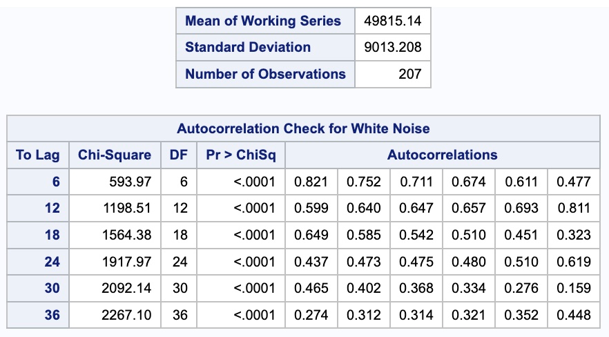
From the output above we see a table of autocorrelation values for the 36 lags we requested. Based on the above plot we can see that there is a lot of correlation over time. The above plot is a more zoomed in version of the ACF plot because of the unpack option in the plotting. In this plot we can see that there also appears to be some higher correlations on the seasonal lengths of 12 and its multiples. This shouldn’t be surprising with seasonal data as this would imply that this January looks a lot like (is highly, positively correlated with) last January, and so on. We will deal with this phenomenon more when we discuss season modeling in a later section.
Partial Autocorrelation Function
The autocorrelation function above does have a fundamental flaw. If the values are correlated across time at certain lags, then it will appear this correlation continues across other lags. For example, if \(Y_t\) is correlated with \(Y_{t-1}\), then by definition of this one lag correlation, that would imply that \(Y_{t-1}\) would be correlated with \(Y_{t-2}\). The problem exists then that \(Y_t\) is probably correlated somewhat with \(Y_{t-2}\), not because what happened two lags ago actually impacts this time period, but because of those correlations across time with \(Y_{t-1}\). That is why we also have the partial autocorrelation function (PACF).
The partial autocorrelation function is the correlation between two sets of observations, from the same series, that are separated by k points in time, after adjusting for all previous (1, 2, … , k) autocorrelations. In other words, partial autocorrelations are conditional correlations.
\[ \phi_k = Corr(Y_t, Y_{t-k} | Y_{t-1}, Y_{t-2}, \ldots, Y_{t-k-1}) \]
These correlations are calculated after removing the impact of the lags in between the two series of interest so as to isolate the direct impact of one lag on the other.
Let’s look through an example of data in the table below of the monthly US airline passengers.
The \(Pass_t\) column is the monthly number of passengers on US airlines. The \(Pass_{t-1}\) column is the first lag of the \(Pass_t\) column. Let’s plot the partial autocorrelation function for the first 12 lags of our data.
The autocorrelation function at lag one is the Pearson correlation between \(Pass_t\) and \(Pass_{t-1}\). For our data this autocorrelation is 0.821. The partial autocorrelation at the first lag is always the same as the autocorrelation. This is because there is no lag in between to remove the impact of. Therefore, our partial autocorrelation at lag 1 is also 0.821.
After the first lag, however, this changes. Where the regular autocorrelation between \(Pass_t\) and \(Pass_{t-2}\) is 0.752, the partial autocorrelation between these two variables is only 0.237 because we removed the impact of the variable \(Pass_{t-1}\). What is happening here? In our example, the direct relationship between \(Pass_t\) and \(Pass_{t-2}\) is actually rather small. However, in the regular autocorrelation function, them both having a relationship with \(Pass_{t-1}\) made it appear as their relationship was much stronger. After removing the impact of \(Pass_{t-1}\), we see this is no longer the case. Now, we could not have known this necessarily ahead of time, which is why we calculated this partial autocorrelation in addition to the regular autocorrelation.
The way we remove the impact of the lags in between is through regression analysis. Imagine we wanted to calculate the PACF at lag k. The computer runs the following regression:
\[ Y_t = \phi_0 + \phi_1 Y_{t-1} + \cdots + \phi_k Y_{t-k} \] The coefficient \(\phi_k\) on the last term \(Y_{t-k}\) is our partial autocorrelation value. For our example above with only two lags the regression would be:
\[ Pass_t = \phi_0 + \phi_1 Pass_{t-1} + \phi_2 Pass_{t-2} \]
and the \(\phi_2\) is our partial autocorrelation. Notice we are always grabbing the last coefficient. That means for every lag of the partial autocorrelation function, we need to run a different linear regression where we add an additional lag and look at that additional lag’s coefficient, \(\phi_k\).
Let’s see how to build these in each of our softwares!
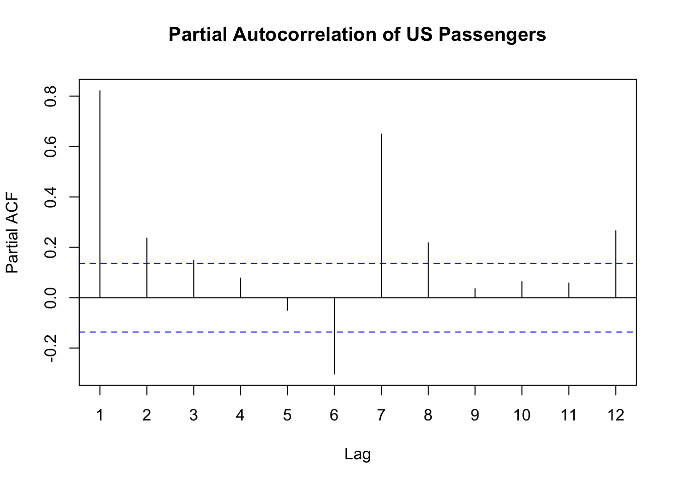
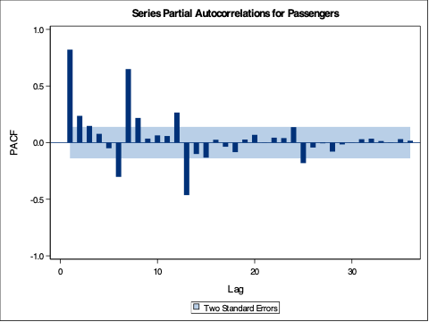
The gg_tsdisplay function in R provides some great initial plots to look at and explore with your data. By using the gg_tsdisplay function on the Passengers variable from our training dataset we see a plot of the original data followed by two autocorrelation plots. The right-hand plot is the one we are interested in this time, the partial autocorrelation function. The lag = option controls how many lags into the past you want the PACF (and ACF) plot to display. A good rule for how many lags would be approximately three seasons into the past for seasonal data. For non-seasonal data it becomes a lot more dependent on your data and trial and error might be appropriate. The plot_type = 'partial' option shows both of these correlation plots as compared to switching out the right hand side for another plot.
Code
train %>%
  gg_tsdisplay(Passengers, lag = 36, plot_type='partial')
Based on the above plot we can see that there is some correlation over time at specific points in time. If you would like to isolate the PACF into its own plot, then we can use the Pacf function from the forecast package. The same lag = option exists here as well.
Code
forecast::Pacf(train$Passengers, lag = 36, main = "Partial Autocorrelation of US Passengers")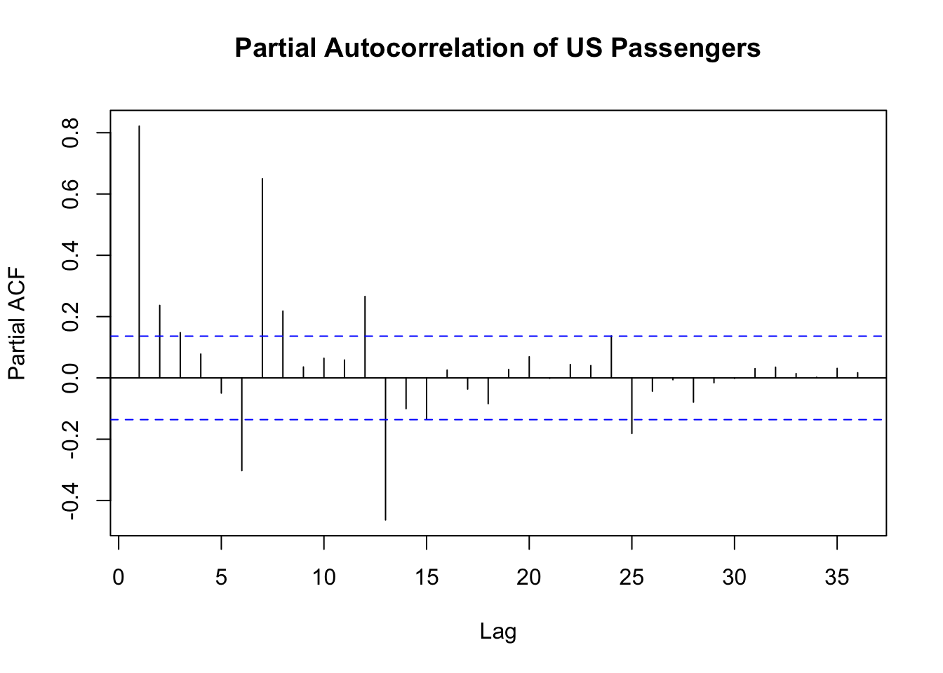
The above plot is a more zoomed in version of the PACF plot. Notice how a lot of the correlations in this plot are smaller than the correlations in the ACF plot we saw earlier.
The plot_pacf function in Python from the statsmodels.api.graphics.tsa package provides the partial autocorrelation function. By using the plot_pacf function on the Passengers variable from our training dataset we see a plot of the partial autocorrelation function. The lag = option controls how many lags into the past you want the PACF plot to display. A good rule for how many lags would be approximately three seasons into the past for seasonal data. For non-seasonal data it becomes a lot more dependent on your data and trial and error might be appropriate.
Code
import statsmodels.api as sm

sm.graphics.tsa.plot_pacf(train['Passengers'],  lags = 36)

plt.show()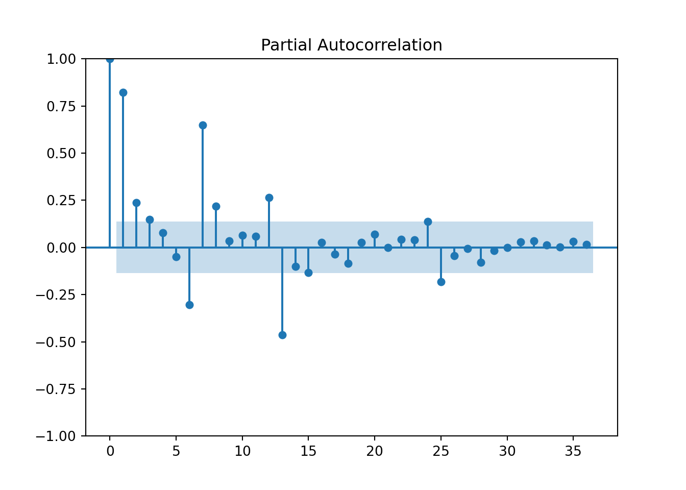
Based on the above plot we can see that there is a lot of correlation over time. Unlike R, this plot shows the PACF at lag 0, the correlation of \(Y_t\) with itself. This always takes a value of 1. Notice how a lot of the correlations in this plot are smaller than the correlations in the ACF plot we saw earlier.
The PROC ARIMA procedure in SAS provides some great initial plots to look at and explore with your data. The plot(unpack) = all option shows us all of the plots for our data exploration. The unpack part of the option separates these plots into individual pictures instead of combining them onto one plot. By using the IDENTIFY statement with the var = option on the Passengers variable from our training dataset we see a plot of this original target variable followed by three autocorrelation plots on it. The nlag = option controls how many lags into the past you want the PACF (and ACF) plot to display. A good rule for how many lags would be approximately three seasons into the past for seasonal data. For non-seasonal data it becomes a lot more dependent on your data and trial and error might be appropriate.
Code
proc arima data = work.train plot(unpack) = all;
    identify var = Passengers nlag = 36;
run;
From the output above we see a table of autocorrelation values for the 36 lags we requested. Notice how a lot of the correlations in this plot are smaller than the correlations in the ACF plot we saw earlier.
SAS also displays another plot called the inverse autocorrelation function. Just like the partial autocorrelation, the inverse autocorrelation function is the correlation between two sets of observations, from the same series, that are separated by k points in time, after adjusting for all previous (1, 2, … , k) autocorrelations. The calculation for this function is just different. In practice, the ACF and PACF are the more widely used functions as compared to this IACF.
With the partial autocorrelations trying to display the direct impacts of one lag on another, it might seem useless to calculate the ACF. However, we will need both the ACF and PACF when it comes to modeling building in the world of ARIMA modeling as we will see in a later section.